Category: Design

  • The Amsterdam Bridge and the Torontobrug

    Reopened, at last

    On Sunday, May 31, the Amsterdam Bridge reopened on Toronto’s Harbourfront after being closed for five years. The footbridge, which spans a marina south of Queen’s Quay, is a popular meeting place and photo opportunity, with views of Toronto Harbour to the south and the towering skyline to the north. A gift of the City of Amsterdam, one of Toronto’s sister cities at the time, the bridge was one of the first great public spaces on the waterfront as it was beginning to transition from a derelict industrial space to the city’s new front yard.

    The Amsterdam Bridge in 2014

    The footbridge, a cable suspension structure over the marina featured a lifting section on the east side so that tall yachts could moor at the north end of the marina on request, though this was not a regular occurrence. The design mimicked some of the iconic canal crossings in Amsterdam. Sadly, due to neglect, the bridge was closed to pedestrians in 2021 and the lifting section removed.

    Plaque on the bridge commemorating the opening of the Amsterdam Bridge, a “Dutch style lift bridge” on June 25, 1978 by Amsterdam mayor Wim Polak, taken in 2014. Note the old pre-amalgamation City of Toronto coat of arms below. A replacement plaque with similar text (but with the current post-amalgamation civic coat of arms) since replaced the original.

    When the bridge reopened in 2026 just in time for Toronto hosting six World Cup soccer matches, the lifting section was replaced by a fixed span. Once again, visitors can climb the bridge, take in the views, and snap great photographs, but the “lift bridge” of the original “Dutch style lift bridge” is no more. It’s a shame too, that it took five years for this fix to even happen; Toronto needs to do better at maintaining its public assets, especially its unusual, fun, and quirky landmarks.

    Fixed deck on the Amsterdam Bridge in 2026

    Around the same time Toronto got an Amsterdam Bridge, the City of Amsterdam named a bridge for Toronto. The Torontobrug spans the Amstel River, carrying the busy Centrumring (Central Ring Road). A five-lane traffic artery outside the major tourist areas, the bridge is not iconic by any means (I biked to it during my 2013 visit to Amsterdam) but it is an important road link. There are separated cycle tracks on both sides of the bridge, so it is at least multimodal. The bridge can still open for river boat traffic when necessary.

    The Torontobrug in Amsterdam, 2013

  • Introducing Mount Dennis

    Introducing Mount Dennis

    Mount Dennis station sign at driveway entrance

    While Montreal was celebrating the opening of another portion of its REM automated light metro system between Gare Centrale and Deux-Montagnes on the region’s north shore, Torontonians had to settle for the partial opening of two light rail stations on the delayed Line 5 Eglinton line: Mount Dennis and Cedarvale.

    While the opening of Cedarvale (apart from the light rail platforms) slightly improved circulation at the existing Eglinton West Station, Mount Dennis Station provides for a new GO Transit and UP Express stop, a large TTC bus terminal, and access to a historic Kodak building. It’s an interesting structure that facilitates new intermodal connections, but could definitely benefit from a few minor improvements.

    An UP Express train leaves Mount Dennis for Union Station, with the Toronto skyline in the background

    The Mount Dennis and Weston neighbourhoods were established around major industries, including CCM, Moffat Stoves, Willys-Overland, Dominion Bridge, Kodak, with even more employment at the nearby stockyards and slaughterhouses at St. Clair Avenue. The CN and CP railways passing through brought materials in and finished goods out. Today, only the Facelle tissue plant — now owned by Irving — remains in operation from that industrial past. The Dominion Bridge property later became the home of a TTC bus garage, while the Kodak plant became the site of the Eglinton Crosstown light rail storage and maintenance facility.

    One building from the massive Kodak complex was preserved: Building 9, the employee recreation centre. The rear section of the main floor contains a public entrance to the station from the passenger pick-up and drop-off area, accessible washrooms, and access to the rest of the building (which is currently vacant). A bright mural, which once graced Building 9, can be found near the GO/UPX platform accesses. A heritage plaque tells the story of the building.

    Mount Dennis Station platforms and Kodak Building 9
    Building 9, as seen from the TTC bus terminal. Note the Metrolinx “T” icon, with the logos of three services – GO, TTC, and UP – below.
    The GO/UP Express section of the station is brightened by a colourful mural saved from Kodak Building 9
    Heritage Toronto Plaque affixed to Kodak Building 9

    As UP Express and most GO Kitchener Line trains now stop at Mount Dennis, approximately three extra minutes is added to train trips. UP Express, which took 25 minutes between Pearson Airport Terminal 1 and Union Station, now takes 28 minutes. On the first day of stopping service last Sunday, very few passengers got on or off UP or GO trains (of the few that did, most appeared to be transit enthusiasts), but with more TTC bus connections and the Line 5 service hopefully coming soon, the station should become much busier.

    Mount Dennis Station was mostly empty on its first day
    A mostly empty Mount Dennis bus terminal currently serves six routes; this will increase to 13 when Line 5 finally opens

    Mount Dennis will be served by 13 different bus routes when the station is fully open, including a new route 901 express between Mount Dennis and Pearson Airport, via Dixon Road. Though most of the changes are simple route extensions to the new terminal (like the 161 and 168), the 35 Jane will be split into two (while the 935 express stays on Jane, bypassing Mount Dennis), and daytime surface service on Eglinton between Mount Dennis and Kennedy Stations will be limited to an infrequent Route 34 bus.

    Map of planned bus network revisions upon opening of Line 5 (click for larger image)

    Despite some long corridors (particularly between the escalators up to the bus terminal and down to the closed-off LRT platforms), the station is well designed for the complexity of the site. The bus terminal and LRT platforms are both within the fare-paid area, eliminating one barrier between buses and rail.

    Corridor towards the elevator and escalators from the TTC fare gates and LRT to the bus terminal. The natural light comes in from the large windows of Building 9. Public washrooms are on the left, past the windowed room, presumably a future retail space.
    Looking down to the LRT platforms

    Three of four UP/GO platforms are in service (the fourth track, which would allow for more frequent GO Kitchener Line service is under construction). I was impressed to see two elevators to each platform, providing essential redundancy for improved accessibility and reliability. However, the GO/UPX platform access points are not easy to spot from this long corridor, which also leads to the Eglinton Avenue and Weston Road intersection.

    Passage to GO and UP Express trains from the TTC bus/LRT area, looking west

    There is no visible wayfinding signage in this long tunnel. Only when one reaches the escalators at the other end are directions apparent, as the overhead signs are affixed to sloped ceilings. This should be a relatively easy fix, but an important one.

    No wayfinding signage visible below escalator level in the GO/UPX area

    Furthermore, an opportunity to provide a useful link to the Mount Dennis neighbourhood from GO/UPX Platform 4 (the west-most platform) has not been exploited. An undeveloped road allowance from the corner of Barr Avenue and Brownsville Road, used for station construction, is fenced off and barricaded. This would provide an alternate route to the station from Weston Road, particularly to the nearby Toronto Public Library branch, and would only need a few Presto tap readers and perhaps a fare vending machine. Perhaps it will take private highrise development to make this happen.

    Looking west from Platform 4 to the Barr Avenue road allowance

    Finally, it was frustrating to see so little wayfinding signage in the TTC bus terminal. Though the TTC has numbered each of the bus bays from 1 to 15, these numbers do not appear inside the waiting area or over the doors. Digital screens over each bay display very small text with next bus information.

    TTC bus terminal plan, with each bus bay and assigned routes
    Outdoor signage at Mount Dennis bus terminal

    The wayfinding signage needs to be corrected, but at least these are simple fixes. Otherwise, it was a treat visiting a new transit hub on a sunny (though cold) November afternoon. The heritage preservation was a nice touch; hopefully, new use is found for Building 9’s upper floors. Furthermore, one hopes the rest of the Line 5 Crosstown stations open soon.

  • Let’s not be jealous of Montreal

    Let’s not be jealous of Montreal

    Rue St-Catharine in the Quartier des Spectacles, August 2025

    A visit to Montreal can make one jealous. Jealous of the city’s better street furniture, greater cycling infrastructure, great public spaces throughout the city, and an improved pedestrian realm. Entire streets are closed in the summer months to motor traffic, allowing pedestrians to spill out into the roadway, and patios to sprout without the need for concrete blocks to protect them (and less noise and pollution to those dining al fresco).

    For example, Avenue Mont-Royal, was first closed in Summer 2020 as a “Corridor Sanitare” to encourage people to get outside during the first wave of the COVID-19 pandemic and support local businesses, which set up patios on the sidewalk and the street. My spouse and I rented a car and visited Montreal during this time, getting a lot of walking in a city that opened up as much as safely possible.

    Avenue Mont-Royal, looking east, August 2020

    Happily, Montreal continued the tradition in the years since, even as pandemic restrictions eased, then disappeared entirely. Five years later, Avenue Mont-Royal was even more vibrant. Not only were there lots of patios on the street, there were public benches, shade structures, and water fountains, allowing anyone to sit, relax, and enjoy the outdoors. The annual summer closure is a hit.

    Avenue Mont-Royal, looking east, August 2025

    Several public squares were also renewed in recent years. Phillips Square, on Rue Ste-Catharine across from the now-shuttered Hudson’s Bay department store, was renewed with new splash fountains along with small café-style tables and chairs, complete with shade umbrellas. The metal chairs are movable, allowing larger groups to sit around a single table. It’s a refreshed natural congregation point along the city’s main shopping street.

    Phillips Square, August 2025

    Similar tables and umbrellas were set up at Dorchester Square, several blocks to the west, near Mary, Queen of the World Cathedral and Central Station. Both squares were reimagined by the brilliant landscape architecture firm Claude Cormier + Associés. At Dorchester Square, a new water fountain, seemingly a classic installation, is cut in the rear, with a woodpecker behind. Such Easter eggs are features of Cormier park projects.

    Dorchester Square, August 2025
    Fountain at Dorchester Square; note the woodpecker on the side. One of the two black curved footbridges across the parking ramps is behind.

    Furthermore, Montreal is rebuilding the western section of Rue St-Catharine towards Crescent. Though motor vehicles are permitted after reconstruction, they are limited to a single through lane, with lay-bys for deliveries, passenger pick-ups and drop-offs, and emergency vehicles. Sidewalks are widened considerably, with more benches, bicycle parking, and street trees.

    Completing Rue St-Catharine, near Bishop Street

    After returning to Toronto, it’s easy to feel down on this city. Montreal seems to do everything right. Meanwhile, ActiveTO, the open streets initiative following the pandemic restrictions here, quickly eroded, and was effectively ended in 2022. Open Streets, which closed sections of Yonge and Bloor Streets to motorists for two Sunday mornings, was last held in 2022. But there are still business improvement area-led weekend street festivals, which attract tens of thousands of pedestrians.

    Torontonians want to walk, and pedestrianized streets, even when they’re just weekend events, are immensely popular. One downside, however, is a lack of seating outside of businesses’ patio areas. One is free to walk, enjoy live music, or just people watch, but to sit down, one is compelled to purchase something from one of the businesses with a sanctioned patio.

    Torontonians love a street festival: Cabbagetown in September

    There are a few other successes. A small segment Gould Street at Toronto Metropolitan University was pedestrianized and rebuilt as a central plaza for that university campus. A short section of Willcocks Street at the University of Toronto was similarly pedestrianized.

    But the best example in Toronto is Market Street, which abuts St. Lawrence Market. Patio space and Muskoka chairs provide plenty of seating, without obligation to purchase anything (though it provides additional seating to those who picked up a snack or lunch inside the market). The shade umbrellas and high-quality surface materials and street furniture make this a wonderful oasis in Toronto’s downtown core.

    Market Street looking north from The Esplanade. St. Lawrence Market is on the right.

    Planning for Yonge Street’s makeover, which will include narrowing the roadway, widening the sidewalks, improvements to the public realm, and seasonal closures of selected sections of the traffic lanes, is complete. Unfortunately, the YongeTOmorrow improvements will have to wait for another five years (work starting in 2030) due to Ontario Line construction.

    Rendering of Yonge Street looking north towards Dundas, once YongeTOmorrow improvements are complete

    There are also other great things happening in Toronto. Claude Cormier was tapped to create new public spaces, such as HtO Park and Sugar Beach on the Harbourfront, but also reimagine existing places such as Love Park (previously a highway off-ramp) and Berczy Park, home of the popular Dog Fountain. At Love Park, not one of the 45 movable chairs have been taken (though one ended up in the pond). Torontonians have been shown to cherish great public spaces.

    Toronto has made a lot of progress on improving its public realm, and it has shown that it is willing and able to close streets to traffic for the benefit of pedestrians and cyclists. Though it is so very easy to envy Montreal for its greater progress in the last two decades, it is up to us to continue the momentum Toronto does have, and work harder to push for change, even when there’s a car-focused provincial government. Streets can be narrowed, parks can be improved, and streets can be handed over to the people. Additional seating and more public washrooms will open up this city to many more residents and visitors.

    This should all be a key pillar of a progressive agenda in next years’ municipal election. When certain candidates talk about tax cuts, austerity, and crime, there needs to be a focus on creating a better quality of life to provide an alternative. And that talk must be backed up with action, with quick wins that don’t require multi-year waits.

  • Downtown Brampton’s next chapter

    Garden Square, at Main and Queen Streets, will be one of the two public spaces downtown to be rejuvenated

    After nearly two decades of little change, Downtown Brampton may finally be turning the corner from being a sleepy town centre to becoming the proper hub for a city of nearly 800,000.

    The Riverwalk, an ambitious plan to enhance flood protection from nearby Etobicoke Creek and create new public space, will break ground later this year. The extension of the Hurontario LRT into Downtown Brampton, by way of a deep-mined tunnel, was approved and funded by the provincial and federal governments. There will also be a new transportation hub to accommodate additional tracks at Brampton GO Station and support Brampton Transit ridership growth. City of Brampton is also hoping to get started on a new Centre for Innovation at the corner of Nelson and George Streets; it will contain a new central library as well as space for Toronto Metropolitan University and Rogers.

    Private sector development is also waking up. The first of a new wave of mixed-use high-rise developments, Rose Garden Residences, has started construction.

    Demolition is complete and shoring is starting at Rose Garden Residences

    These are exciting times for Brampton. The city, looking to attract more people to the downtown core, is planning to improve both Ken Willians Square, in front of City Hall, and Garden Square, in front of the Rose Theatre. The municipal government is looking for feedback on four proposed designs for the two square.

    For Urban Toronto, I wrote more about Brampton’s plans to rejuvenate its downtown public realm.

    Proposed design for Ken Willians Square, Downtown Brampton
  • Live from the CBC mothership

    Live from the CBC mothership

    Walking towards the CBC Broadcasting Centre at 6:00 am

    Yesterday, on Wednesday, May 7, I had the privilege of appearing on the long-running CBC Radio program Metro Morning. Though I have been interviewed on the radio a few times before – generally about pedestrian safety or transit issues – this was the first time I was asked to come into the studio.

    I spoke about the new permanent barriers that have gone up around Union Station in the last few weeks, seven years after temporary Jersey barriers were installed. I take exception to the size and placement of new barriers – which needlessly restrict pedestrian flow around the busy transport hub – as well as their unappealing appearance.

    The new barriers are already scuffed up and are not appealing to sit on

    I arrived around 6:10 for a short interview at 6:40. After checking in with security, I was let up to the CBC Toronto newsroom, which has a radio studio for local programs including Metro Morning and the afternoon drive time show Here And Now. I met with one of the producers and with host David Common before the segment. They were all great. David is a great interviewer, and it was nice to go see where the magic of radio happens.

    You can listen to me speak with David Common here.

  • The case against transit advertisement wraps

    The case against transit advertisement wraps

    A Go Transit double decker bus completely covered by a vinyl wrap, with the exception of the front windows and entrance door. The wrap advertises the transit agency’s wifi and music streaming gimmick.

    Apart from unscheduled short-turns, lengthy delays, or missed transfers, the thing that bothers me most about riding buses or streetcars is an obstructed view caused by a vinyl advertisement wrap.

    Though transit advertisements have been around almost as long as there have been transit services, these advertisements have generally been limited to posters and cards mounted outside the vehicles, or placed inside, above the windows or beside doors. Advertisements have long been placed inside train and subway stations, and in outdoor transit shelters.

    TTC photograph of streetcar advertising, 1935. The advertisement can be found below the left dash window of the streetcar. City of Toronto Archives Fonds 16, Series 71, Item 11134.

    For advertisers, transit ads provide an ideal vehicle for promoting their goods and services: they can be targeted to specific neighbourhoods that a bus, streetcar, or train passes through; the advertisements move around unlike static billboards, potentially drawing more eyeballs. For transit operators, advertising provides an easy revenue source. Most transit agencies outsource their advertising to larger firms, who are responsible for maintaining accounts and installing and removing ads from vehicles and transit facilities. These companies typically provide an annual payment for the right to advertise on transit vehicles, and at stations and stops.

    A GO Transit coach bus departing Bramalea Station, wrapped for a newspaper’s investment news service; all passenger windows are obscured by the advertising wrap

    Though vinyl decals on transit vehicles are not a new innovation (advertisements in the late 1980s and early 1990s were typically opaque, sometimes covering parts of passenger windows) more recent technology has allowed for perforated vinyl wraps that fully cover windows, while providing an obscured outside view through small dots. While the vehicle is moving, a passenger inside may be able to see where they are, but not be able to read signage or see details. For some, not having a clear view of forward motion can contribute to motion sickness.

    The view from the inside (via Chris Livett, on X/Twitter)

    In TTC subway stations and some GO Transit stations, surfaces such as walls, floors, pillars, faregates and even stairways have also become advertising surfaces, a tactic called “station domination.”

    An example of Pattison Outdoor’s “station domination” advertising, with a traditional ad poster at right, an installed video screen and ad pillar at centre, and stairs covered in ads, at left.

    On occasion, vehicle wraps are used for public relations, rather than advertising. GO Transit and the TTC’s Pride buses are a good example of this. A more shameful example was the TTC’s messaging about fare evasion which took place in late 2019 and early 2020, just before the COVID-19 pandemic.

    “Forgot to tap” – part of a TTC streetcar wrap used in late 2019 and early 2020

    For the most part, the TTC does not allow ad wraps to completely obscure bus and streetcar windows, but allows up to 70 percent of the passenger windows to be covered, either in a “strip” format (where only the lower parts of the windows are kept uncovered) or “mural” format (where three of five sections of a streetcar are fully covered). Other agencies, like the Hamilton Street Railway, allow for complete vehicle wraps.

    In Waterloo Region, Regional Councillors just considered a motion to increase the number of wrapped Grand River Transit buses and — for the first time — on ION LRT cars. The appendix to the staff report recommending the increased number of advertising wraps depicts a rail car in a Tropicana wrap, with the windows partially obscured.

    Depiction of what an advertising wrap would look like on an ION LRT rail car, from the October 10 agenda of the Regional Municipality of Waterloo Planning and Works Committee

    According to the report, the Region of Waterloo/Grand River Transit has a contract with Pattison Outdoor — one of Canada’s largest advertising firms — that allows for a total of five buses to be wrapped at any one time. GRT and Pattison want to increase this to ten percent of the total bus fleet, which numbers over 250. It also seeks to wrap one ION rail car at a time, with the promise that windows would not be fully covered and convert some static back-lit shelter ads to digital ads.

    Currently, Waterloo Region receives guaranteed revenue from its contract with Pattison, averaging $1,546,500 a year, though the total revenue is projected to reach $1,800,000 for 2023, as ridership increases. Allowing for wraps on 20 more buses and one ION railcar is estimated to net an additional amount up to $500,000.

    It’s worth noting that the report notes a 2018 recommendation against advertising on the exterior of LRT vehicles “due to concerns of diminishing the ION brand.” This restriction was also carried to ION-branded buses that follow the planned LRT extension between Fairway Station and Cambridge. It also notes strong public feedback against covering windows, and proposes to do so, “to maintain the customer experience.”

    The Region of Waterloo’s entire Transit Services budget — including paratransit — for 2023 is $207,203,000, with transit fares bringing $46,143,000 of that – a 22.3% farebox ratio (property tax and provincial grants cover the difference). $2.3 million brought in from all advertising revenue — traditional poster ads and transit wraps — is not an insignificant sum, but it makes up just over 1% of the entire transit operating budget. In Toronto, the TTC’s 12-year, $324-million contract — also with Pattison Outdoor — brings in a total of $27 million a year, or 1.1% of the entire TTC budget.

    At least Waterloo Region staff recognize that transit customers don’t like advertisements that obscure windows. They also acknowledge that transit wraps diminish the transit brand. For a revenue source that represents a mere drop in the bucket, why do transit agencies keep allowing them on their vehicles?

  • Shining a light on Toronto’s streetlamps

    Shining a light on Toronto’s streetlamps

    Replacement high pressure sodium lamp on left, the white glow of Toronto’s classic “acorn” lamp on right.

    Street lighting is an important, yet overlooked, part of any city’s standard infrastructure. For over seventy years, Toronto’s streets were lit with an elegant and increasingly unique streetlamp design. But modern standards and a desire for standardization will see this change, just as Toronto’s streetcars and street signs have.

    Toronto Hydro, which is responsible for Toronto’s street lighting, is replacing the older “acorn” lamps with high pressure sodium (HPS) cobra head lamps (so-called due to their shape when seen from the top or bottom). While surrounding municipalities are switching to white-burning LED lights, Toronto Hydro is installing the older beige-orange glowing lamps.

    I asked Toronto Hydro what their long-term plans were for the city’s street lighting infrastructure. Read more on Spacing’s website.

  • Yonge, tomorrow

    Yonge, tomorrow

    Over the past few years, I have been involved with the YongeTOmorrow project on behalf of Walk Toronto. It has been a very interesting and worthwhile experience being part of a stakeholder advisory group. Allied organizations working towards a more exciting and sustainable Yonge Street include Cycle Toronto, 8 80 Cities, and the David Suzuki Foundation.

    After several rounds of public consultations and stakeholder meetings, you can now see what the proposed changes to Yonge Street will look like.

    Rendering of proposed changes to Yonge Street , looking north towards Dundas Square. In this section, northbound traffic is permitted, with two-way cycling, and much wider sidewalks, along with new trees and improved street furniture.

    Though the selected concept is not perfect, the proposed changes will provide significant improvements to Yonge Street between Queen and College Streets. These include wider sidewalks, patio space, bike facilities, and a pedestrianized zone between Dundas Square and Edward Street, allowing for better circulation, more flexibility for special events, and a more pleasant street.

    With more high-rise development on the way (including the redevelopment of the Chelsea Hotel on Gerrard Street), it is only right that more space be given to residents, students, employees, and visitors. Compromises in the plan allow for access to parking garages, permit taxi and other vehicle drop-offs and pick-ups, as well as business deliveries.

    I encourage you to have a look and provide your feedback. The online survey is available until September 30.

  • Some love for Ontario’s municipal flags

    Some love for Ontario’s municipal flags

    Flag of TorontoThe flag of the City of Toronto, designed by Renato De Santis, is an example of a very good civic flag

    I was in Orillia last week, mainly to check out the new Simcoe County Lynx bus system. While there, the flag flying from the Opera House (formerly the city hall) caught my attention. Most municipal flags are boring, usually consisting of the town or city’s coat of arms, shield, or logo on a plain background.

    Orillia municipal flag, with a yellow sun in the middle

    But Orillia’s flag is different. It has waving blue and white waves, with two green triangles facing the centre, and a bright yellow sun in the middle. The symbolism wasn’t difficult to figure out: the city’s position on the narrows between Lake Simcoe and Lake Couchiching, with the sun being a nod to Orillia author Stephen Leacock’s Sunshine Sketches of a Little Town, a light, humourous collection of short stories about the denizens of Mariposa, a thinly-veiled fictionalization of Orillia.

    Yet Canadian cities that boast populations twenty or thirty times that of Orillia can’t boast having such a fine flag.

    For the most part, we don’t think about state, provincial, and municipal flags, and that’s a pity. In the few cities that have an unique and powerful flag, they have become part of that city’s iconography. Unfortunately, though Toronto does have a very good civic flag, we don’t fly it like it should.

    According to the North American Vexillological Association, there are five principles for creating a good flag:

    • Keep it simple — so simple, it can be drawn by a child from memory
    • Use meaningful symbolism
    • Use two or three basic colours
    • Never use lettering or seals
    • Be distinctive or be related

    Canada’s flag, adopted in 1965, adheres to these principles perfectly. It uses just two basic colours: red and white. With a large red maple leaf in the middle, it’s easily recognizable around the world. While a child might not get the eleven-point maple leaf exactly right, it’s otherwise easy to draw from memory.

    There are, of course, exceptions to these principles.

    Maryland’s complicated state flag, based on the coat of arms of colony founder Cecil Calvert, Lord Baltimore, is distinctive and popular, nearly as common as the US flag. California’s state flag is emblazoned with the words “California Republic” but it has significant historical meaning. The flag of South Africa, adopted in 1994, has six colours, but by merging the Pan-African colours of the African National Congress with the red white and blue of Britain and the Netherlands, it represents unity in the post-apartheid era.

    Flags of Maryland, California, and South Africa, notable exceptions to the rules

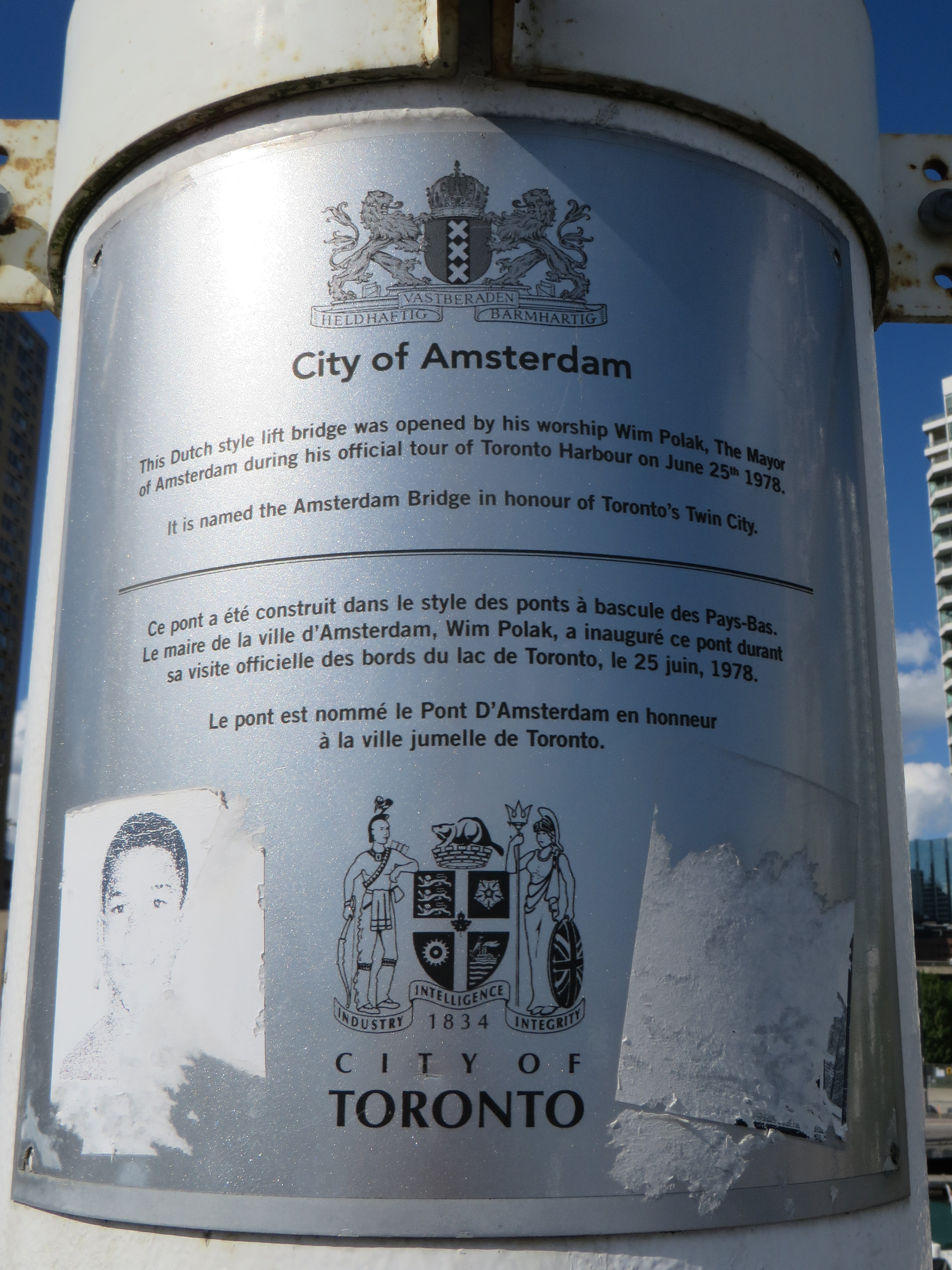
    For the most part, famous and great civic flags adhere to these principles. The flags of Amsterdam, Berlin, Chicago, and Tokyo all stand out. In Chicago and Amsterdam, these flags are proudly flown from private homes and watercraft, found on t-shirts and souvenirs, and well known around the world. The bear from Berlin’s flag is almost as popular as the Ampelmännchen. Though Amsterdam’s flag’s origins go back centuries (the “x”s are actually St. Andrew’s crosses), it looks bad-ass, and on-brand for a city famous for its tolerance.

    Great civic flags: Amsterdam, Berlin, Chicago, Tokyo

    Compared to the great examples above, Ontario’s provincial flag is just bad. Compare the provincial red ensign with the flag of Manitoba, and then compare it to the Franco-Ontarien flag.

    The Ontario and Manitoba flags, British red ensigns defaced with the provincial shields, were only adopted in 1965 and 1966 as conservative reactions to the new flag of Canada. The two flags are difficult to tell apart from a distance, and they both contain the St. George’s cross (representing England) twice: once in the union flag in the canton, and again in the shield. There’s very little Ontario to be found. (At least the Manitoba flag contains a bison, a recognizable symbol of that province.)

    Meanwhile, the Franco-Ontarien flag is immediately recognizable, with the fleur-de-lis and a stylized trillium, the provincial flower, representing the French-Canadian presence in Ontario.

    Like Orillia, there are a few other civic flags in Ontario that get it right.

    Flags of Thunder Bay, Hamilton, Ottawa, and Toronto

    Thunder Bay’s flag depicts a rising sun above Lake Superior and the Sleeping Giant, a prominent natural landmark across the water. The flag of Hamilton includes a yellow cinquefoil, the badge of the Clan of Hamilton, with a steel chain with six large links representing the steel industry and the six municipalities amalgamated into the modern city. The flag of Ottawa contains the civic logo, with the points representing waterways and the Peace Tower on Parliament Hill. Finally, the flag of Toronto has an abstract depiction of Toronto’s city hall, with a maple leaf where the council chamber sits. The two towers also make a “T.”

    It’s a shame that Toronto doesn’t make more of its simple, yet great flag.

    Unfortunately, most flags look like those used by Ontario’s third and fourth largest cities.

    Mississauga’s flag violates most of the principles listed above by including the name of the place it represents, with the addition of “incorporated 1974” at the bottom. In the middle is the civic shield, with the typical trappings: a cog representing industry, a lighthouse representing a port (Port Credit), a waterwheel, a stalk of wheat, and wings, possibly representing Pearson Airport. Though Mississauga is a proud city with its own identity, this flag doesn’t appear except in front of civic buildings.

    Brampton’s flag is just the civic shield on a white background, again with similar trappings: a bushel of wheat, a plow, a steam locomotive, and a beaver. According to the city’s website, the gold colour and castle top signify the city’s relation with the small Cumbrian town of Brampton, England. The shield dates from the small rural town before post-war growth, with only a pine tree in the middle to represent the old township of Chinguacousy it merged with. There’s no recognition of Brampton’s modern identity as a multicultural city.

    But at least they’re not as bad as the worst city flag identified by the North American Vexillological Association, that of the city of Pocatello, Idaho, which manages to include the city slogan, a trademark, and a copyright notice. After some embarrassment, the city came up with a new, much better flag.

    Old Flag of PocatelloThe former flag of Pocatello, Idaho

    It would be wonderful to see Brampton and Mississauga come up with better designs. Brampton’s new logo and slogan, Flower City, better represents the city’s history and ambitions. A pretty good flag could be made out of that.

    As for Toronto, let’s embrace our flag more. It’s a fine one and far better than the province’s. As Torontonians generally think of themselves as Canadian first, Torontonian second, and Ontarian third, perhaps we should give our municipal banner more love.