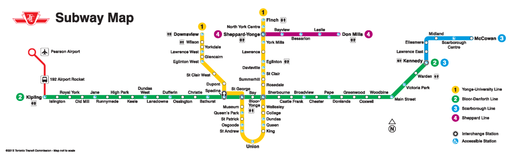
Tag: TTC

  • King Street: a mess of Uber proportions

    21207239313_0c5746b3f8_o

    One of the most frustrating things about living and working in central Toronto is having to rely on streetcars for east-west travel. This isn’t the fault of the streetcars; when free of traffic, they’re a smooth, fast and comfortable way to get around. But trapped in the quagmire that is downtown traffic, streetcars are painfully slow. They’re stuck behind left-turning cars and trucks. Cars plugging the curb lane, legally or not, force all traffic into the streetcars’ path. Replacing streetcars with buses isn’t a solution either; not only would more buses (and drivers) be required to match the each streetcar’s superior capacity, but buses would be forced to weave in and out of the curb lane around taxis, parked cars, delivery vans and other obstructions.

    Rapid residential growth, both east and west of the downtown core, have overloaded the 504 King Streetcar. With 64,600 daily riders, it’s the busiest surface route in the system. The city has done little to facilitate this highrise boom in neighbbourhoods such as Corktown and the Distillery District in the east, and CityPlace, Liberty Village, Niagara, and Queen/Gladstone in the west. Further west, the highrise condos built at Humber Bay Shores must either rely on a painfully slow and unreliable ride on the 501 Queen Streetcar, take an infrequent double-fare express bus, or ride a bus up to the Bloor Subway.

    No wonder then, Uber, the controversial firm that has delighted passengers with cheap transportation, but put the livelihoods of taxi drivers in jeopardy, launched UberHop, a variation of its “ride sharing” service that offers flat $5 rides between neighbourhoods along the King Streetcar and the downtown core. From a purely capitalist viewpoint, Uber is filling a need that’s been left unfulfilled.

    (more…)

  • It’s time for two-hour transfers on the TTC

    15102078722_2ee5e4e9e3_k

    As of Monday, December 14, all TTC streetcars will operate under a “proof-of-payment” system; allowing customers to enter through the rear doors, as they currently do on 509 Harbourfront and 510 Spadina, the two routes partially equipped with the new Bombardier low-floor streetcars. All-door loading and proof-of-payment (POP) is supposed to be in effect on streetcars on Queen Street, but in practice, operators inconsistently open the rear doors; sometimes at all stops, often just a few downtown stops, sometimes only at Yonge Street, sometimes not all.

    This new policy requires passengers to have a valid pass, transfer, or Presto card on board every streetcar; fares can continue to be paid at the front door on the older CLRVs and ALRVs; at that point a transfer must be obtained.

    TTC fare inspectors have been handing out brochures about the new policy to streetcar passengers, informing them about the upcoming change:

    The design of the new low-floor streetcars has required POP: they have four doors instead of two doors on CLRVs and three on ALRVs; the operator is in a separated cab, and normally does not interact with passengers, including fare collection and handing out transfers. At this point, at the end of 2015, all streetcars on the 509 and 510, as well as the 505 Dundas and 511 Bathurst routes were supposed to be equipped with low-floor accessible streetcars, but the many delays at Bombardier has resulted in only the twelfth new streetcar, #4413, entering service today.

    By the end of the year, all TTC streetcars (not just the new Bombardier LFLRVs) will be accepting payment by Presto Card, one small step towards the elimination of tickets, tokens and paper transfers, a process already complete at many suburban GTA transit agencies.

    But widespread adoption of Presto at the TTC will result in a few challenges unique to it, thanks to its outdated transfer policy that dates back over 100 years.

    On the TTC, transfers are only valid for continuous one-way trips, no stopovers permitted. But most other major systems in Ontario work on the time-based transfer system, that allows for stopovers, even return trips within a 90 minute period (the policy at Grand River Transit) or 120 minute period (permitted in Mississauga, Brampton, York Region, Hamilton and elsewhere). After boarding the first bus, each additional tap with a Presto card will not result in a new fare deducted until the 90 minute or two hour time limit has passed.

    The TTC will have a different policy. Paper transfers will still be required for Presto card holders if they intend to transfer to a bus (Presto readers will not be coming to the TTC’s buses for another year); but transfers to connecting streetcars and subway stations can be done by tapping the card on the new vehicle or at the subway turnstile. If it’s a valid transfer under the TTC’s rules, it will not deduct another fare. Here’s the TTC’s Brad Ross (the TTC’s amazing Head of Communications) clarifying this:

    https://twitter.com/bradTTC/status/672810002688569344

    But there’s a hiccup:

    https://twitter.com/bradTTC/status/672841401177014272
    https://twitter.com/bradTTC/status/672841244918210560

    If a passenger taps onto another vehicle on the same route, which is quite a common occurrence due to delays, short-turns, and diversions/shuttles, the Presto Card will deduct a second fare.

    There is an easy solution: two-hour transfers. It would eliminate confusion, allow for short stopovers and quick two-way trips, and solve such issues such as customers re-boarding streetcars and buses on the same route. Allowing Presto cardholders the same luxury as that enjoyed in Toronto’s suburbs would provide an incentive to passengers paying by cash and token to switch. After all, the TTC already offers a two-hour transfer on St. Clair Avenue, a pilot project left over from the construction of the streetcar right-of-way.

    The TTC already considered at time-based transfers in 2014 as it planned for the transition to Presto for fare collection. The Commission estimated that it would cost $20 million in annual revenue (thanks to lost fares stopovers and single-fare return trips), but it would by a lot of goodwill. And I doubt that the TTC would lose $20 million a year as it might attract new riders, especially during off-peak periods.

    It’s now time for the TTC to bite the bullet to make it easier to ride the rocket.

  • Not seeing the light on pedestrian safety

    IMG_9773

    Earlier this week, I ranted on Twitter about a poster I spotted on the TTC. The poster, showing a pedestrian crossing a downtown street, is one of a series of posters aimed at pedestrians, all with the tag “Stay Focused. Stay Safe.” They are co-produced by the TTC and the City of Toronto.

    The poster, as seen above, shows a blurry image of a pedestrian crossing the street, wearing a backpack and a dark jacket. But it shows that pedestrian crossing legally and safely at one of the safest intersections in Toronto – Yonge and Dundas. We see cars and a streetcar waiting at the light in the background. There’s nothing wrong with this picture. What part of “stay focused” does clothing come in, anyway?

    (Some of the responses to my rant were hilarious, like the woman who compared walking downtown wearing dark clothing with hiking in rural B.C. and not being prepared for cougar attacks.)

    With the new school year and with the shorter days, it isn’t a bad time to be reminding all road users about how to stay safe. Other posters remind TTC passengers to cross at designated crosswalks and to pay attention when crossing the street, rather than focusing on their smartphones. While crossing many streets midblock isn’t itself dangerous – as long as one crosses a quiet street with caution it’s usually quite safe – the advice given in the poster above bothers me. It indirectly blames pedestrians for the clothes they wear.

    Most fall and winter clothes, especially jackets, are dark – black, navy blue, dark grey, etc. Instead of blaming pedestrians, should we be blaming clothing retailers? Should we be requiring all pedestrians to wear high-visibility clothing, and be equipped with bright flashing lights? Or as David Hains pointed out in Torontoist, why aren’t cars required to be brightly coloured as to be seen better by pedestrians?

    In Spacing, fellow Walk Toronto co-founder Dylan Reid wrote about, and debunked some common myths about pedestrian collisions. The vast majority of pedestrians in Toronto – 67% – hit by motorists had the right-of-way, such as with a walk signal at a traffic light or in a marked crosswalk. Only in 19% of collisions did injured pedestrians not have the right of way. And downtown, where there is a higher volume of pedestrians, there’s a safety in numbers; it’s on busy suburban arterials where pedestrians are most at risk; speed kills.

    And as for bright-coloured clothing, it’s a great idea for joggers and runners at night, especially in rural areas. But it doesn’t necessarily prevent collisions. I was hit on Dupont Street by a careless taxi driver two years ago, even though I was riding safely in a bike lane. My bright, reflective jacket, my steady front and rear bike lights and my flashing helmet-mounted lights did not do a thing. I’ve been nearly hit over a dozen times by aggressive drivers racing through red lights or making right turns without looking for pedestrians with the right of way; I was attentive, and avoided injury in every case.

    Some factors that make pedestrians difficult to see at night include poor lighting, inattentive and/or aggressive drivers, and motorists who don’t put their headlights on at night. There’s nothing wrong with reminding all users about how to get around safely; pedestrians should always be attentive when walking in and around traffic. There’s lots that can be done to promote pedestrian safety: better infrastructure, improved lighting, lower speed limits, and so forth. Safety campaigns are a useful tool. But blaming pedestrians for their wardrobe is ridiculous and misses the point.

  • Mapping an accessible TTC

    IMG_3898

    Last week in Torontoist
    , I wrote about the challenges of getting around on the TTC for passengers who rely on mobility devices, such as wheelchairs. Most of us never think about this problem unless we’re directly affected by the consequences of an inadequate system, as I was after a cycling injury in 2012.

    But for TTC users with mobility disabilities (or even passengers with strollers, wheeled carts, or luggage), it’s an issue. While the bus system is (mostly) fully-accessible, the backlog in the delivery of new streetcars and the installation of elevators in subway stations leaves the system failing many of its riders. The alternative, Wheel-Trans, is also underfunded, inconvenient and useless for last-minute travel plans.

    Here’s what the subway system looks like if you require the use of elevators to navigate the system:

    accessible map - now 2015

    By 2016, only one more station  — St. Clair West  — will be equipped, by 2017, Wilson, Ossington, Coxwell, and Woodbine (and hopefully the Spadina Subway Extension to Vaughan Centre, with its six new fully-accessible stations, will open by then) will follow. But there’s not enough funding to make the entire system accessible by 2025, the deadline set by the Accessibility for Ontarians with Disabilities Act (AODA). Seventeen stations, including Islington and Warden, remain unfunded.

    The entire bus fleet is accessible, though not all bus stops are (the TTC requires a solid, concrete or asphalt place to deploy the ramp or lift, and room for the passenger to board; some suburban stops without a bus pad, or narrow urban sidewalks make loading a passenger in a wheelchair difficult). The first four low-floor streetcars are operating on Spadina Avenue, 200 more are still to be delivered. By now, the Spadina, Bathurst and Harbourfront cars were to have been fully-equipped with the new trams.

    In the meantime, the few bus routes that operate in the central core don’t have many accessible connections; east-west travel is particularly difficult. For example, the 47 Lansdowne bus is inaccessible from either subway station it services (Lansdowne and Yorkdale), and offers no barrier-free transfers south of Dupont Street. The map below shows this problem:

    TTC - Downtown v3 Crop

    Elevators at Ossington would connect the subway with three accessible bus routes, including the 94 Wellesley, a useful east-west alternative. (The 94 serves four subway stations and enters three of them, not one is equipped with elevators.) Meanwhile, both Toronto Western and St. Joseph’s Hospitals are isolated from the accessible transit network.

  • The over-simplification of the TTC’s maps

    IMG_7647[1] The 192 Airport Rocket on the new TTC subway map posted in its trains

    The Toronto Transit Commission (TTC) introduced a new subway map on “T-1” subway trains, the older 6-car trains used on the Sheppard Line (known as Line 4), and the Bloor-Danforth Line, now known as Line 2. I first spotted the new map a few days ago and I have a few thoughts about it.

    In the latest edition of the map, found over every second set of doors, a red line representing the 192 Airport Rocket bus route was added, the first time a bus route was included on a TTC subway map. It’s a helpful reminder to passengers that a fast, frequent, affordable, and usually reliable airport transit link exists. I could quibble about the details (which makes little sense; I’d simply terminate the line at the airport icon), but it’s a great addition to the map. Now that the premium Union-Pearson Express train is about to launch, it’s an excellent time to remind customers about the TTC’s affordable airport link. (It’s worth noting that the MTA in New York City includes bus routes to LaGuardia and JFK airports on its subway maps as well.)

    Another little change that I like is the removal of the word “Spadina” from the name of the Yonge-University-Spadina Line, now known as Line 1. With the subway extension to Vaughan [ugh] Metropolitan Centre due to open in 2016 (though it may end up being 2017), Line 1 will now serve all four of Toronto’s universities (not counting secondary campuses): Ryerson, OCAD University, the University of Toronto, and York University. Since the line only operates under Spadina Road for less than 2 kilometres, and will extend beyond the old Spadina Expressway alignment (now Allen Road), the shortened name makes a lot of sense.

    And there’s one more great little addition to the new map: information on how to purchase your own subway map via the TTC’s website. The TTC’s slowly starting to realize the demand for transit-related merchandise; it recently began selling re-prints of old promotional posters and maps to the public via a new Shop TTC page on its website and through the new Spacing Store. An authentic subway map can be yours for $10. The new maps also emphasize the subway lines’ numbers over their names, part of a larger TTC wayfinding strategy. Numbered bullets, similar to those used in New York City, are used on new signage and maps for each subway and RT route.

    IMG_7644[1] Spadina is dropped; information on how to buy your own map

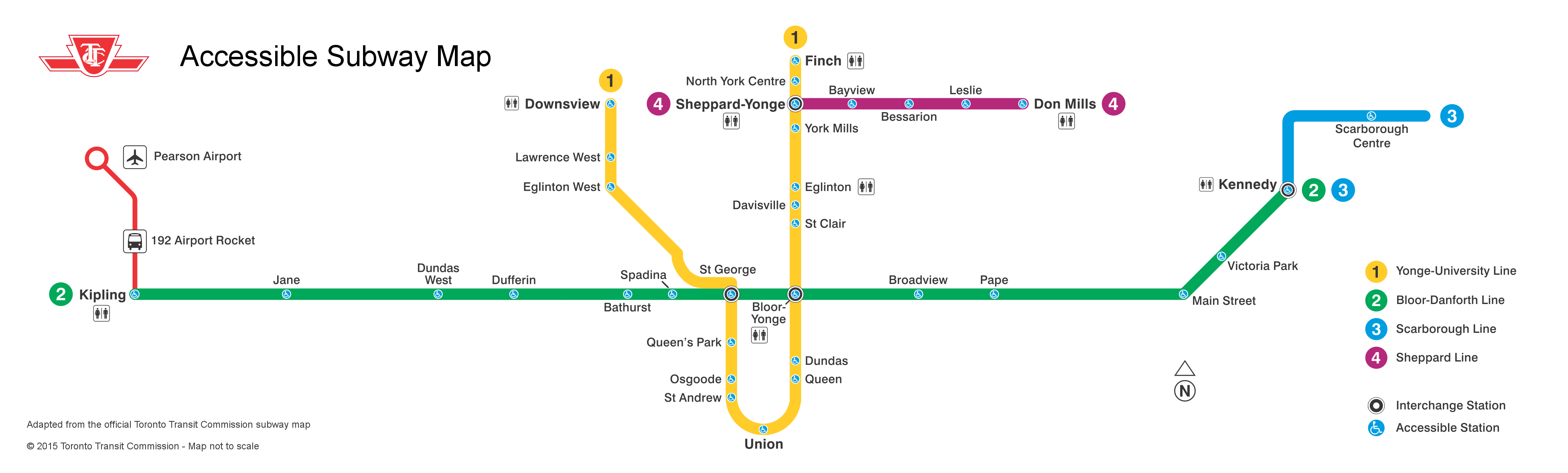
    Despite these changes, I feel the new map edition is still two steps forward, two steps back. For one thing, there are too many details removed. Compare it to the 2005 subway map [PDF, archived at Transit Toronto]. The 2005 map includes the station’s address (which is quite useful on Yonge, Bloor, and Danforth if looking for the closest station to a specific address), whether a paper transfer is required to connect with surface transit routes, and the locations of commuter parking lots. On the 2005 map, the international symbol of access (the blue wheelchair icon) indicates which stations in the system are fully accessible. In 2005, 22 1/2 of 69 subway and RT stations were accessible. (The 1/2 refers to Spadina Station, where the University-Spadina Line platforms are not accessible to persons using wheeled mobility devices, but the platforms for the Bloor-Danforth Subway Line 2, buses, and now, streetcars, are.)

    Ten years later, in 2015, 11 additional stations were fitted with elevators, bringing the total up to 33 1/2, nearly half of the TTC’s 69 stations. The 2015 map still includes the ISA icons, but they are now smaller, located within the white dots indicating the location of each station. In the photo below (taken with an iPhone), Scarborough Centre, Kennedy, Victoria Park, and Main Street, all accessible stations, are nearly indistinguishable from other, nearby stations that are not. The ISA icons are practically illegible from any distance or to anyone with impaired vision. This is the greatest failure of the new subway map; I believe that the TTC should re-issue these subway route maps for this reason alone.

    IMG_7645[1]

    The new subway maps available on the internet and on the Ride Guide paper system map have white backgrounds (perhaps to save printer toner if one wishes to print the PDF?), but it the same flaws as the version used in the subway trains.

    Subway_Map_2015
    Click image for full-resolution version on the TTC’s website

    The new, over-simplified subway route map reminds me of complaints that I had about the new TTC system map, released in mid-2014. The old system map was too large and cluttered (see the 2013 version archived at Transit-Toronto [PDF]) and was in need of a re-fresh. In the new map, the street grid is removed; as are bus routes operated by adjoining systems, such as GO Transit, Miway and York Region Transit. Landmarks are removed as well, but the addition of thick lines representing frequent-service surface routes was a nice addition. Green lines indicating express bus routes was also a great feature, though I don’t understand why frequent express routes, like the 196 York University Rocket, weren’t represented by thick lines either.

    Hopefully the TTC will re-think and revise both maps in the very new feature.