Tag: TTC

  • Open the streetcar doors, TTC

    27244906632_25f4d58e90_o
    4401: A Space Odyssey

    As part of Doors Open Toronto, the Toronto Transit Commission opened up the Leslie Barns for public tours. The new streetcar facility was built to house and maintain the new fleet of Bombardier-built low-floor streetcars. Of course, the streetcar delivery schedule has been disrupted by Bombardier’s incompetence; while there are only eighteen new streetcars currently in revenue service, there should have been 70 in service by the end of last month. Now the Bombardier problems have affected the Region of Waterloo’s light rail project, ION, which was to open in late 2017.

    27309171006_5c7cb17a50_oView from the yard at Leslie Barns west toward the Toronto skyline

    In any case, the TTC always puts on a great public event. Visitors to Leslie Barns were welcomed to tour the vintage streetcars — a 1923 Peter Witt, and a 1951 PCC streetcar. A new streetcar gave visitors a tour through the barns and around the (mostly empty) yard. Employees held a charity barbecue, there were giveaways for children and lots of friendly staff eager to answer questions. These public open houses are where you’ll find the TTC at its very best.

    You could tell that some of the organizers had some fun. The CLRV on display (pictured below) was signed for Old Weston Road, a short turn point on the 512 St. Clair carline. Townsley Loop, once the terminus for Dovercourt and later Harbord Cars, was closed to streetcars in 2003 and the tracks removed during the St. Clair Avenue streetcar right-of-way construction. Streetcar 4401, parked in the paint shop was just asking for the title I gave it, an homage to the visuals in that great Stanley Kubrick film.

    IMG_7410Yeah, operating a streetcar was a childhood dream for a while. Note the rollsign.

    Also on Sunday (and every Sunday, from noon until 5PM until Labour Day Weekend), you can ride a PCC streetcar in active service along Queen’s Quay between Union Station and Fleet Loop, and rides are free. We did this yesterday between visiting several downtown Doors Open sites, before exploring Fort York. The two PCC streetcars retained by the TTC (the rest were sold to museums or sent to Kenosha, Wisconsin) were restored to their 1951 appearance and are used for special events, charters, and summer Sunday service on the Harbourfront.

    The TTC is often maligned, often unfairly, for poor customer service, service disruptions, and delays. But I think events like Doors Open and free rides on vintage streetcars are a great way for the public to feel good about our transit system.

    IMG_2138Streetcar 4500 on Queen’s Quay

    IMG_2142Interior, PCC streetcar

    PCC Streetcar 4500 at Fleet Loop
    Streetcar 4500 at Fleet Loop, passing the 1861 Queen’s Wharf Lighthouse

  • The TTC’s disappearing parking lots: why this isn’t a bad thing

    IMG_6376New office development at the TTC York Mills Station parking lot

    I’ve written several times on my blog about GO Transit’s problems with free parking. The Toronto Transit Commission (TTC) also operates many parking lots — 11,000 parking spots located at 13 of its 69 subway and RT stations — but has declared many of its lots surplus to its needs. Right now, the City of Toronto’s real estate arm, Build Toronto, is in the process of selling or leasing TTC lots for residential and commercial redevelopment. The TTC, unlike GO Transit, charges for parking at all lots, and it isn’t in a hurry to build more. For the TTC, redeveloping parking lots raise money (which, in the TTC’s case, goes to the city) while they generate additional ridership.

    There’s a difference between TTC subway stations and GO Transit stations, to be sure. The TTC relies mostly on buses and streetcars, as well as walk-up traffic, to feed its rail system, while GO Transit relies mostly on suburban commuters driving to its stations. They are different models. But in urban areas like Downtown Brampton, I believe GO Transit should be much more innovative than deciding to rip down a city block to build yet another “free” surface parking lot.

    GO Transit should rethink their model, encouraging more walk-up and local transit connections as it transforms into a regional rail system. Redeveloping some of its lots is a good way to go; commuter parking garages can easily be integrated into new urban uses and make their stations more attractive places to walk and cycle.

    I have more to say about the TTC’s parking lot crunch over at Torontoist.

  • The many challenges of creating a transit hub at Pearson Airport

    7afe7e75-d368-4472-b208-ab02c57457aa-001
    Sign in Terminal 1 at Pearson Airport. Whether we realize it or not, Pearson Airport is already a transit hub. 

    Updated April 7, 2016

    Lester B. Pearson International Airport is Canada’s busiest airport, handling 41 million passengers a year. It is not the busiest transportation hub in the Greater Toronto Area, though; Union Station is considerably busier (GO Transit alone handles 64.4 million passengers a year at Canada’s busiest station).

    Pearson Airport is located almost entirely within the City of Mississauga, but the terminals are less than a kilometre away fromthe City of Toronto’s western boundary; due to the location of the airport terminals, most passengers reaching the airport by road, or transit pass through the City of Toronto to get to it.

    The Greater Toronto Airports Authority (GTAA), the not-for-profit agency that operates Canada’s busiest airport, has expressed interest in creating a transit hub and guiding transit-oriented development around it. It’s an interesting idea, and some of the facts are compelling.

    There are approximately 300,000 jobs located at and near Pearson Airport. The airport itself hosts 40,000 employees that work for the airport authority and its contractors and tenants, including retailers, airlines, and allied services. The remaining 250,000 jobs are located in office parks and industrial areas that surround the airport, in the cities of Toronto, Mississauga, and Brampton, a very large area that extends north into Bramalea, west of Hurontario Street and south to Highway 403.

    You can read the GTAA’s report, written by the prestigious planning firm Urban Strategies Inc., and named Pearson Connects: A Multi-Modal Platform for Prosperity online as a PDF. The report claims that Pearson Airport and environs has more jobs, and more economic clout than any Canadian downtown, with the exception of Downtown Toronto. To a degree, this is true. But the size of the Airport Employment Zone, as the GTAA defines it, is much larger in size than any downtown, even Toronto’s; the jobs are mostly dispersed in warehouses, factories, and suburban office buildings difficult to reach by transit.

    In fact, Pearson Airport and its surrounding area — all 25,600 hectares  (256 square kilometres) — has fewer than 25 employees per hectare, while Downtown Toronto, one-tenth the size, has nearly 200 employees per hectare (and a growing residential population as well). Igor Dragovic calculated these figures from a recent Neptis report. The low employment densities found in business parks and warehouse districts are only partly to blame; the airport itself, with five active runways and a large land buffer, contributes to this.


    The GTAA wants to build an “airport-related multi-modal hub” that would tie together existing and planned rapid transit services, including the Kitchener RER Service, LRTs on Eglinton and Finch Avenues, the Mississauga Transitway BRT and a proposed Derry Road transit corridor.  It cites airports in Amsterdam, Frankfurt, London, and Hong Kong as examples to emulate.

    GTAA ProposedThe GTAA’s proposal for a transit hub, taken from Page 7 of the report

    The report also neglects to recognize that Pearson Airport is already a major transit hub; the problems lie in integrating the existing and proposed transit services together. And for an area the size of the GTAA’s Airport Employment Zone, that’s a very tall order.

    (more…)

  • On transit ridership in the GTHA

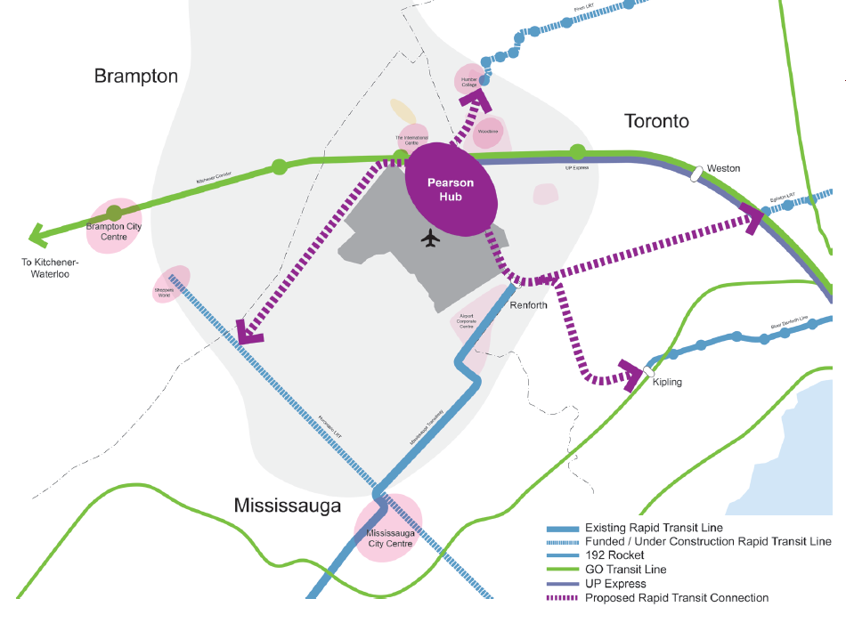
    Earlier this week, the Toronto Transit Commission (TTC) released its agenda for the next board meeting, to be held on March 23. Among the items to be discussed are updates on the delayed Line 1 subway extension to York University and Vaughan, plans for the Line 2 subway extension to Scarborough Centre, the new MiWay/GO Transit terminal at Kipling Station, the planned new 514 Cherry streetcar line and other Waterfront bus improvements, and a ridership update.

    As always, Steve Munro is on top of it all, and I encourage you to read his post.

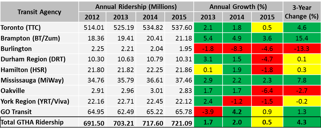
    I wanted to make a few observations about ridership, especially in Toronto’s suburbs. Growth in the TTC’s ridership has slowed down in the last three years, from a 2.1% annual increase in 2013, to a much more modest 0.5% increase in 2015.

    Ridership figures are not detailed enough to know at what times of the day ridership is changing, nor on what routes. But ridership growth has fallen (or even declined) for other major Canadian transit systems, including Vancouver, Montreal, and Ottawa. There are many causes for changes to ridership — population and employment growth or decline, fare increases, service improvements or cuts, even the cost of gas, which has been declining in the last two years. Much of the employment growth within the City of Toronto has been in the downtown core, but so has the population growth due to new residential highrises. (I’m one of thousands who live and work in or near the downtown core — my TTC use is now mostly during the evenings and weekends as I mostly walk to work).

    Hopefully, the Commission and the city don’t use this short-term trend as  an excuse to hold back on needed service improvements or projects such as the Relief Line — for one thing, many buses, streetcars and subway trains are already overcapacity, and it is impossible to know whether slower ridership increases represent a long-term trend, or a short-term blip.

    There was one table in the TTC ridership update that caught my attention. The table, on page 5, shows the ridership for every Greater Toronto and Hamilton Area transit system (though excluding Milton Transit). I reproduced that table below.

    Ridership

    GTHA transit agency annual growth rates, 2013 to 2015. Adapted from TTC 2016 Ridership Update, page 5.

    While the TTC’s ridership growth has slowed, ridership in many suburban municipalities have either flatlined or declined. Only Mississauga and Brampton show consistent, positive growth over the last three years. MiWay, previously known as Mississauga Transit, hasn’t expanded transit operations that much in the last few years, but that city continues to enjoy modest employment growth and improved connections to the airport, Brampton Transit and the TTC. It is currently building a new bus rapid transit (BRT) line, the Mississauga Transitway (more on that in a later post), and city council is backing the Hurontario LRT line, which would largely replace bus service on its busiest corridor.

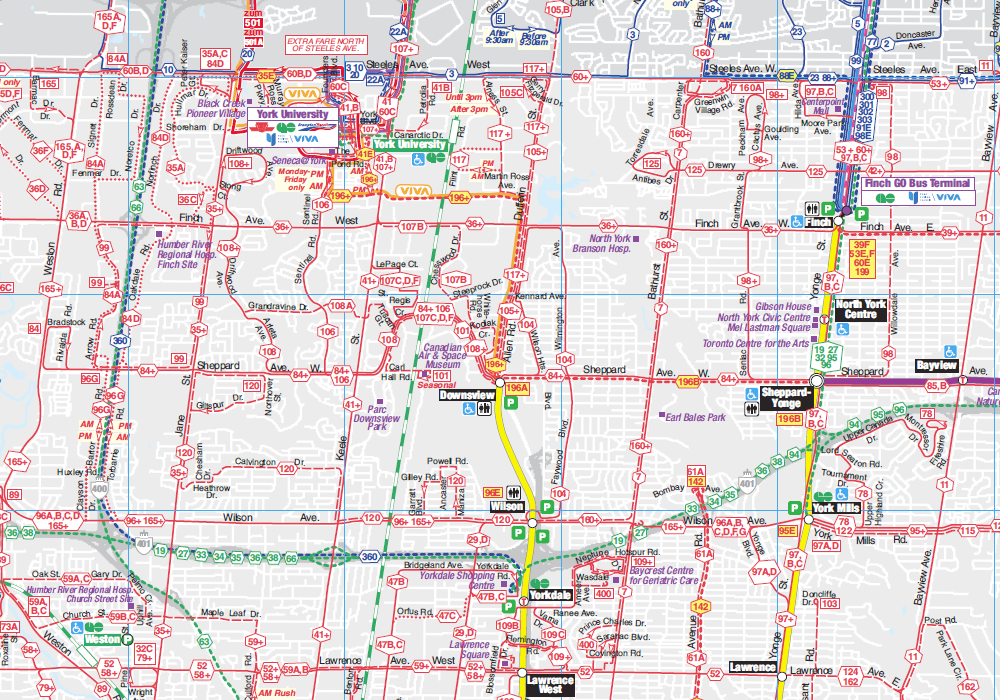
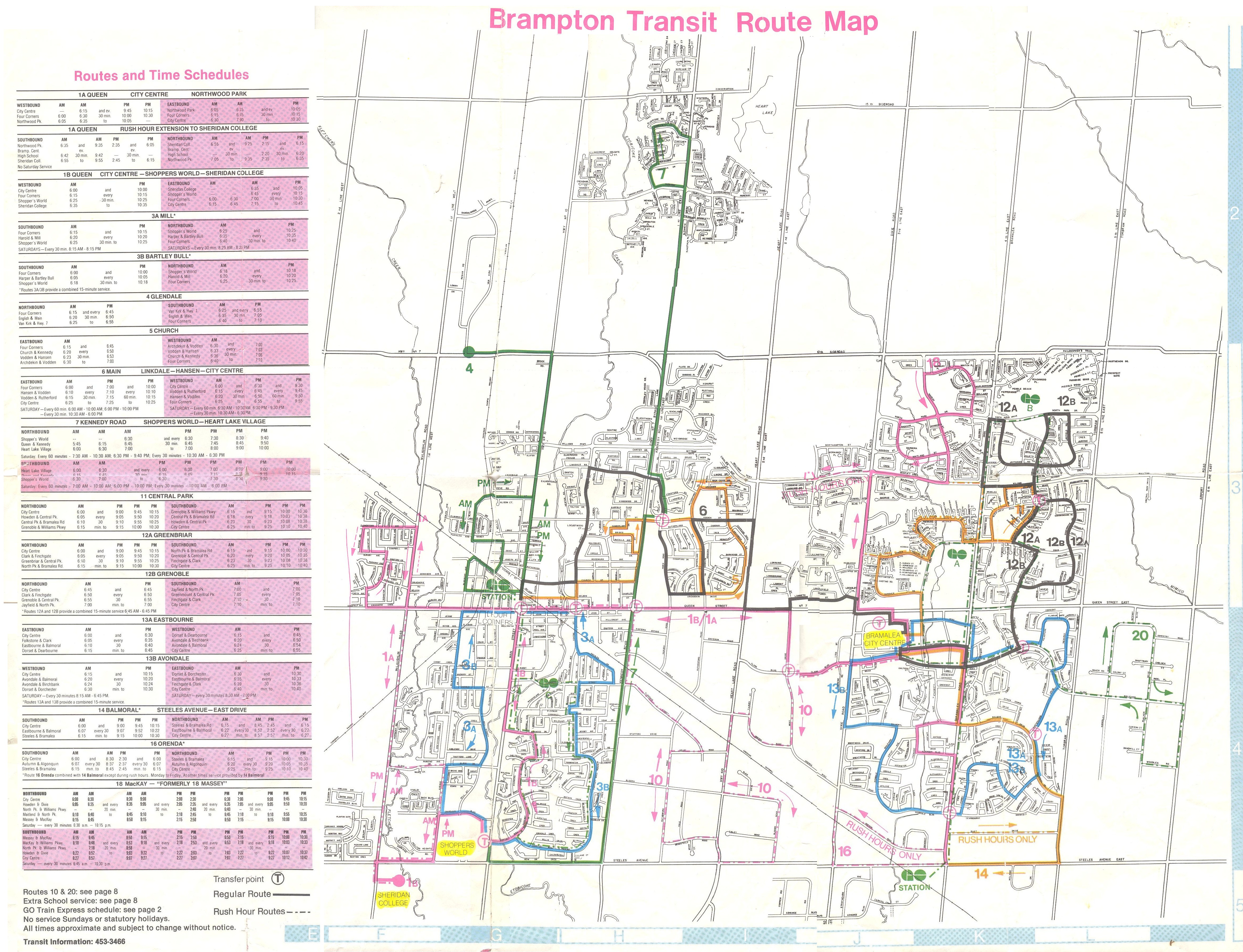
    Brampton’s growth has been, by far, the most impressive. That suburban municipality is growing thanks mostly due to new sprawling subdivisions, but since in the last decade, Brampton Transit has been introducing annual system improvements, including the Zum “BRT-lite” network of limited-stop bus routes. Brampton’s ridership is now almost that of the Hamilton Street Railway (HSR). Unlike Hamilton, Brampton doesn’t have two major post-secondary educational institutions, nor a dense urban core, though it serves Humber College, York University, and two secondary Sheridan College campuses in Brampton and Misssissauga.

    In Hamilton, ridership dropped by 1.8% in 2015. Most ridership in Hamilton is concentrated in the lower city, as well as a few trip generators in the suburbs, including Mohawk Collage on the Mountain, and Lime Ridge Mall. Many parts of the lower city have been hit hard by job losses in that city’s major industries, though new subdivisions (and, to a lesser extent, downtown gentrificaton) have contributed to modest population growth. Hamilton is going ahead with a provincially-funded east-west light rail line that will connect McMaster University, Downtown Hamilton, and the east end.

    Elsewhere, transit ridership growth has been quite disappointing. Burlington Transit saw a drastic 13.3% decline over the last three years, Durham Region, which I recently visited, saw a major decrease in 2015. However, there is lots of promise in its five-year service strategies, which will improve and simplify the agency’s route structure and provide enhanced service.

    2015 Ridership
    2015 ridership for GTHA transit agencies (Milton excluded). The TTC, with narly 75% of the region’s ridership total, dominates. GO Transit holds another 9%. 

    York Region Transit, serving a population of 1.2 million, has only 1 million annual riders more than Brampton, whose population is nearly half of York’s. And despite adding new subdivisions (and a few new residential towers), ridership declined in the last two years. As illustrated in the table below, YRT’s ridership per capita is less than half of Hamilton’s or Mississauga’s.

    YRT Ridership StatsComparing York Region Transit to other Canadian transit systems, 2013. From the VRT/Viva 5 year service plan, page 7. 

    It’s interesting that despite poor transit ridership (amid York Region Council-mandated service cuts and steep fare hikes) York Region, with senior government assistance, is spending $1.4 billion on dedicated median busways on Highway 7, Yonge Street and Davis Drive. York Region will get the Spadina subway extension in 2017, and it pines for an extension of the over-burdened Yonge Subway to Richmond Hill Centre.

    In York Region, there’s a troubling disconnect between spending money on capital projects and funding the services that will use the shiny new infrastructure, or feed ridership to it. Brampton has proven that growing service, not necessarily fancy infrastructure, will grow ridership. That said, it remains disappointing that the suburban municipality with the best record for ridership growth in the Toronto region rejected a funded light rail transit line to its downtown core.

  • Tunnel Vision: A History of Toronto’s Subway

    IMG_0209-001

    If you haven’t yet had a chance to go, you should be sure to visit the Market Gallery at St. Lawrence Market. The current exhibition, called Tunnel Vision: The Story of Toronto’s Subway, is a fascinating collection of maps, photographs, memorabilia, and drawings illustrating over a century of subway plans and operations in Toronto. Dominating the gallery, which was the City of Toronto Council Chambers in the 19th century, is the front of an H-4 subway car; visitors are encouraged to take selfies with it.

    While Canada’s first subway opened in 1954, there were serious subway proposals that date back to 1910. Interestingly, many of these early subway maps feature a line that looks very similar to the (Downtown) Relief Line.

    I wrote more about this exhibition, which continues until June 11, 2016, in Torontoist

  • The upshot of the new, lower UP Express fares

    24281427544_ddb67d604d_k

    Earlier this month, I commented on the poor ridership numbers of UP Express, Metrolinx’s airport rail link between Toronto’s Pearson International Airport and Union Station. I suggested that despite the embarrassing ridership figures, UP Express (UPX) was no white elephant. I argued that instead, the rail service could be a useful transit link for residents of North Etobicoke, Weston, Mount Dennis, and West Toronto.

    Later today, Metrolinx’s Board of Directors is expected to approve a major fare reduction for UPX slashing fares by over 50 percent. The Globe and Mail broke the story yesterday; today the Toronto Star has more details.

    The one-way cash fare between Union Station and Pearson Airport will drop from $27.50 to $12.00; the fare charged to Presto cards will drop from $19.00 to $9.00. Fares between Union Station, Bloor and Weston will drop to the equivalent GO fares. (The 2016 GO Transit fare from Bloor to Union Station is $5.30, or $4.71 with Presto; from Weston, it is $5.65, or $5.02 with Presto).

    The UPX fare between Union Station and Pearson will still be priced at a premium compared to the equivalent GO Transit fare — the cash fare from Union to Malton Station is $7.70, or $6.84 with a Presto card.

    Interestingly, before UPX was launched, Metrolinx conducted studies on potential ridership and fares. One study, by Steer Davies Gleave, that some UPX trains might even at capacity by August. You can read Metrolinx’s market research and ridership studies (with some details redacted) here. Obviously, there weren’t enough well-heeled business travellers willing to ride UPX for $27 each, or even enough local residents willing to pay $19 with their Presto card.

    This change in pricing makes UPX much more attractive for commuters in the Junction/Junction Triangle neighbourhood, as well as those living in Weston. The lower fares should help increase ridership between Pearson Airport and Union Station as well. It’s a good start, but it isn’t enough.

    Last year, I commented on GO Transit’s “fare by distance” structure, which charges disproportionately high fares for short distances, and very inexpensive fares for long commutes.  While GO offers co-fares to suburban transit agencies, it offers no such fare integration with the TTC. GO Transit offers free parking at suburban rail stations, burying the cost of building and maintaining its parking lots into the fares of every passenger, whether they need parking or not.

    The charts below show the single ride and Presto fares, per distance travelled in 2016, with the new UPX fares. Per distance travelled, a GO Transit fare to Union Station to Exhibition, Bloor, and Danforth is more expensive than going from Toronto to Pearson Airport via UP Express.
    2016CashFares 2016PrestoFares

    Metrolinx is in the midst of developing a new fare integration strategy, so hopefully these concerns will be addressed. Once the TTC completely rolls out Presto at all subway stations and on all buses, it will be technically simple to adopt a GO-TTC co-fare, and UPX should be part of this as well. There are tens of thousands of jobs at the airport and in the surrounding offices and industrial parks. With proper fare integration with TTC, Miway and Brampton Transit (all of which serve Terminal 1), UPX could become much more useful to many more commuters.

    Lowering UP Express fares is a good start, a welcome acknowledgement that the rosy forecasts of business travellers crowding the airport trains were never reached. But lowering fares isn’t enough: with proper fare integration, UP Express can offer far more utility than simply being an airport rail link.

  • A new, improved TTC system map

    Last week, the Toronto Transit Commission quietly introduced a new system map on its website. The map, a 3.8 MB PDF file, can be directly accessed here.

    This new system map, which includes all scheduled routes including the limited-service community buses and the Blue Night network, is very different than previous editions of the TTC’s “Ride Guide,” but I think it is the best edition yet. That said, there are a few tweaks that I would like to see.

    Below is a screenshot of the new 2016 map, showing York University, Downsview Station, and North York Centre.

    TTCJan2016

    Unlike previous editions, the new Ride Guide is not to scale; subtle curves and bends in the road network are dispensed with in favour of a diagrammatic style, which shows transfer points very well. (It reminds me of the Los Angeles Metro system map.) Like the 2012 edition, shown below, only the streets served by surface routes are illustrated, but landmarks (such as hospitals, post-secondary education institutions, and major parks) are given more prominence than in previous maps. GO Transit rail lines are more prominent (with the same colours used on GO Transit maps and schedules), and there’s an effort to show connections with other transit systems, such as GO buses, and suburban agencies such as York Region Transit, Miway, and Brampton Transit.

    TTCAug2014
    Screenshot of the 2014-2015 edition of the TTC Ride Guide, showing the same area as the 2016 map.

    From 1994 to 2012, the TTC’s official system map included the routes of adjoining transit systems (see screenshot below). Note the YRT, GO Transit and Brampton Transit Züm routes converging on a very crowded York University. Depicting the connecting networks was certainly useful, but it added to a very cluttered map (which included the entire street network); it also relied on every other agency to provide timely updates. Removing the other transit agencies’ bus routes in 2014 allowed the TTC design team and cartographers to concentrate on their own system.

    In 2014, the system map was stripped of almost all features apart from the TTC’s own routes, a decision I criticized in a previous post. All landmarks were removed, as were all connections, apart from faint lines showing GO Transit rail corridors. It was easier to read, but went too far in removing important and use information. But it had a few improvements, such as highlighting the “frequent service network” – surface routes that operated every ten minutes or better at most times of the day. Express bus routes were better depicted.

    The 2016 edition restores these features lost in 2014. In a few places, the logos of the suburban transit agencies are once again shown, such as York University (where Brampton Transit, GO Transit and York Region Transit connect) and Pearson Airport (where Brampton, Miway and GO also operate). The contact information for the five neighboring systems is also included on the map. The addition of the frequent service category remains.

    TTCNov2012November 2012 Ride Guide

    Overall, I think the new map looks great. Surface routes are clearer, GO Transit rail lines are more prominent, and more points of interest are shown. Not only does downtown Toronto get a new inset, so does a complex section in north Scarborough, where the 102 Markham Road, the 53 Steeles East, and the 42A Cummer routes converge. The TTC design team has done a fine job.

    But I did find a few things about the new 2016 edition that I would like to see improved:

    • Hospitals are labelled inconsistently. Humber River, Sunnybrook, and Scarborough Centenary are, but North York General, Etobicoke General, Scarborough General, St. Joseph’s, East Toronto General, and the downtown hospitals are not.
    • Some suburban connections are shown, most are not. Pearson Airport shows GO, Brampton, and Miway logos, and York U shows GO, Zum, and YRT logos, but they are missing from Humber College, a major terminal for Brampton Transit (511, 11, 50) and Miway (22, 107), it’s a terminus for a YRT route as well. Rouge Hill GO shows a DRT logo, even though this is a very limited service, but there isn’t one for Miway at Long Branch, where two major routes, 5 and 23, terminate.
    • I’m not sure I like how branches are labeled now; I miss the use of the “+” that denoted a section of a route on which all branches operated on.

    Hopefully, we will see these relatively minor issues corrected in the next edition of the Ride Guide, which will likely be issued later in 2016.


    If you’re interested in the history of TTC maps, Transit Toronto has a fine archive of old system and subway maps dating back to the 1930s. It’s worth a look.

  • The challenge of getting to the bus stop

    IMG_8796-001

    It’s time for a rant on suburban transit, and how unnecessarily difficult it can be to get to the nearest bus stop.

    Transit has a harder time in the suburbs. Population densities are lower than in neighbourhoods developed before the Second World War. Suburbs are not only built for the car, but they’re laid out with crescents, cul-de-sacs and winding street systems meant to discourage through traffic in residential areas. Backyard fences line arterial roads, safe pedestrian crossings might be a ten or fifteen minute walk down the road. These factors can make it difficult for people living in subdivisions and near busy streets to easily access a nearby bus stop.

    Last year, Streetsblog USA asked its readers to vote for the sorriest bus stop in America, and some of the submissions are truly awful. But in the Greater Toronto Area, there are many examples of poorly designed or located bus stops. Intersections like the one at Steeles Avenue West and McMurchy/Malta Avenue in Brampton, which, granted isn’t as bad as the StreetsblogUSA submissions, is just one example of how not to get people out of cars and onto public transit. Some thought into placing bus stops and improving access to local transit is necessary.

    I like Brampton Transit and what they’ve been doing over the last decade in my hometown. In 2005, the suburban transit agency began to re-organize its routes into a grid system. There were some hiccups: additional transfers, combined with low frequencies made some trips more difficult, but as ridership improved, so did service levels on key corridors. Schedules were adjusted to improve transfers. Connections to Toronto and Mississauga were improved. My hometown’s bus system was no longer a joke.

    Brampton Transit - December 1980 front

    Here’s what Brampton Transit looked like in 1980, marked with meandering routes and one-way loops. The 2015-2016 system map is here [PDF]. 

    In September 2010, Brampton Transit introduced its first “Züm” route, 501 Queen, which connects Downtown Brampton with York University. Like the first phase of York Reigon’s Viva and Durham Region’s Pulse, Züm was developed as a specially-branded limited-stop bus service. Züm stops have special shelters, with real-time schedule information, winter heating. And on sections of Queen Street and Steeles Avenue, special “queue jump” lanes allow buses to by-pass cars and trucks waiting at intersections.

    Services such as Zum and Viva, which operate mostly in mixed traffic should not be mistaken for “bus rapid transit” such as Ottawa’s Transitway or Bogota’s TransMillenio; “BRT-lite” or “quality bus” are more appropriate terms for these routes. Route 501 Queen operates every 15 minutes or better, seven days a week, into the late evenings. It’s proof that quality transit can be operated in Toronto’s suburbs, and be a success.

    Since Route 501 was introduced, three more Züm routes were added: 502 Main, which follows Main and Hurontario Streets as far as the Mississauga City Centre Terminal at Square One, 511 Steeles, and 505 Bovaird. Each of these routes complements an existing local bus route, though the level of service on these other routes are not as high as on Queen Street; Züm service ends sooner in the evenings (though local bus service operates until after midnight) and frequencies are lower.

    With the introduction of Züm, and combined with other service increases, Brampton Transit ridership increased by nearly 30 percent in the last five years (2011-2015). This increase is significantly higher than the rate of Brampton’s population growth over the same time period.

    In September 2015, the 511 Steeles Züm bus was extended west from Shoppers World to Lisgar GO Station in Mississauga; standard Zum shelters were installed along the corridor, including the intersection of McMurchy/Malta Avenues and Steeles. This intersection is only a few hundred metres from where I grew up. The existing bus stops for local bus routes were relocated to the new shelters, like the one seen below.

    IMG_8800-001

    Both bus stops were installed on the east side of the intersection. The trouble is that pedestrian crossings are prohibited on the east side, due to the priority given to motorists at this suburban intersection. Therefore, transit users may have to cross the intersection three times to get to and from their bus; with several rental apartment towers, townhouses, and compact single-family housing, this is not a low-density neighbourhood.

    IMG_8797-001

    From a traffic engineering rationale, this traffic arrangement, which has existed for about a decade, makes sense. The majority of traffic is on busy, six-lane Steeles Avenue. From the north, most traffic on McMurchy Avenue turns east (left) onto Steeles, while Malta Avenue is a short stub, serving a small townhouse development on the south side of Steeles Avenue. Eventually, Malta Avenue will continue south, hooking up with another section of the same street. For now, a dormant farm field separates the two streets and awaits development.

    To facilitate through traffic on Steeles, the cross streets, McMurchy and Malta, are given only green time equivalent to the minimum pedestrian crossing time. And to facilitate the left turns from McMurchy to Steeles, pedestrians are banned from crossing that side of the street. From the viewpoint of a traffic engineer, this makes sense, but it’s a mindset that ignores the needs of pedestrians and transit customers, and with the re-location of the bus stops, this has become more of a problem. This intersection is owned and maintained by the Region of Peel, not the City of Brampton, as Steeles is a regional road.

    There are two options here, and at other places where people must give way to cars:

    1. Allow pedestrians to cross at all four sides of the intersection, ignoring, for a minute, the desire for cars and trucks to move through with minimal disruption; or
    2. Move the bus stops to the west side of the intersection, minimizing the inconvenience for transit riders.

    Brampton Transit has done a fine job growing its ridership over the last decade, making it a bit easier to get around Toronto’s second-largest suburb without a car. But situations like these, where pedestrian access can be improved, are low-hanging fruit that would demonstrate that transit users are valued, even in the car-dependent suburbs. The current arrangement is unacceptable. Brampton and Peel Region should do better.

    There are plenty of cases elsewhere where there are poorly-located transit stops. One example here in Toronto is the eastbound stop for the TTC’s 42A Cummer bus at McNicoll Avenue at Boxdene Avenue in north Scarborough. There’s no sidewalk on the south side of McNicoll, and Boxdene runs north. Anyone attempting to use this stop is at the mercy of traffic on this busy, four lane road.

    Overall, I would like to see more thought put into locating bus stops in general and making sure they’re easily accessible.

  • A vision for King Street

    21207239313_0c5746b3f8_o

    In today’s Toronto Star, city columnist Ed Keenan reports on the “King Street Visioning Study,” a city planning project that will soon be available for public feedback. The study proposes improving streetcar operations along the King Street Corridor between Dufferin and Parliament Streets as well improving the public realm, making it a more pleasant place to walk. The 504 King Streetcar is the busiest surface route in the TTC’s system, and as I, and many others, have said before, the streetcar needs to be able to move more people more efficiently. But now City Planning is leading the study, not the TTC, making this a more holistic vision for King Street.

    Chief City Planner Jennifer Keesmaat says that it’s “reasonable” that the initial pilot projects could be started in early 2017. Work has already been contracted to some of the same firms that were responsible for transforming Queen’s Quay (which despite some construction delays, and conflicts in a few places between pedestrians, cyclists, and motorists, is a fantastic project).

    Keesmaat echoes previous attempts at creating a King Street Transit Mall, suggesting a similar system of alternating one-way sections that would provide for taxis, deliveries and passenger drop-offs and pick-ups, but forcing through traffic onto parallel streets. Extending transit priority all the way from Dufferin to Parliament could do a lot to streetcar improve operations, especially as the TTC is planning a new 514 route on King between Dufferin and Cherry Streets to supplement the overburdened 504 line and better serve the West Donlands, Distillery District, and Liberty Village.

    Yes, King Street improvements would start off as pilot projects, much like the bicycle lanes on nearby Richmond and Adelaide Streets, or the decade-old 2-hour transfer on St. Clair Avenue, or the Toronto Hydro ALAMP street lighting trials that should have concluded years ago. (Toronto seems to like permanent pilot projects.) That said, previous plans for a King Street transit mall never even got to the “pilot project” phase.

    But hearing that pedestrians and transit will be getting priority is music to my ears. Knowing that City Planning, and not just the TTC, is looking at this gives me optimism that this could finally go ahead. There will be opposition from businesses along the corridor, taxi drivers, suburban politicians concerned about a non-existent “war on the car.” And it’s not clear if Mayor John Tory is in favour, or a majority of city councillors.

    An improved public realm is especially appropriate on King Street, especially through historic Old York on the east and the cultural and tourist draws of the Entertainment District on the west. Sidewalks are often crowded, especially as the theatres get out in the evening, but with such diverse uses along the corridor, from bank towers to night clubs, King is one of Toronto’s most vibrant streets. Toronto often has trouble with attractive streetscaping (thanks to ugly wooden poles and overhead wires, cheap, grey street furniture, and ugly traffic signals), but it has recently managed to get Queen’s Quay (mostly) right.

    As for design, I’m hoping for something interesting and something different. I’d do away with the Muskoka chairs mentioned in Keenan’s article. They’re wonderful on Toronto’s waterfront, but I’d like to see some imagination on King Street. What about seating shaped like director’s chairs in front of the TIFF Lightbox? (Oh, and on the subject of TIFF, could we tell film festival organizers to stuff it when they want to wreck the King Streetcar again in 2016?)

    After years of talk about fixing King Street, there’s a very serious proposal to do something about it. Maybe the third time’s the charm.

  • A smarter SmartTrack

    ST - Before 2016
    John Tory’s original SmartTrack plan, shown with the existing TTC Subway and GO Rail networks. 

    In Friday’s Globe and Mail, we were treated to a scoop by Oliver Moore, that newspaper’s excellent transportation reporter, on behind-the-scenes revisions to Mayor John Tory’s SmartTrack rail transit platform, a topic that I discussed several times in this blog.

    Tory’s SmartTrack plan, dreamed up by a private-sector planning firm, was intended to connect office parks in Mississauga and Markham to Downtown Toronto, as well as serve the proposed First Gulf development at the Unilever site near the mouth of the Don River. Tory promised that it would provide relief to Toronto’s overburdened subway system, but that was never the main objective.

    I have been aware of rumours that Tory’s SmartTrack plan was going to be walked back due to mounting costs and technical issues of implementing the mayor’s campaign promise. The team that came up with the idea of a U-shaped rail network intended to connect several suburban employment centres with Downtown Toronto overlooked some important details, such as the availability of land along the former Richview Expressway corridor along Eglinton Avenue West. SRRA, the private-sector planning organization that came up with SmartTrack, assumed that the Richview lands were available and owned by the province, but the city owned the land, and sold much of it off for development in 2011 and 2012.

    The cost of building the western spur between Mount Dennis and the Airport Corporate Centre was, in all likelihood, found to be prohibitive, though we have yet to find out what the estimated costs for a tunnel along that section. The eastern section, north of Kennedy Station, would have closely paralleled both the Scarborough RT and the proposed extension of the Bloor-Danforth Subway to McCowan Road, a project that Tory also backed.

    The Globe and Mail’s Oliver Moore reports that SmartTrack will cover a much shorter section than the map on John Tory’s 2014 campaign brochures. Frequent rail service will complement existing GO Transit Regional Express Rail (RER) services on the Kitchener and Stouffville Corridors, terminating at Mount Dennis and Kennedy Stations. The Eglinton West section will be covered by the “shovel-ready” Phase II of the Eglinton-Crosstown light rail transit line (ECLRT), which is already under construction east of Mount Dennis. (The provincial government deferred funding for this section of the ECLRT in 2010 for budgetary reasons.) The north-eastern section of SmartTrack, between Kennedy Station and Unionville Station in Markham, will be deferred.

    This new plan, which is being finalized and will likely be officially announced later this year, will cost an additional $2-billion to $3.5-billion to the existing plans for RER, in order to facilitate more frequent, subway-like frequencies, as well as complete the western section of the ECLRT.

    If Moore’s reporting is accurate (and I have seen maps and other materials that collaborate his report), then Tory will have to eat some crow. Spin doctors will have to figure out how to polish this turd as Tory seeks a second mandate in 2018. It’s also inevitable that the new additional service on this corridor will continue to be branded as “SmartTrack.” But this is the best solution, and maybe this is a sign that Tory is learning on the job.

    At the end of the day, what Toronto gets is what Metrolinx’s “Big Move” plan envisioned: upgrades of most GO Transit corridors to RER, as well as Phase II of the Eglinton-Crosstown LRT line to Pearson Airport. (The Finch West and Sheppard East LRTs are also approved, but have yet to start construction.) The paired-down SmartTrack plan, if trains are frequent enough, and with attractive transfers with the subway and TTC surface routes, will draw some riders. It could help provide medium-term relief as the [Downtown] Relief Line Subway is studied and built.

    New SmartTrack PlanThe new SmartTrack plan, including Phase II of the Eglinton-Crosstown LRT

    But where I find myself annoyed is when I realize that we wasted over a year on Tory’s campaign slogan without any progress on the Relief Line (which will offer real, long-term relief to the Yonge Subway), the Waterfront West LRT, or other transit priorities such as accessibility at all existing subway stations. I remember during the 2014 election campaign, critics of Tory’s simplistic and flawed SmartTrack plan were dismissed without acknowledging their objections. It’s also worth noting that Tory also adopted rival Olivia Chow’s bus plan, after belittling it during the campaign.

    In order to provide fast and reliable transit to the Airport Corporate Centre and Pearson Airport itself, there are opportunities to refine the western section of the Eglinton-Crosstown LRT. The environmental assessment called for 15 stops between Mount Dennis and Pearson Airport, while SmartTrack would have had as few as three stops along the same section. If the ECLRT can be sped up at all, it would be worth considering. I would also be interested in whether the SmartTrack corridor could be integrated with the UP Express rail link, whose ridership started off quite low.

    And maybe, just maybe, the high costs of constructing the Scarborough Subway extension will also prompt a rethink, going back to the original LRT replacement and extension plan. As the Spadina Subway extension to York University and Vaughan is now two years late (and yet another $400 million over-budget), maybe there’s an opportunity to get it right there as well. It’s also imperative that proponents of the Relief Line Subway strike now.

    I could be giddy with the revelation that Mayor Tory’s signature campaign platform is coming undone, having foreseen the problems with his plan. But I’m not. However, I do take pleasure in knowing that we have a smarter plan in the works.