Marshall’s Musings

  • Why transit system maps matter

    Why transit system maps matter

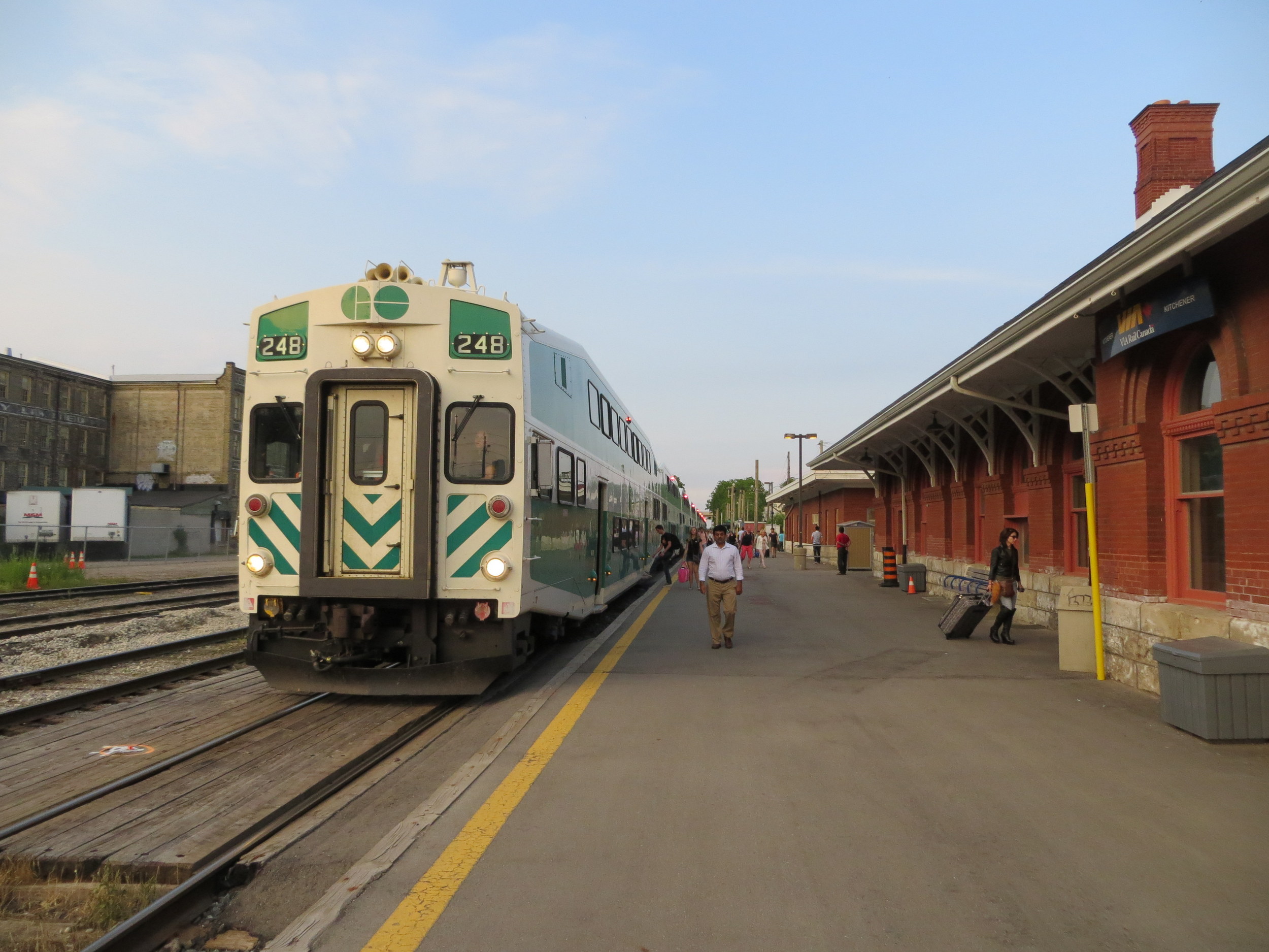
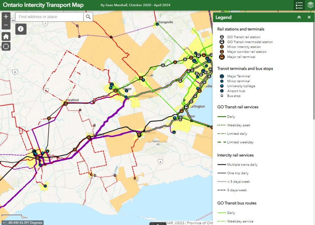
    I love maps, especially physical, paper maps. I like to visualize the places I travel to and determine how each city and region’s transit networks work. Though online interactive maps can be very helpful (like the ones I created to show all intercity transport services in Ontario and across Canada, filling a much-needed gap), there is still nothing like a well-designed static map, especially when it is in print and easily accessible to the public.

    This means providing maps that accurately and clearly depict the entire transit system, along with landmarks, connections, and frequency. Los Angeles Metro’s system map does a reasonable job for a map that covers a very large region.

    The Los Angeles Metro system map depicts the complex bus and rail network, including non-LA Metro agencies like Culver Citybus and Santa Monica’s Big Blue Bus. Colours and line width used to denote operator, service type, and frequency.

    Thankfully, most urban transit systems in North America continue to provide proper system maps both on their websites and in print, provided free on request at subway booths or terminal offices. (Some, however, have charged a small fee for a physical copy of their transit maps, such as San Francisco’s Muni.) In Europe, complete transit maps often have to be purchased, such as in Berlin or Vienna.

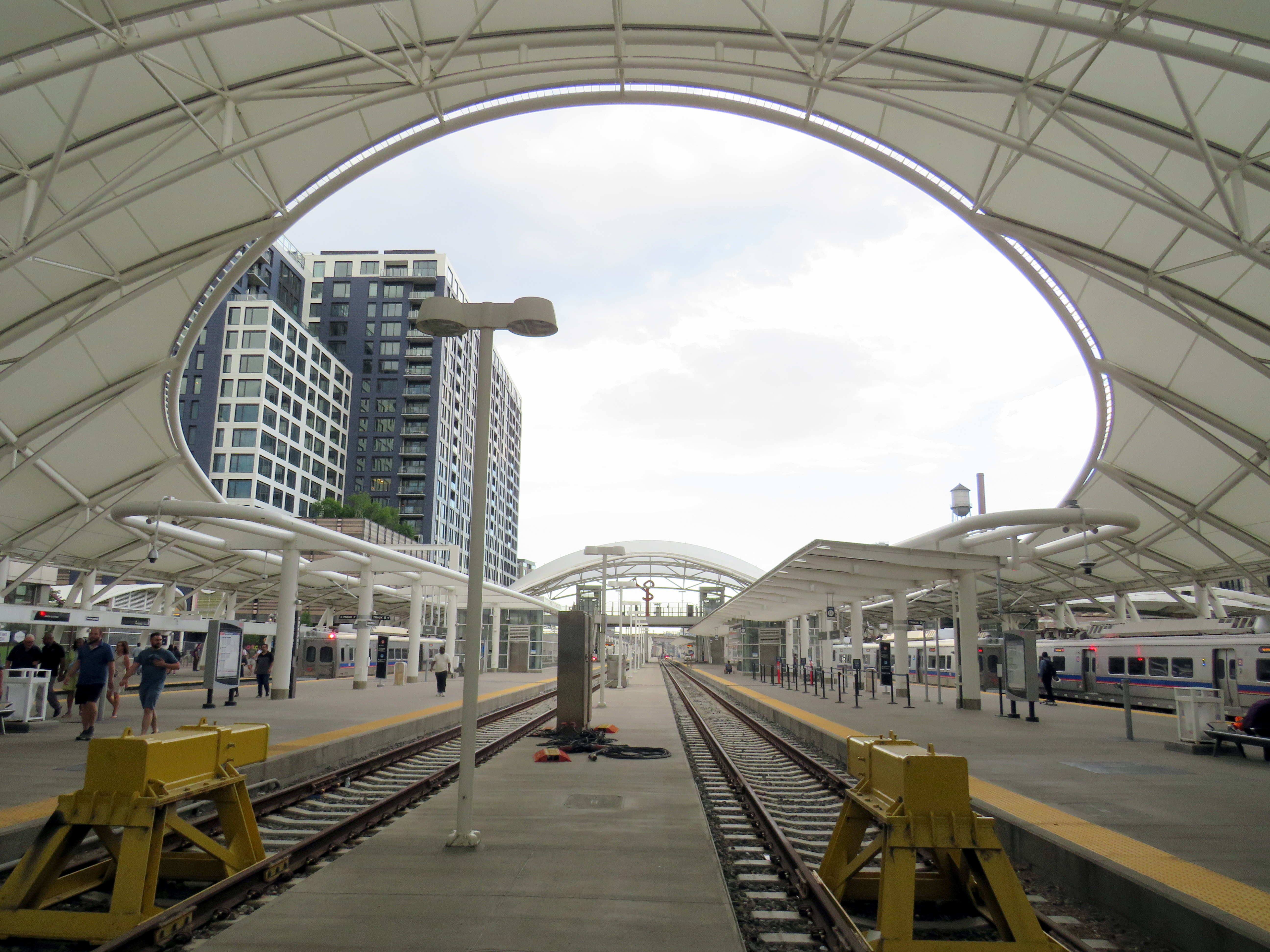
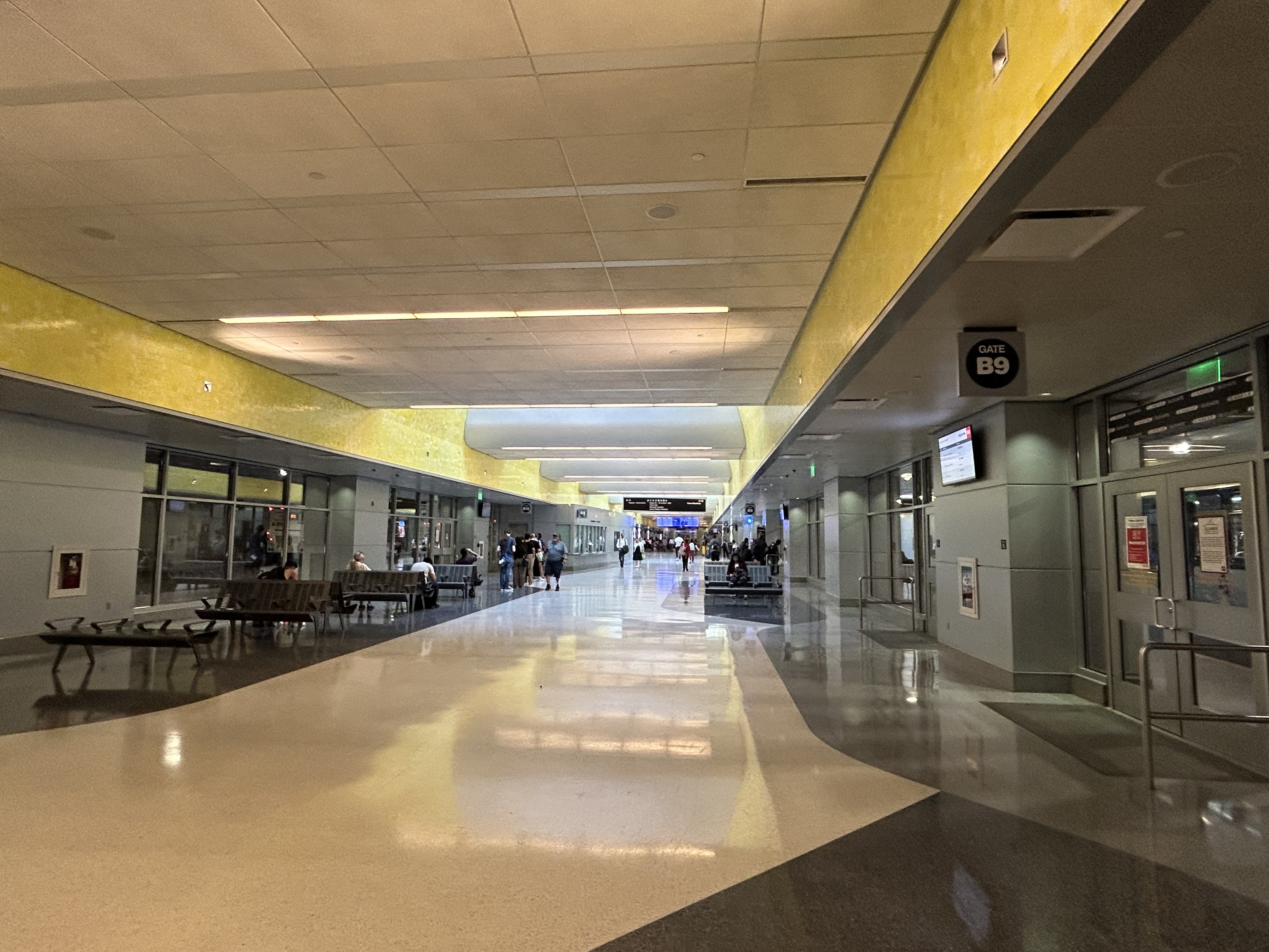
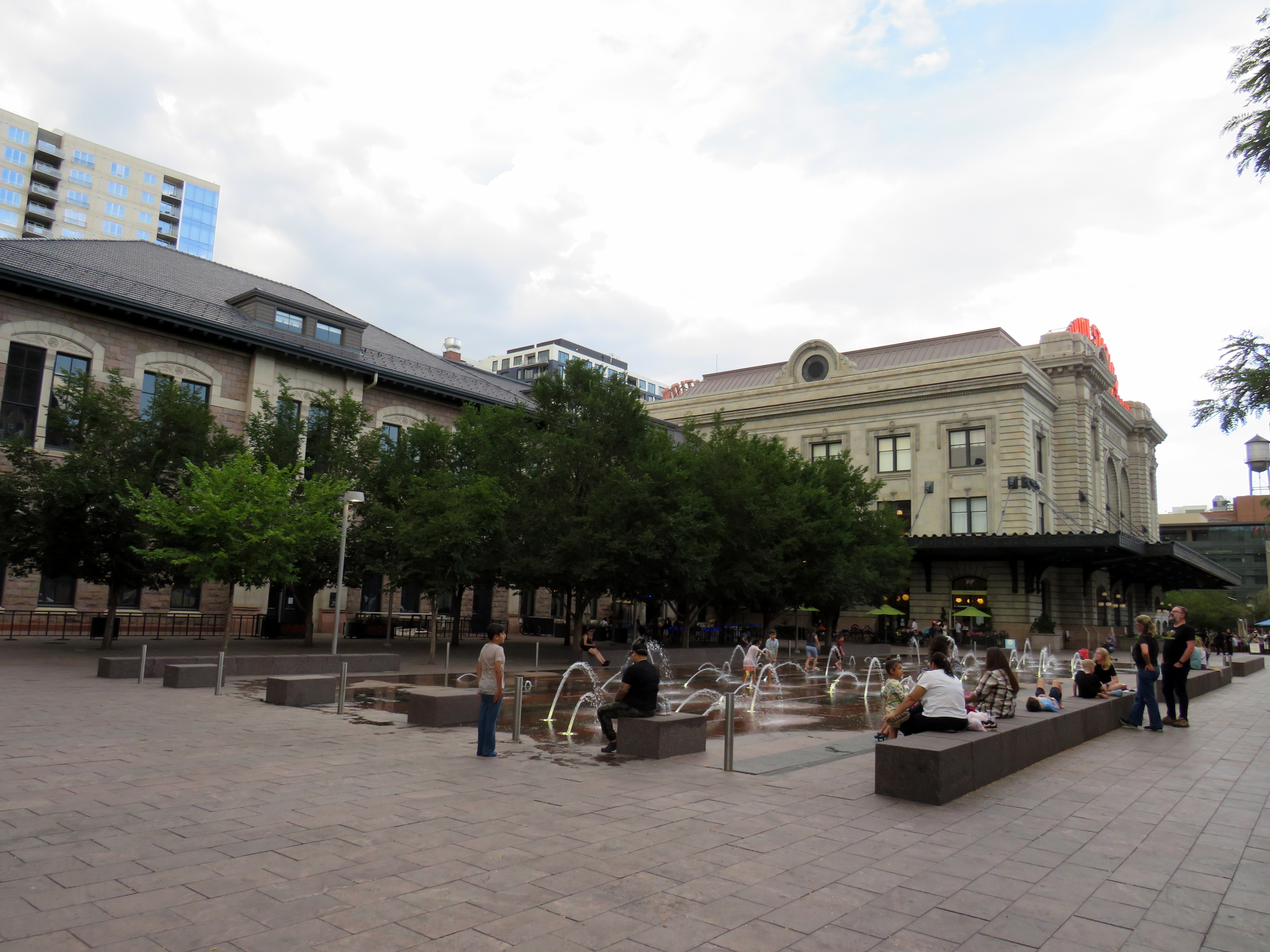
    I recently visited two mid-sized American cities that have done away with physical maps for their transit systems: Pittsburgh, Pennsylvania and Denver, Colorado. In those cities, figuring out how to get around by tram and bus was frustrating, even in an age of Google and Apple maps and transit planning apps accessible to anyone with a smartphone.

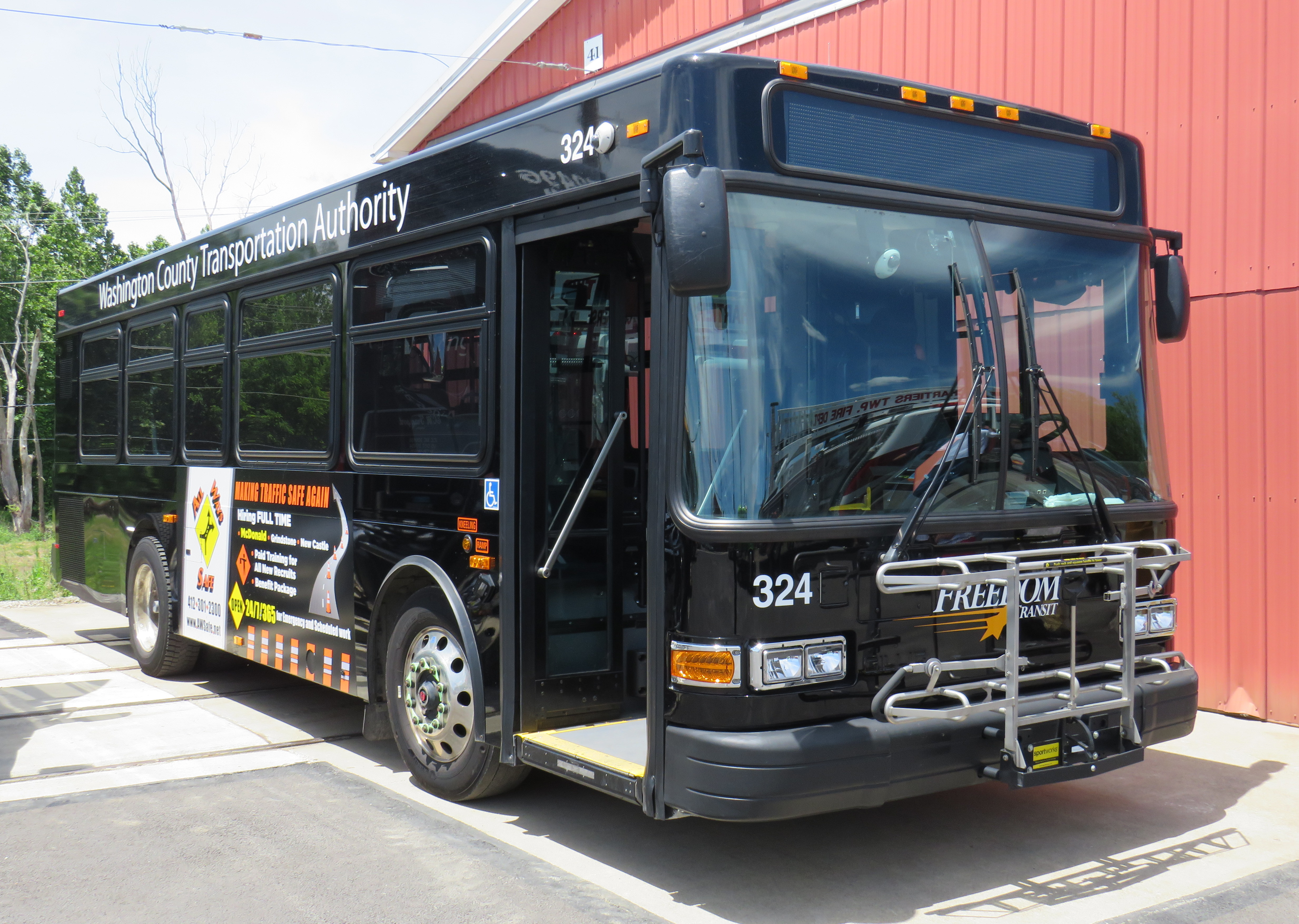
    Pittsburgh Regional Transit (formerly known as Port Authority Transit) operates a complicated web of bus routes that radiate from the city’s downtown core, along with a few cross-town and feeder routes. There are three busways and a light rail service to the southern suburbs. However, there is no proper system map, either in print or online as PDF or image file that allows the new or casual user to make sense of the network.

    Individual bus and LRT route schedules can be found under the Schedules tab on the PRT website, but one needs to know what route they are looking for. Under Rider Info, there is a link to a system map, but it takes the user to an ESRI interactive map.

    Screenshot of the system map page of the PRT website

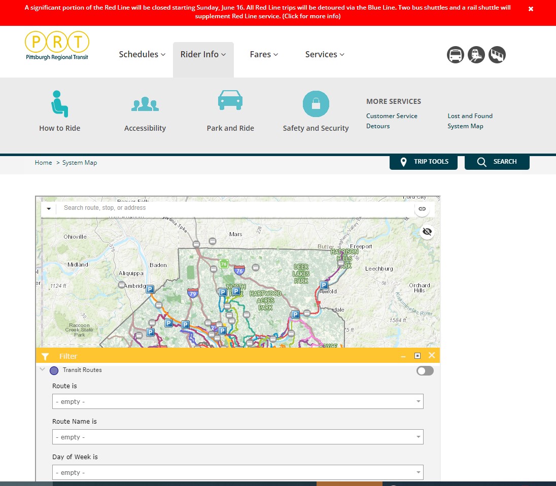
    The user can then select a service by route name or number in a drop-down tool, but the map itself is difficult to figure out. Zooming in reveals the location of fare vendors and park-and-ride lots, but not important service details like route numbers or service frequency.

    Zooming in, park-and-ride lots become the most prominent feature

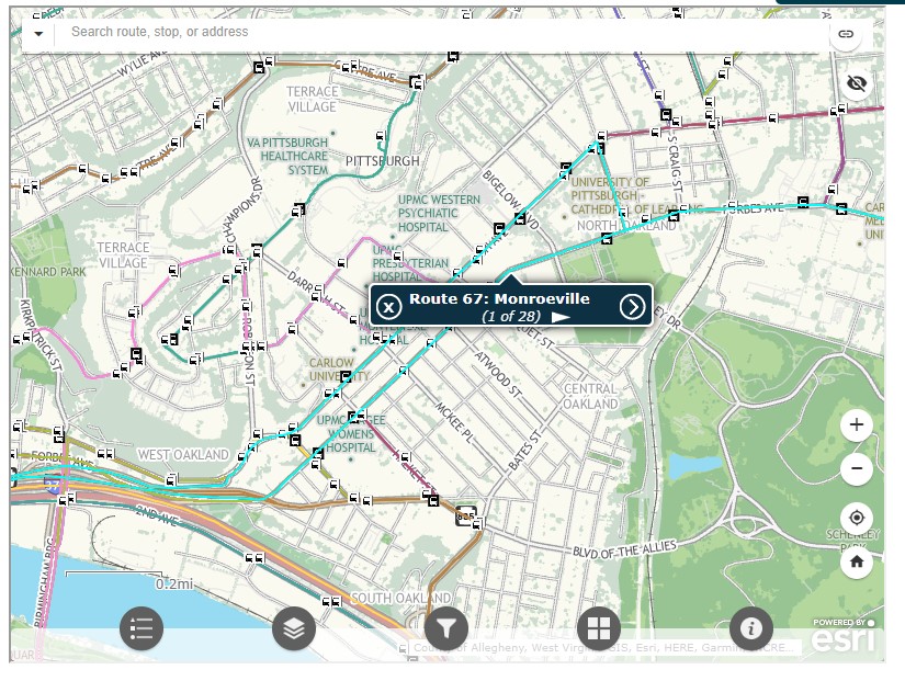
    Even at the neighbourhood level the map is difficult to read. The screenshot below shows Pittsburgh’s Oakland district, home to University of Pittsburgh, Carnegie Mellon University, several other educational institutions, medical centres, parks, museums, and cultural venues. Many bus routes follow Forbes Avenue and Fifth Avenue, but as each route is layered on top of each other, it is difficult to discern where each route runs and where they go.

    PRT’s ESRI interactive system map, zoomed into the Oakland District

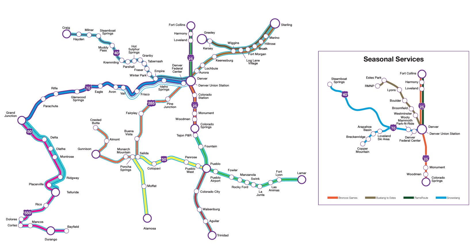
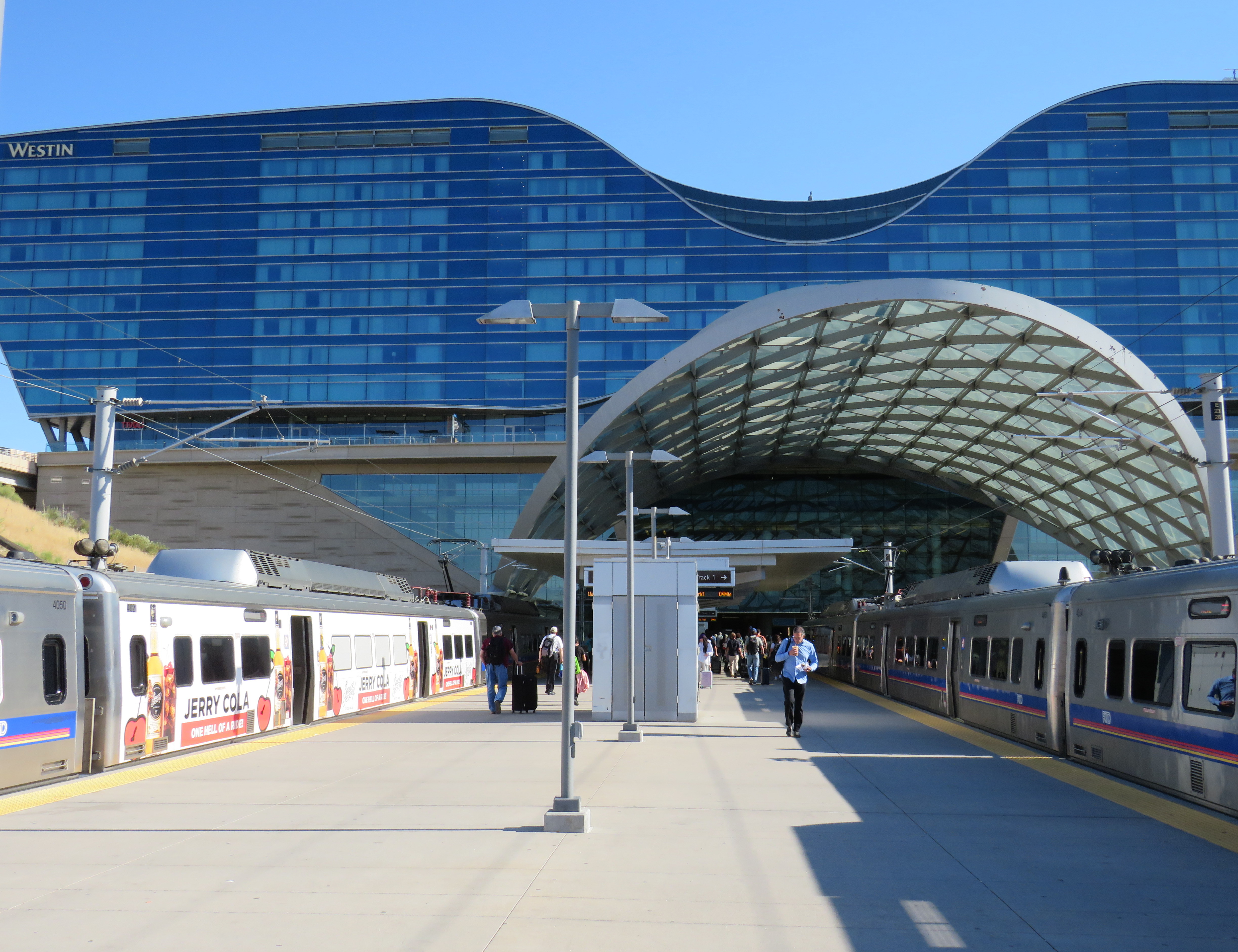
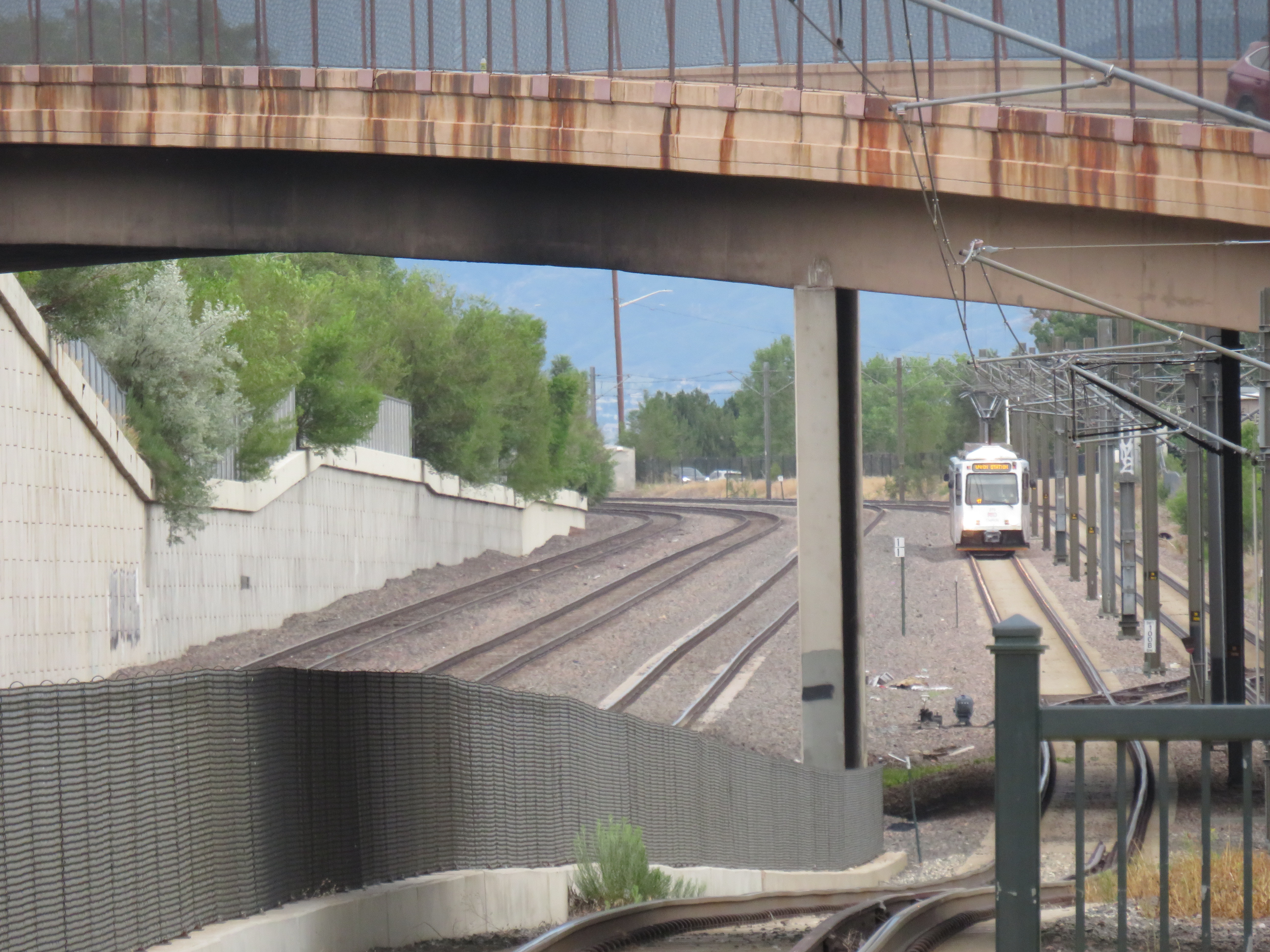
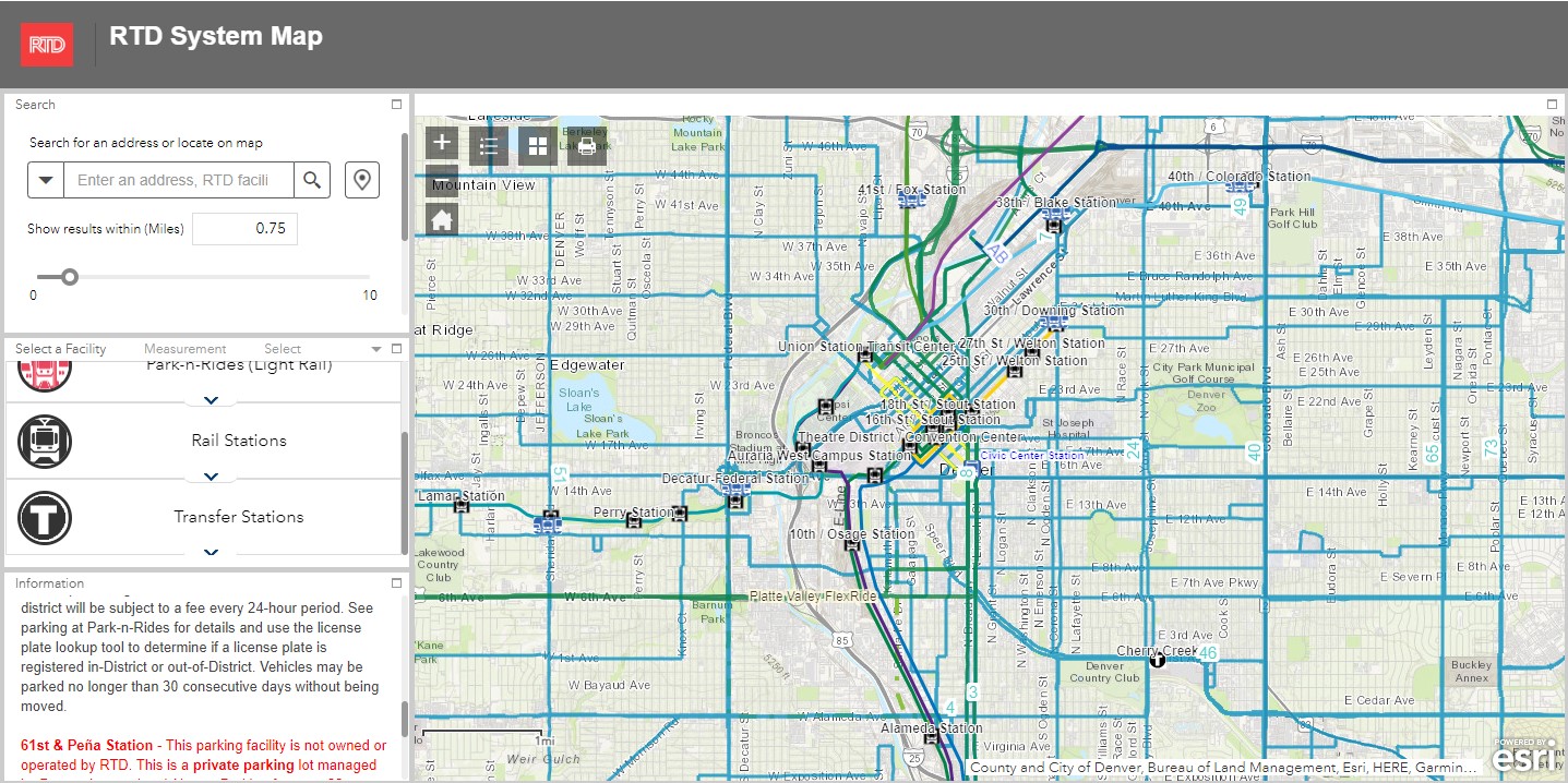
    Denver’s Regional Transportation District (RTD) also uses ESRI interactive maps to show bus routes (rail services are depicted in a static image map as well). At a small scale, only the light rail and commuter/regional rail services appear, along with transit park-and-ride locations. Denver’s bus system is less complicated than Pittsburgh, operating largely on a grid, but still, a proper map would make it much easier to get a sense of the network.

    RTD System Map zoomed out

    Zoom in, and bus routes appear, along with route numbers, but there is nothing to show the level of service for each route.

    Though online-only interactive maps have their purpose (my Ontario and Canada intercity maps are designed to show where connections exist, or not, and how to obtain schedule information), they are not well suited for urban transit systems and are very difficult to read on a mobile device. Properly designed static maps, in web image or PDF format do much better jobs.

    It is worth comparing Pittsburgh and Denver to the Toronto Transportation Commission (TTC). The TTC’s complete system map is provided to customers for free at subway stations, with smaller, simplified versions available as tear-away pamphlets. Large-format versions are also displayed across the network in bus shelters and subway stations. A PDF version can also be easily found on the TTC website in the main Routes and Schedules page. Surface routes are categorized by service level (express, frequent service, regular service, limited service, seasonal, and community routes) with major landmarks and transfer points to connecting services clearly indicated.

    I have some minor complaints about the TTC’s map (like regular routes, express routes should be categorized in the map based on their service levels, for instance) but it is a reasonable, easy to read map that is also quite easy to find.

    Unfortunately, more transit systems are moving away from easily accessible paper maps. Durham Region Transit, for example, no longer provides copies of its system map. Fortunately, a proper, well-designed PDF copy remains accessible on its website.

    When travelling, or looking to understand a city’s transit network though, there is nothing quite like poring through a well-designed, easy-to-read paper map. It would be a shame if more agencies went the way of Denver and Pittsburgh.

  • Travel by train (or bus): Denver’s renewed Union Station

    Travel by train (or bus): Denver’s renewed Union Station

    Denver’s Union Station, with the iconic “Travel by Train” neon signage

    Earlier this summer, I had the privilege of travelling with my spouse to California. We started in San Diego (where my partner was attending a conference) and then made our way northwards, to Los Angeles, Santa Barbara, San Simeon, and finally the San Francisco Bay Area. I continued my trip an extra three days to ride Amtrak’s California Zephyr train east through Nevada and Utah to Denver, Colorado.

    Looking south from the California Zephyr across the Colorado River near the Utah-Colorado border

    Besides the breathtaking scenery through eastern Utah and western Colorado, I wanted to visit Denver itself, including its Union Station.

    Denver’s Union Station was constructed in 1881 to serve the Denver Pacific Railway (the city’s connection to the Union Pacific transcontinental railroad at Cheyenne, Wyoming), as well as the Denver & Rio Grande, the Denver, South Park & Pacific and the Colorado Central Railroads. (Today, it is reached by tracks belonging to the Union Pacific or BNSF Railroads.) Renovated and expanded in 1914, one of the station’s most iconic features, rooftop neon signs beckoning customers to “Travel by train” were added in the 1950s, as interstate highways were being planned and constructed across the United States and air travel became more common.

    The station was nearly closed in the 1980s with only Amtrak’s Oakland-Chicago California Zephyr calling once a day in each direction. Passenger train facilities would have been moved to a small “Amshack” building outside of the downtown core, with the station building incorporated into a proposed new convention centre. (This proposal is similar to the fate of St. Louis’ Union Station, which was turned into a hotel, shopping, and entertainment centre, with the Amtrak station moved into a small building off-site.) Luckily, this never took place.

    Denver’s Regional Transit District (RTD) purchased the station in 2001, with a new master plan developed for the station property and the vicinity in 2002, approved by voters in 2004 as part of the “FasTracks” program. Denver’s light rail system was extended to Union Station in 2002, while the immediate area was redeveloped with midrise apartment and office buildings. The train platforms were rebuilt with a new canopy, meant to accommodate both Amtrak and proposed new commuter and regional rail services.

    Denver Union Station train platforms

    Connecting the historic Union Station building and train platforms with the LRT platforms two blocks north is a long underground bus concourse.

    Denver Union Station’s underground bus terminal

    The underground bus terminal serves local and regional RTD services, as well as Bustang, the State of Colorado’s intercity coach service. Bustang offers multiple daily bus services to cities such as Colorado Springs, Fort Collins, Grand Junction, and Pueblo, connecting most of the state together. There are also seasonal ski buses from Denver, along with special runs for Denver Bronco games.

    Bustang service map

    There are also two free RTD bus services connecting Union Station with the rest of Denver’s downtown core: MallRide, a frequent, daily service along the 16th Avenue pedestrian mall (which was undergoing reconstruction in July 2024, and was on detour), and MetroRide, which operates during daytime hours on a parallel route.

    Splash fountains in the Union Station west plaza

    Union Station now hosts a boutique hotel, several restaurants and bars, a branch of a local bookshop chain, and includes amenities such as public art and a splash fountain outside its main entrance. Though the main lobby was undergoing minor renovations, it was clear how much work went into the project.

    Union Station lobby
    Take the A-Train
    Arriving at Denver International Airport

    Like Toronto’s Union Station, Denver offers an airport rail link, operating every 15 minutes most of the day. The electric A-Line train runs from Union Station, making 7 intermediate stops. With the exception of the airport itself, the A-Line operates within the regular RTD fare zone, with free transfers between connecting buses and trains.

    To enter or exit the airport station itself, occasional travelers must purchase a special $10 day pass (a standard day pass is $5.50), but that, of course, includes all rides taken before or after arriving at or departing from the airport. (By contrast, there are no transfers or fare discounts when connecting between UP Express and GO Transit, TTC, or suburban transit services.)

    Because of the additional stops and the long distance between Downtown Denver and the international airport (25 miles or 40 kilometres), the trip takes 37 minutes versus UP Express’ 25 minutes.

    Unfortunately, most RTD rail services, like the A-Line, follow existing or abandoned rail corridors. Though these routes offer limited obstructions to construction and allow for faster service than operating within roadways, they limit how much ridership can be generated by walk-on service. Even the Downtown Littleton station on the D-Line is distant from any commercial or residential uses, with a large commuter parking lot behind the historic station building.

    At least many RTD stations offer convenient bus transfers, which draw much of the ridership.

    The D-Line LRT at Littleton, Colorado

    A lot was done right at Denver Union Station, which is well served by local, state, and national rail and bus connections, and is serves well as a model for developing a good intermodal hub in a midsized city like Denver. There are certainly aspects that could be replicated at some GO Transit stations, such as Brampton, Port Credit, or Unionville, which are poised to become important intermodal hubs, such as great public spaces, easy connections between nodes, and complementary retail spaces. At Brampton in particular, much can be done with the small historic station building there to make it a centrepiece of a great downtown redevelopment.

    I am glad I visited Denver, and I am glad to have travelled by train.

  • A bus to St. Thomas, finally

    A bus to St. Thomas, finally

    Middlesex County Connect and “Local Motion” buses at St. Thomas, June 2024

    On Saturday, June 15, I took a trip that was not possible for over a decade: I went to St. Thomas, Ontario, without a car. This was possible because of one of several new intercity transit links that opened this year in Ontario, and I have updated my interactive map accordingly.

    (more…)
  • A heartbreaking end for the Ontario Science Centre

    A heartbreaking end for the Ontario Science Centre

    A family enters the Science Centre for the last time on Friday June 21, 2024

    When I was growing up, our family would make a trip every year to the Ontario Science Centre, a 45-minute car drive from our home in suburban Brampton. Invariably, these trips would take place on the first PA day of the school year, typically on a Friday in late September or early October, when the ravine was still lush and green, with only the first hints of the changing season.

    Because it was early in the school year, and since the Toronto school boards typically had different PA days than the Dufferin-Peel Catholic board, the Science Centre would be mostly empty; my father would run with my brothers and I along the corridor over the ravine between the entrance hall and the great hall. At the end of our visit would be an hour spent at the Science Arcade, the highlight of any child’s visit to the once-great institution. I marveled at Raymond Moriyama’s wonderful harmony of concrete, glass, and natural beauty as one descended into the West Don Ravine by means of glass walkways and escalators.

    Later visits in high school and in my early adulthood, however, were not as great. The exhibits were getting old, and the place started feeling worn out. The Dalton McGuinty and Kathleen Wynne-led governments did not value the Science Centre enough to invest in its relevance or its long-term maintenance. Doug Ford’s PC government continued the neglect, favouring a private redevelopment of Ontario Place (closed under the previous Liberal government) with a new, downsized Science Centre to take its place.

    In 2022, that once-wonderful double-deck bridge between the entrance hall and the exhibition space was closed due to the risk of structural failure, with no plans to fix or restore the link. Instead, $2 million a year was spent on shuttle buses ferrying visitors between the upper parking lot (after they paid admission) and the lowest level at the bottom of the ravine. That year, the planetarium (a smaller version of the McLaughlin Planetarium that operated next to the Royal Ontario Museum until the 1990s) also closed due to deterioration.

    A December 2023 report from the provincial Auditor General’s office took issue with the government’s management of the Ontario Science Centre and the flawed business case for moving it to a new location on Toronto’s waterfront, in a location much less accessible to school groups.

    Loading Ontario Science Centre visitors on shuttle buses, June 21, 2024

    The most recent development in which engineers warned of sections of the roof in danger of failure and collapse in a report to Infrastructure Ontario (linked in full on the CBC Toronto website) after October 31, 2024, with repairs costing between $22 million and $40 million. The immediate closure, announced on a Friday afternoon, would provide time to allow the exhibits to be removed, possibly to an interim location. However, most of the roof was found to be in good or fair condition in an the engineer’s report, making the immediate closure suspect.

    Globe and Mail architecture critic Alex Bozilkovic questioning the government’s sudden closure on X/Twitter.

    On Friday morning, gates were already being installed at the parking lot entrances to the Science Centre, before the official announcement, even before the Toronto Star published the first story about the closure on its website around noon.

    Workers install rigid gates at the staff parking and bus exit at Ontario Science Centre. Local Liberal MPP Dr. Adil Shamji speaks to a reporter in front.

    One cannot help but be skeptical about the sudden decision to close the Science Centre, despite the demolition by neglect by the Liberal and PC governments. Had an announcement been made, but with the closure taking effect two weeks later after the long weekend, it would have given visitors one last time to appreciate the Science Centre and its unique architecture. But that might also be the point. By making the closure a done deal without the opportunity for the community to rally to save the Ontario Science Centre, Doug Ford’s PCs have shut down debate. By the time the legislature meets again in October, their hope is that opposition to the destruction of Ontario Place and the Ontario Science Centre will have dissipated. The Friday afternoon news dump also fits this strategy.

    Though I made it up on Friday to document the closure, I am sad that I did not make it for one last visit, just as with the sudden closure of the Scarborough RT last year.

    The most heartbreaking thing for me was watching a young family walk from Flemingdon Park into the Science Centre just as the news media was assembling for a press conference with Don Valley East MPP Dr. Adil Shamji and Floyd Ruskin of SaveOSC. The young child looked so excited for a day at the science centre, unaware that it would be the last day it would ever be open.

  • Transit museums’ transit dilemma

    The Pennsylvania Trolley Museum now features a new main entrance and exhibition hall, along with an on-street boarding area complete with vintage signage.

    While visiting Pittsburgh earlier in June, I also paid a second visit to the Pennsylvania Trolley Museum (PTM), located 45 minutes south of Downtown Pittsburgh in Washington PA. I had visited the museum a few years prior as part of a visit to the Pittsburgh area, but since then, a new section of the museum opened to the public, and there were additional cars in operation.

    While I went to PTM with a friend who planned to stick around until the evening, I planned to return to downtown Pittsburgh earlier in the afternoon. I found information on a local transit service operated by Washington County — called Freedom Transit — that ran a route to and from Pittsburgh that stopped not too far from the museum’s main entrance. That plan did not go well at all.

    It is an unfortunate irony that most North American transit museums have poor or non-existent transit access. There are historical reasons why this came to be, but some of the continent’s best transportation exhibitions are inaccessible to newer generations of transit fans, historians, and enthusiasts, many of which do not or cannot drive.

    Washington County Transportation Authority, or “Freedom Transit,” doesn’t offer much freedom
    (more…)
  • A walk to the ballpark

    Returning to Downtown Pittsburgh across the Roberto Clemente Bridge after the game and a fireworks display

    Earlier in June, a friend and I took a weekend road trip to Pittsburgh, a five-hour drive southwest of Toronto. On our first night there, we took in a ballgame at PNC Park, where the hometown Pirates hosted the Minnesota Twins.

    Though I do not follow the Pirates (who are in the National League) nor the Twins (who are in the AL Central), I was excited to take in a ballgame in Pittsburgh because I have heard about the park’s intimate confines, the great view of the Pittsburgh skyline, and the fireworks that follow certain Friday and Saturday night games. PNC Park lived up to the hype.

    Among the major North American sports leagues, Major League Baseball has the most significant differences between venues. Unlike hockey, basketball, soccer, and football fields, the dimensions of each playing surface vary considerably, as does the architecture. PNC Park was built in the retro-classic style similar to Baltimore’s Camden Yards; it opened in 2001. When the naming rights for the new publicly-financed stadium was purchased by local bank PNC, the city renamed the adjacent 6th Avenue Bridge for beloved Pirates player Roberto Clemente, a Hall of Famer and a humanitarian. That bridge is closed before and after each game to motor vehicles so that fans can walk and bike across the Allegheny River to and from downtown.

    Statue of Roberto Clemente located between the stadium and the bridge renamed in his honour. No statues of cable tycoons can be found here.

    The skyline view from behind home plate is spectacular, showcasing the most iconic buildings and some of the many bridges crossing the three rivers in the downtown area. With lots of washrooms, a wide concourse, and plenty of food and drink concessions, the stadium felt intimate, yet uncrowded. Lineups were always short, and where play wasn’t visible (such as in the washrooms), speakers played the radio broadcast. Ushers were very friendly and helpful as well.

    View from up behind home plate

    The game was followed by a 10-minute fireworks display, with the rockets launched off a barge in the Allegheny River.

    Finale of fireworks show

    Though transit access is quite good — there is a station one block away on Pittsburgh LRT’s North Shore extension — many fans walked part of the way home. Downtown parking garages — built for office commuters — provide much of the parking demand, so there are few surface parking spaces surrounding the stadium. Even the football stadium, a few blocks to the west, is mostly served by parking garages and another LRT station. Hotels, restaurants, museums, and apartments neighbour the two North Shore stadiums.

    Walkability and transit access are the key to fostering a great fan experience. Walkable stadiums promote safe, accessible, and sustainable travel to and from sports venues, and help support local businesses. Downtown locations have the advantage of having better transit access, existing parking facilities, and in the case of Pittsburgh (or Detroit, or Minneapolis), a downtown ballpark can be a point of civic pride, showing off the city to its inhabitants, and to a much larger audience.

    To see how your local sports venue ranks, visit my Story Map here.

  • Can you walk to City Hall?

    Can you walk to City Hall?

    Mississauga City Hall, one of the most walkable municipal buildings in Ontario

    In late March 2024, with a streak of mild, sunny days, I was eager to get outside and walk. As I have long been interested in local politics and planning issues, public transit, active transportation (especially walking advocacy), I thought I would try to get to every city, town, and township hall in the Greater Toronto and Hamilton Area (GTHA) without a car.

    This was a fun project, even if there were times I felt really frustrated at times by poor transit and long hikes. The highlight of my quest was a tour of Mississauga City Hall from Councillor Joe Horneck. Mississauga’s civic centre is one of Ontario’s most iconic — and walkable — government buildings.

    Mississauga Council Chambers

    Of the three levels of government (federal, provincial, municipal), the municipal level has the most impact on the day-to-day lives of most Canadians; it is also the closest level of government to all. Residents can depute at committee meetings, get meetings with their local councillor and city staff, and obtain building permits, marriage licenses, or pay bills at city and town halls. Therefore, they should be as accessible as possible, especially to those without cars.

    Only one GTHA town hall (Caledon) was completely inaccessible without a car, though several other town halls required long walks from the nearest transit stop, making them inaccessible to some residents. But I could get to Brock Township, the least-populated and most-rural municipality in the GTHA, thanks to Durham Region Transit’s On-Demand service, though I had some difficulty there.

    The complete list of GTHA city and town halls, along with photographs and a map can be accessed here.

    Preview of Story Map

  • Bloor Street blues

    Bloor Street blues

    Bloor Street, entering Mississauga from Toronto

    On Friday, May 10, Mississauga City Councillor and mayoral candidate Dipika Damerla posted a message and video on Twitter/X, stating that “it will be up to the residents to decide on who best represents the vision of the Mississauga they want.” She followed that by saying that she “will not be silenced in my opposition to remove two lanes from Bloor Street and create more gridlock in Mississauga.”

    In the video, she is standing on Bloor Street West at Yonge Street in the heart of Toronto’s Bloor-Yorkville business district, 16 kilometres east of the Mississauga border at Etobicoke Creek. Needless to say, this is a very different built environment than anywhere in Mississauga.

    Toronto’s Bloor-Danforth bike route, which stretches from Danforth Avenue and Dawes Road on the east to Bloor Street West at Aberfoyle Crescent (near Islington Avenue) is very well used by cyclists, including commuters, couriers, and casual riders. There is also a subway paralleling the entire corridor. Behind Councillor Damerla, there is heavy traffic, but it is unfair to blame the bike lanes for this congestion. The vehicles are stopped at a red light at Yonge Street, one of the busiest intersections for pedestrians and cyclists in the city. There’s a dedicated scramble crossing at the intersection, which does reduce the green light time for traffic on Bloor, though it makes it safer for pedestrians, who outnumber all other road users there.

    There is also considerable construction in and around the intersection. Work continues on the troubled “The One” condominium tower, blocking off some of the southwest Yonge-Bloor corner. Just east of Yonge, pedestrians, cyclists, and motorists are squeezed as the TTC works to expand the Bloor-Yonge Subway Station below.

    Furthermore, before the bike lanes were installed, the curb lanes were used by stopped cars and delivery trucks; Bloor Street was never a traffic clearway, and it is a ridiculous argument that the bike lanes have caused congestion.

    Construction on Bloor Street is the cause of some of the congestion in the area

    In Mississauga, Bloor Street is a minor arterial road that extends as far west as Central Parkway. Between Etobicoke Creek and Royal Orchard Drive (just west of Dixie Road), Bloor is lined with rental and condominium apartment buildings and townhouse complexes. From Royal Orchard to Cawthra, the street is lined with low-density dwellings, a shopping plaza, and a high school. The western-most section is lined with fences as the houses back onto Bloor, more typical of major suburban arterial roads.

    Bloor Street in Mississauga
    Looking west towards Central Parkway and the Mississauga City Centre skyline

    The City of Mississauga was already planning to resurface Bloor Street, but took advantage of the timing to completely study the corridor with the goal of promoting active transportation and improving road safety while maintaining traffic flow.

    After extensive community consultation, Mississauga city staff recommended Alternative 6 for Bloor Street which widens the sidewalks, adds new separated cycle tracks, and a boulevard for trees and street lighting between the roadway and cycle tracks and the sidewalks and property lines. A continuous two-way left turn lane would allow motor vehicles to turn in and out of side streets and private driveways without conflicting with through traffic. This was approved by City Council in June 2023. Construction is scheduled to begin in October 2024.

    Council-approved redesign for Bloor Street in Mississauga

    This plan balances the needs of all road users, particularly students and seniors. It is great to see suburbs like Mississauga and Brampton rethink their streets to better serve all of their residents.

    Bloor Street, looking east from Havenwood Drive. Note the “school route” sign and the cyclist using the sidewalk in the distance.
    Yellow lawn signs with the slogan “Save Bloor Street.” Note the SUV parked in a way that partially blocks the narrow sidewalk.

    Bloor Street, whether it be a residential roadway in Mississauga, or a commercial street in Downtown Toronto, is not a place where drivers should expect nor be given ultimate priority over pedestrians, cyclists, or public transit riders.

    Luckily, many Mississauga politicians already get it. Reporting for the Mississauga News, Steve Cornwell noted that fellow councillor and mayoral candidate Alvin Tedjo “stands by the approved Bloor project”, while Carolyn Parrish, another city councillor running for mayor declared that a reversal of last year’s council vote would not pass, saying that the “issue’s dead” at one mayoral debate. Ward 3 Councillor Chris Fonseca — whose ward covers most of Bloor Street — championed the changes.

    Though Parrish has led several polls (with Damerla and Tedjo in second and third place), it is unfortunate to see a top-three candidate and sitting councillor using the Bloor Street redesign as a wedge issue. Mississauga is growing up. Some of its politicians should too.

  • A review of Metrolinx’s April 2024 service changes

    A review of Metrolinx’s April 2024 service changes

    With a GO train serving as a backdrop, Premier Doug Ford, along with Transportation Minister Prabmeet Sarkaria, announced major changes to GO Transit service, with 300 new weekly trains (a 15% service increase). The service changes will take effect on Sunday, April 28, 2024.

    Though most new trains will be added on the Lakeshore West, Lakeshore East, and Kitchener Lines (the Milton Line gets just one additional weekday round trip in the peak direction), the media event was held in Milton, where a byelection was called to replace outgoing PC MPP Parm Gill. With a competitive race between PC candidate Zeeshan Hamid and Liberal candidate Galen Naidoo Harris, the choice of venue made it an especially political event.

    News of the pending service changes was publicized in regular Metrolinx email newsletters in March, but was since taken down, likely to allow for the news to be shared first by the premier and minister of transportation. It is quite clear that Metrolinx is entirely beholden to the provincial government these days, where communications are tightly controlled by its political masters.

    The new GO Transit schedules are now available online. Though there is plenty of good news, some of the added trains are merely restoration of previous service levels. Meanwhile, there will be a significant service cut for two Toronto stations.

    Lakeshore Corridor

    Fifteen-minute train service returns on the busy Lakeshore line on weekend afternoons and evenings, between Oshawa and Oakville Stations only. Service will still run every half-hour on weekdays, weekend mornings, and to Bronte, Appleby, Burlington, and Aldershot Stations, and every hour to West Harbour GO in Hamilton.

    However, weekend 15-minute service starts late in the afternoon. Frequent service from Oakville to Union starts at 2:30 PM Saturdays and Sundays and at 3:14 at Union Station. This additional service starts too late for family day trips to the city or for getting to afternoon Blue Jays games.

    Bus route 18K, which operates between Aldershot, West Harbour, St. Catharines, and Brock University, is renumbered to Route 11.

    Milton Corridor
    Map of Route 21

    There will be one new peak-period round trip leaving Milton at 6:43 AM and leaving Union at 4:10 PM.

    More importantly, Route 21 will return to its previous routing, operating directly into Union Station Bus Terminal. When I wrote about the April 2023 changes, I commented that the changes simplified the complicated Route 21 while improving reliability and predictability for Milton Line passengers. However, the changes proved to be unpopular, with poorly timed connections between buses and trains.

    But with the Gardiner Expressway down to two lanes between Dufferin Street and Strachan Avenue for long-term construction, and with downtown Toronto’s traffic, I am wondering how much better the ride will be.

    Route 21A, which ran between Milton and Oakville, will be replaced by Route 22, which offers much more limited service — every two hours, weekdays only. Route 21A offered useful connections to GO buses at Trafalgar Road Park & Ride for Highway 407 services to McMaster University, Downtown Hamilton, Square One, and beyond. It is a shame to see that service reduced, though perhaps Milton Transit should begin serving it.

    Kitchener Corridor and UP Express
    New UP Express service pattern

    The good news? There will be new weekday half-hourly train service between Bramalea and Union Stations during midday and early evening periods. (Hourly service between Bramalea and Union will remain in the counter-peak direction.) There are no changes to rail service between Kitchener, Mount Pleasant, or Union Station and only minor changes to connecting GO buses. Not all trains will stop at Etobicoke North, which only has one platform.

    The bad news? UP Express service will be split into express and local services, with non-stop service between Union Station and Pearson Airport every 30 minutes, and local trains every 30 minutes stopping at Bloor and Weston. Both local stations will see improved weekday GO service, but this still amounts to a service cut, especially at Bloor, an important connection to the Line 2 Subway and local TTC services. This is also at a time when the connection between Dundas West Station and Bloor Station is finally being improved.

    Other changes

    Weekday evening train service will be restored on the Stouffville Line on April 28.

    Elsewhere, there are minor schedule adjustments — it’s always a good idea to check your trip before you depart.

    One last thing worth commenting about is a brand new, well-designed GO Transit bus map that clearly shows each route and how they connect to the rail network. Bus routes are sorted into “core” and “train support” services, a useful distinction.

    My only criticism is that they should show frequency or level of service — some “train support” routes run hourly or better, seven days a week (like Route 30) while some of the “core” routes do not operate evenings and weekends.

    Regional bus map
    Finally

    Apart from my observations and criticism above, I would have liked to have seen more changes to the bus network. For example, service to Peterborough remains too slow, while there should be weekend service between Kitchener, Guelph, and Hamilton. Hopefully, there will be more changes in September.

  • Ontario intercity updates for April 2024

    Ontario intercity updates for April 2024

    NOTE: Previous versions of the Ontario and Canada maps are retired; please see the new Canada Intercity Transport Map, launched March 30, 2025. This will now be the only interactive map that I will update.

    Since 2020, I have maintained an interactive map of bus and rail services in Ontario. Without a central repository of transit information, my maps have become one of the few comprehensive resources available. I am pleased to keep the resource going, and I appreciate the messages of support, as well as additions and corrections that you submit.

    There are a few updates for April 2024:

    • Middlesex County Connect launched a new route between Dorchester, White Oaks Mall in London, and St. Thomas. This route operates six days a week, with four round trips Mondays through Saturdays.
    • A new FlixBus route, operating six days a week, now runs between Downtown Toronto, Pearson Airport, and Sudbury, competing with Ontario’s Northland bus service.
    • Ourbus became the latest company to operate a coach service between Toronto, Kingston, and Ottawa. There are now five coach operators competing on the same route.
    • Grey Transit Route announced that they will be ending weekend services on most of its routes starting May 1.

    Though the gap between London and St. Thomas is now filled, there remains several other parts of the province without intercity transport links, even in Southwestern Ontario. For example, service in Huron and Bruce Counties is limited to a three day/week TOK coach service and a three day/week minibus service between Goderich and Grand Bend. There are still no links from Haldimand County and Six Nations to nearby large urban centres like Brantford, Hamilton, and Toronto.

    I plan to update this Ontario map again in July. At that time, I will also update my Canada-wide transportation map to reflect changes in the intercity transport industry.


    If you like my maps and you would like to help out with my online mapping and webhosting costs, consider buying me a coffee. Thank you!