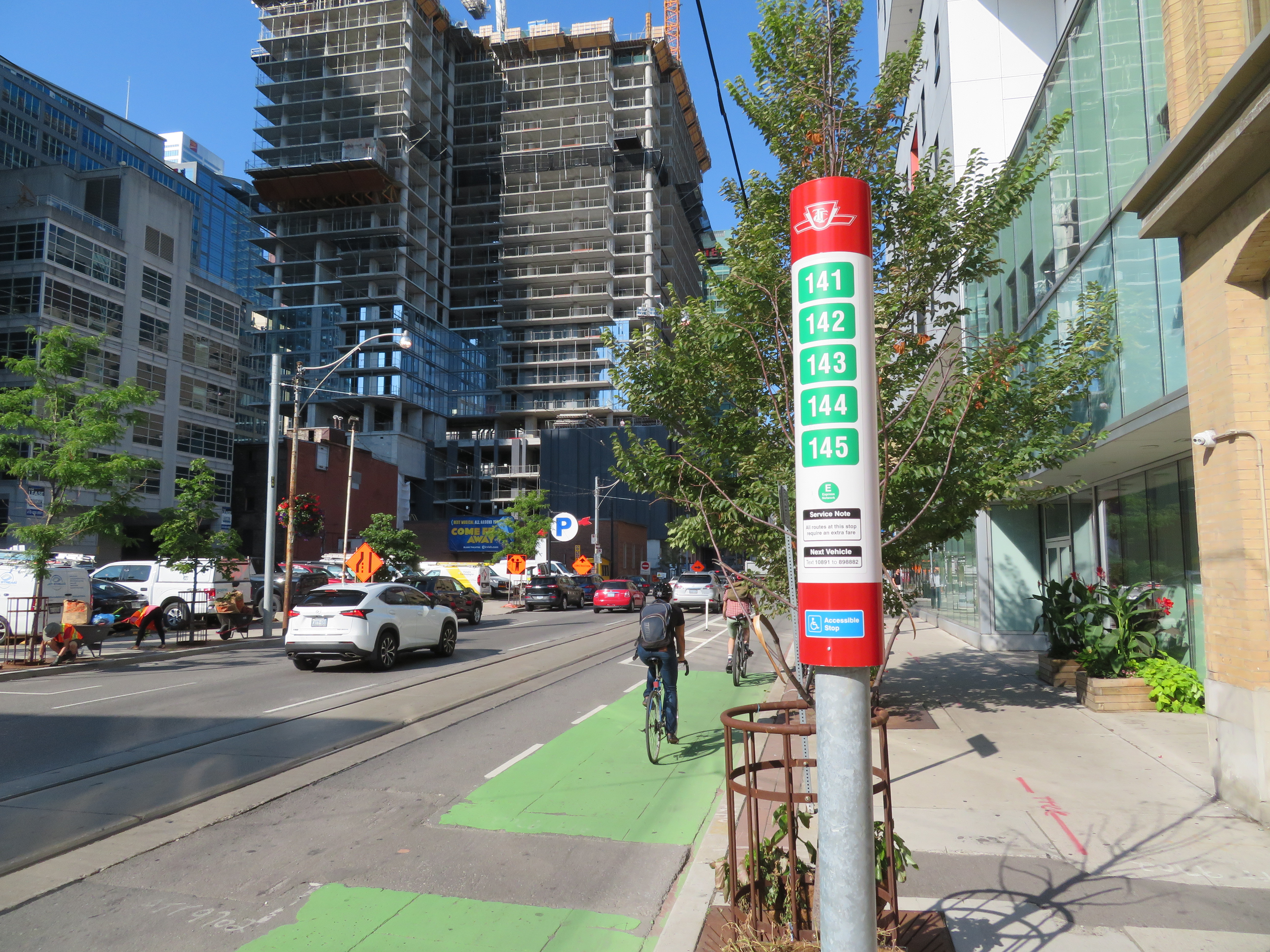
TTC stops have improved with the addition of route numbers, but this bus stop is deceiving
In the last few years, the TTC has made significant improvements in its maps, signage, and wayfinding standards. It also introduced new streetcar and subway fleets, retrofitted elevators into older stations (all but one streetcar line and a majority of subway stations are now fully accessible), and opened a new subway extension. Though overcrowding, bunching, and weekend closures continue to be aggravations, it is important to recognize where the TTC has improved.
Specific changes to TTC wayfinding include a new simplified system map, better signage at subway stations, introducing standard signage for diversions, scheduled closures and construction notifications, and revising the classic TTC bus stop.
However, two recent changes represent an unfortunate departure from these improvements.


The evolution of the TTC map from 2013 to 2019
The system map used from 1993 to 2013 was packed full of useful information, including the entire street system, connecting routes, including GO Transit buses, and local landmarks. Line colours differentiated transit agencies, with only line style representing the level of service offered (regular, limited, rush-hour, and express). Though the 2014 map stripped too much information from the map (including hospitals, connecting services, and even shopping malls), by 2016, the TTC got the simplified system map right. The revised map included hospitals, major parks, shopping centres and educational institutions, with highlighted lines representing frequent service routes (service every ten minutes or better at all times). Express routes, marked in green, followed the conventions used for red local routes (solid route marker and line for all-day service, hollow marker and dashed line for limited service).
The TTC began expanding its express bus network as well, with some existing routes getting improved frequencies and service hours.
 The 2016 TTC system map
Starting in 2017, the TTC began renumbering its express routes, which was yet another wayfinding improvement. Previously, there were three different numbering schemes:
- “E” branches that were simply an express branch of a regular service, with most operating during rush hours only (for example, 41E Keele)
- 190-series routes offering at least some off-peak service. The 190-series began with Route 191 Highway 27 Express in 1991, followed by 190 Scarborough Centre Express (cancelled in 1992 and resurrected in 2002), Route 196 York University Express, and the 192 Airport Rocket in 2002. As the number of “Rocket” routes expanded, they were numbered in the 180-series.
- 140-series routes. These express buses were introduced to help take some strain off the overcrowded subway system in the late 1980s and early 1990s, providing express rush hour services from inner-city neighbourhoods to downtown. By 1991, these services charged a premium fare.
Between 2017 and 2019, “E” branches and 180-199 series routes were assigned new numbers in the 900-999 range, with numbers reflecting the local routes they paralleled. Route 199 Finch Rocket became Route 939, as it parallels the 39 Finch East route, while 185 Don Mills Rocket became 925 Don Mills Express. Route 192 Airport Rocket became Route 900, as it has no parallel route except the 300A night bus.) Similar changes were implemented with the Blue Night network, where many routes were similarly renumbered to reflect the daytime route where possible.
However, with the re-branding of the TTC’s express bus network, a valuable piece of information was lost: all express routes were given the same symbology, a solid green line with a solid green route marker, without distinguishing various levels of service like those provided for local services. (See the TTC map legend below.)
 TTC System Map legend
The move towards marking all express routes the same way ignores the wide spectrum within the “Express Network.” Routes 900 Airport Express and 927 Highway 27 operate every 10 minutes or better 18 hours a day, but these are not highlighted in the latest versions of the map. Except for Route 985, all other express services have limited hours. Some, like 939, run at all times except late Sunday evenings. Others, like 989 Weston Road or 941 Keele, run only during peak periods.
Even the 140-series routes, which were never renumbered, are shown in maps and on bus stops with the same symbology. The only difference is a small “+” note to indicate an extra fare. A stop downtown might show five routes, potentially indicating frequent express service, with only a note explaining the extra fare, but nothing to indicate one-way rush hour only service.
The other unfortunate change was the move to add streetcars (and only streetcars) to the subway maps. Though Toronto’s legacy streetcar network is an unique aspect of the city’s transit system, for the most part, they are not any faster nor frequent than many TTC bus routes. Though the 504 King is the busiest surface route in Canada, there are also many buses in the top ten TTC routes by ridership.
Showing only the streetcar lines undermines the TTC’s success in building strong ridership in suburban, auto-centric areas by providing frequent bus services across the city and the recent expansion of its express bus network.
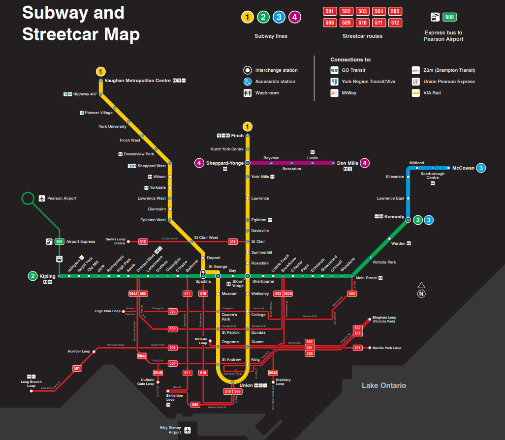
Subway and streetcar map now displayed in TTC subway cars
Furthermore, three streetcar routes have not operated with buses for several years. Due to watermain work and a shortage of active streetcars, buses have been operating on the 505 Dundas since February 2018. Routes 502 and 503 have been without streetcars even longer. Despite routes 502 and 503 operating having limited service hours, they are shown on the map as full-service routes. The streetcar map shows where they connect with the subway and with each other, but that’s all.
In Vancouver, the equivalent map shows the three rapid transit rail lines, SeaBus, and the 90-series B-Line express buses with their stops. There is more rationale for showing the B-Line routes, which offer frequent, all day service, than streetcar routes in Toronto.
The new strip maps on Line 2 subway trains continue the practice of showing connections to streetcar routes, GO Transit and Miway, but not to other TTC surface routes (the 900 Airport Express excepted).
Unlike many Torontonians, I like the route-specific strip maps in general. This is the practice used in cities like New York, London, and Chicago, where complex rapid transit networks dictate this arrangement, with full maps placed in panels near doorways. Once Line 5, the Eglinton-Crosstown LRT, opens the condensed subway route map we’re used to will no longer fit above doorways.
 New TTC Line 2 strip map
Though the TTC has vastly improved its maps, signage, and wayfinding standards, it has missed the mark reverting to uniform symbologies for its express routes, and highlighting the streetcar system on its subway maps when they do not offer any specific benefit. Happily, these are easy fixes.

Leave a comment