There are buses to more destinations in 2024, but a few major gaps persist
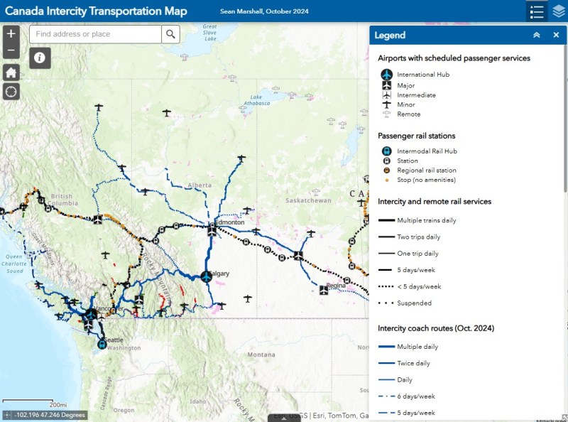
NOTE: Previous versions of the Ontario and Canada maps are retired; please see the new Canada Intercity Transport Map, launched March 30, 2025. This will now be the only interactive map that I will update.
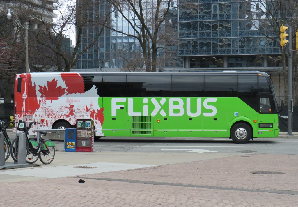
Unfortunately, outside of Ontario, there not that many updates to make. On Vancouver Island, at least, there is now daily service all the way to Port Hardy in the north and Tofino and Ucluelet to the west, with additional runs between Comox, Nanaimo, and Victoria. There are more buses between Vancouver and Seattle; FlixBus is now operating on the busy Calgary-Edmonton and Calgary-Banff routes. There is also a new twice-weekly Edmonton-Camrose service, thanks to work by the University of Alberta’s student union; it partnered with FlixBus to provide the service.
Also new to the map is Mountain Man Mike’s bus service between Vancouver, Nelson, Kaslo BC, and Calgary, as well as Mobilité Charlevoix, a regional service that connects several towns east of Québec City including Baie-Saint-Paul, La Malbaie, and Clermont.
Unfortunately, several wide gaps remain. Despite plenty of competition on the busiest routes in Southern Ontario and Alberta, there is no bus service between Calgary and Regina, leaving cities like Medicine Hat and Moose Jaw without intercity connections, apart from airport shuttle services, despite once-frequent Greyhound service. Between Winnipeg and Regina, it is still just one bus a week. Maritime Bus, for whatever reason, still has not restored service across the New Brunswick-Québec provincial line.
Without comprehensive government-led coordination and support, these gaps are likely to remain unfilled.
I love maps, especially physical, paper maps. I like to visualize the places I travel to and determine how each city and region’s transit networks work. Though online interactive maps can be very helpful (like the ones I created to show all intercity transport services in Ontarioand across Canada, filling a much-needed gap), there is still nothing like a well-designed static map, especially when it is in print and easily accessible to the public.
This means providing maps that accurately and clearly depict the entire transit system, along with landmarks, connections, and frequency. Los Angeles Metro’s system map does a reasonable job for a map that covers a very large region.
The Los Angeles Metro system map depicts the complex bus and rail network, including non-LA Metro agencies like Culver Citybus and Santa Monica’s Big Blue Bus. Colours and line width used to denote operator, service type, and frequency.
Thankfully, most urban transit systems in North America continue to provide proper system maps both on their websites and in print, provided free on request at subway booths or terminal offices. (Some, however, have charged a small fee for a physical copy of their transit maps, such as San Francisco’s Muni.) In Europe, complete transit maps often have to be purchased, such as in Berlin or Vienna.
I recently visited two mid-sized American cities that have done away with physical maps for their transit systems: Pittsburgh, Pennsylvania and Denver, Colorado. In those cities, figuring out how to get around by tram and bus was frustrating, even in an age of Google and Apple maps and transit planning apps accessible to anyone with a smartphone.
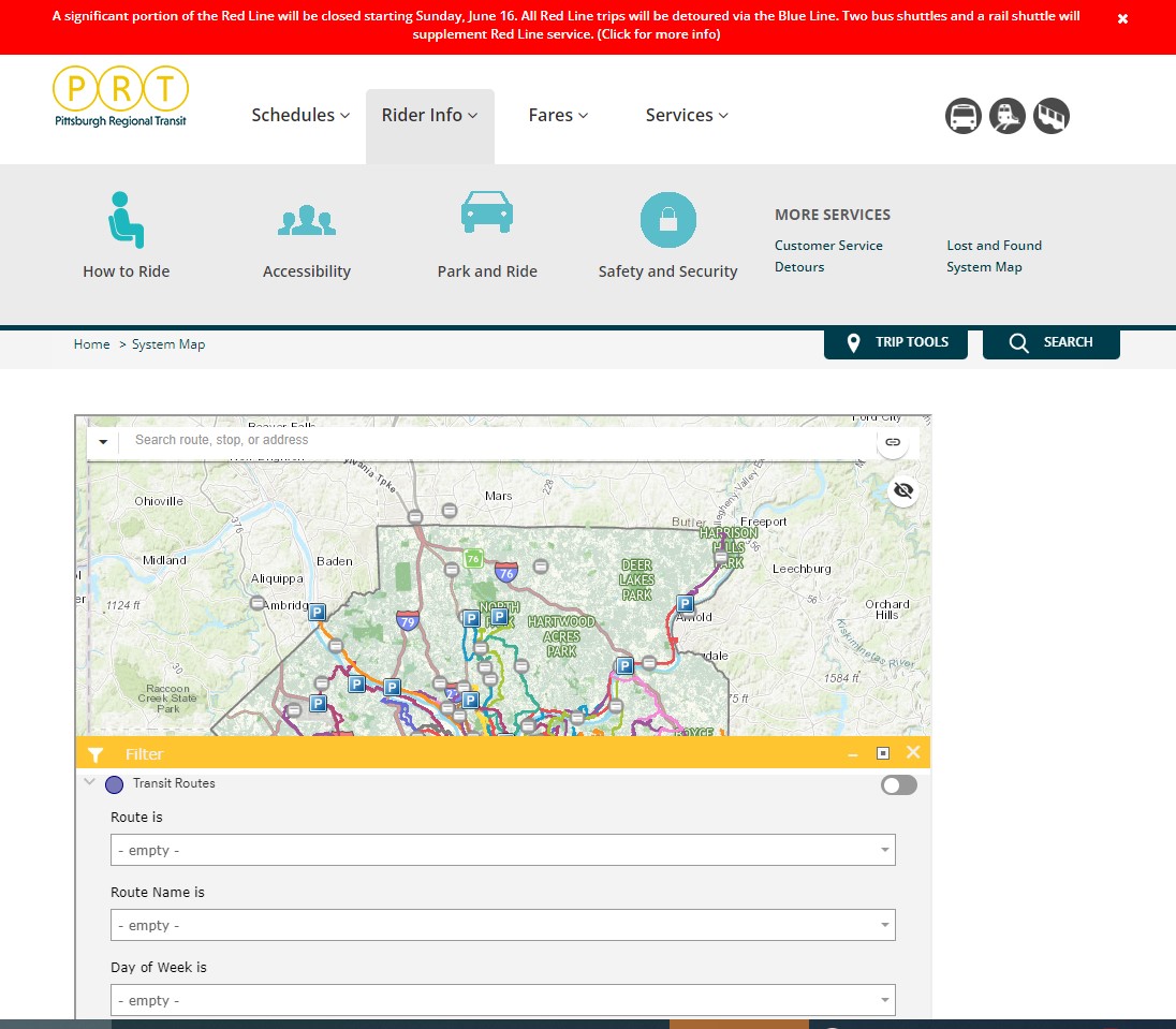
Pittsburgh Regional Transit (formerly known as Port Authority Transit) operates a complicated web of bus routes that radiate from the city’s downtown core, along with a few cross-town and feeder routes. There are three busways and a light rail service to the southern suburbs. However, there is no proper system map, either in print or online as PDF or image file that allows the new or casual user to make sense of the network.
The user can then select a service by route name or number in a drop-down tool, but the map itself is difficult to figure out. Zooming in reveals the location of fare vendors and park-and-ride lots, but not important service details like route numbers or service frequency.
Zooming in, park-and-ride lots become the most prominent feature
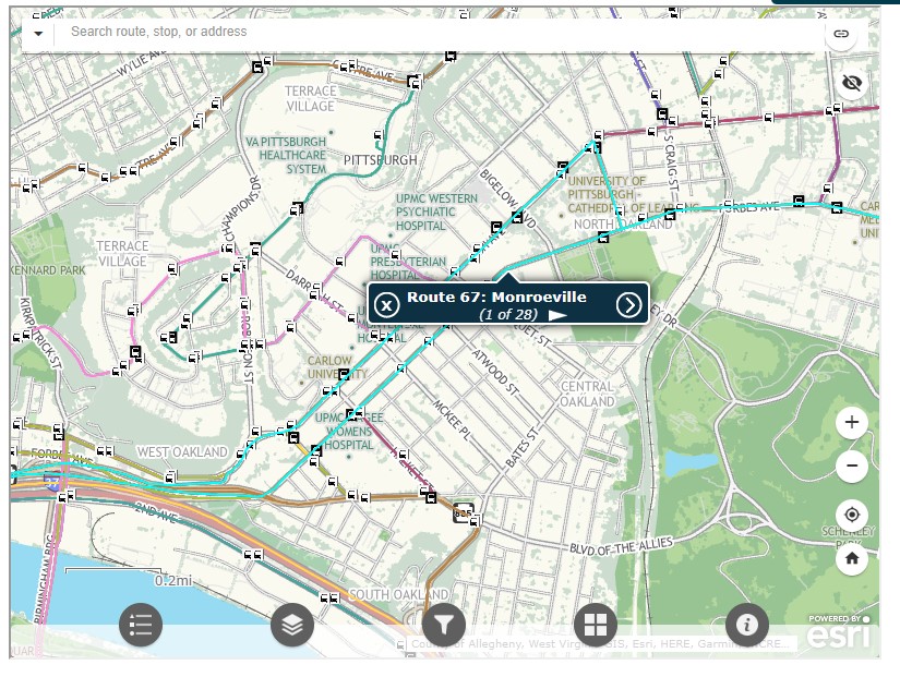
Even at the neighbourhood level the map is difficult to read. The screenshot below shows Pittsburgh’s Oakland district, home to University of Pittsburgh, Carnegie Mellon University, several other educational institutions, medical centres, parks, museums, and cultural venues. Many bus routes follow Forbes Avenue and Fifth Avenue, but as each route is layered on top of each other, it is difficult to discern where each route runs and where they go.
PRT’s ESRI interactive system map, zoomed into the Oakland District
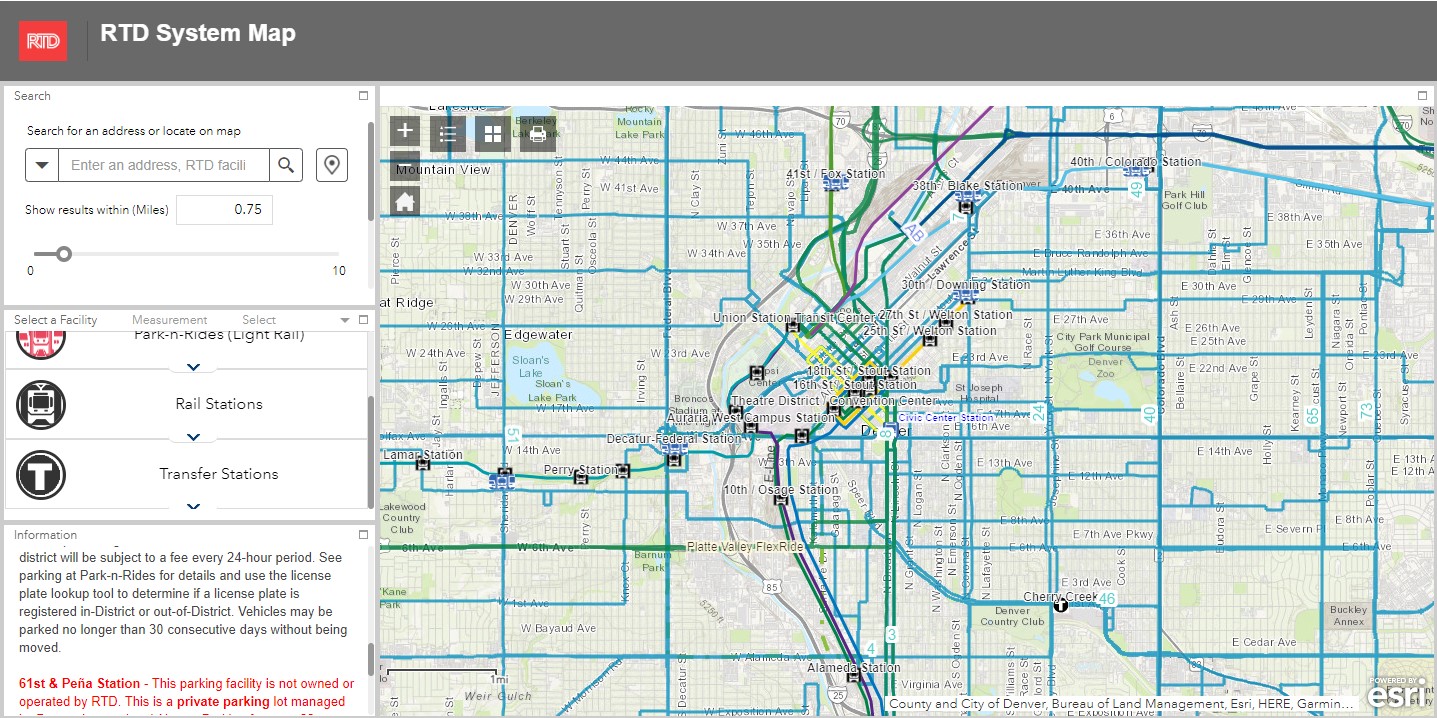
Denver’s Regional Transportation District (RTD) also uses ESRI interactive maps to show bus routes (rail services are depicted in a static image map as well). At a small scale, only the light rail and commuter/regional rail services appear, along with transit park-and-ride locations. Denver’s bus system is less complicated than Pittsburgh, operating largely on a grid, but still, a proper map would make it much easier to get a sense of the network.
Zoom in, and bus routes appear, along with route numbers, but there is nothing to show the level of service for each route.
Though online-only interactive maps have their purpose (my Ontario and Canada intercity maps are designed to show where connections exist, or not, and how to obtain schedule information), they are not well suited for urban transit systems and are very difficult to read on a mobile device. Properly designed static maps, in web image or PDF format do much better jobs.
It is worth comparing Pittsburgh and Denver to the Toronto Transportation Commission (TTC). The TTC’s complete system map is provided to customers for free at subway stations, with smaller, simplified versions available as tear-away pamphlets. Large-format versions are also displayed across the network in bus shelters and subway stations. A PDF version can also be easily found on the TTC website in the main Routes and Schedules page. Surface routes are categorized by service level (express, frequent service, regular service, limited service, seasonal, and community routes) with major landmarks and transfer points to connecting services clearly indicated.
I have some minor complaints about the TTC’s map (like regular routes, express routes should be categorized in the map based on their service levels, for instance) but it is a reasonable, easy to read map that is also quite easy to find.
Unfortunately, more transit systems are moving away from easily accessible paper maps. Durham Region Transit, for example, no longer provides copies of its system map. Fortunately, a proper, well-designed PDF copy remains accessible on its website.
When travelling, or looking to understand a city’s transit network though, there is nothing quite like poring through a well-designed, easy-to-read paper map. It would be a shame if more agencies went the way of Denver and Pittsburgh.
NOTE: Previous versions of the Ontario and Canada maps are retired; please see the new Canada Intercity Transport Map, launched March 30, 2025. This will now be the only interactive map that I will update.
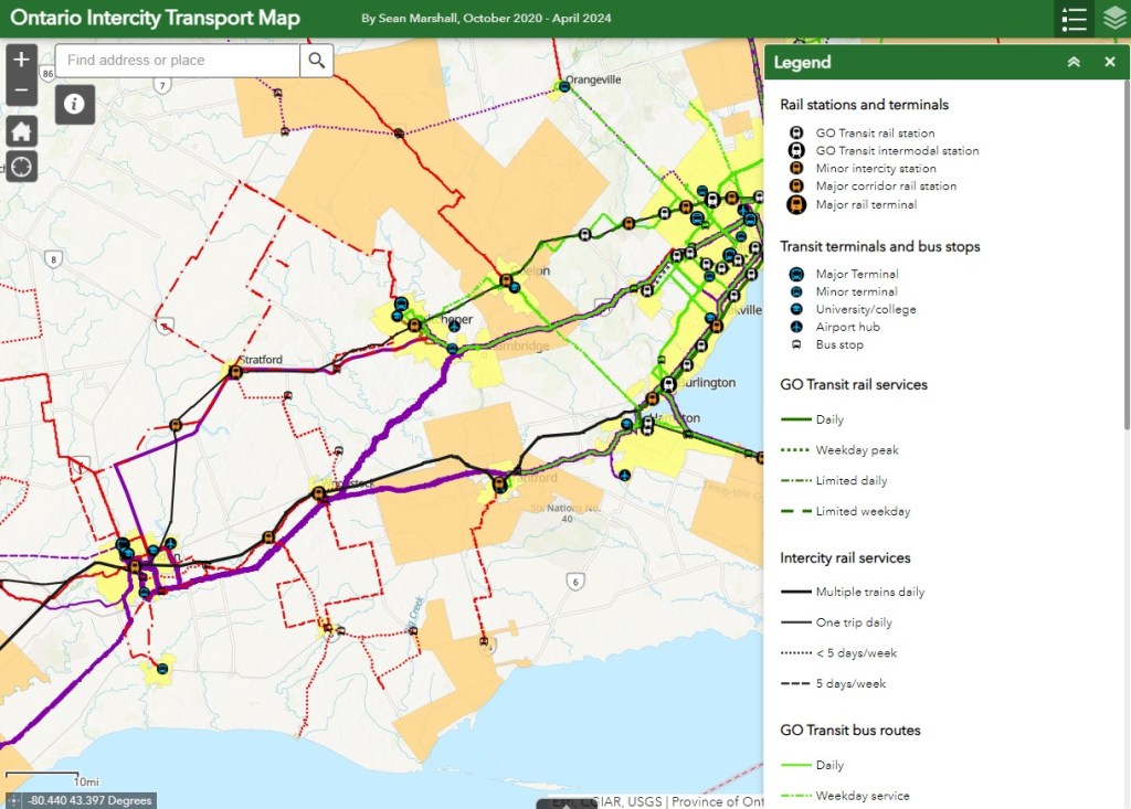
Since 2020, I have maintained an interactive map of bus and rail services in Ontario. Without a central repository of transit information, my maps have become one of the few comprehensive resources available. I am pleased to keep the resource going, and I appreciate the messages of support, as well as additions and corrections that you submit.
There are a few updates for April 2024:
Middlesex County Connect launched a new route between Dorchester, White Oaks Mall in London, and St. Thomas. This route operates six days a week, with four round trips Mondays through Saturdays.
A new FlixBus route, operating six days a week, now runs between Downtown Toronto, Pearson Airport, and Sudbury, competing with Ontario’s Northland bus service.
Ourbus became the latest company to operate a coach service between Toronto, Kingston, and Ottawa. There are now five coach operators competing on the same route.
Grey Transit Route announced that they will be ending weekend services on most of its routes starting May 1.
Though the gap between London and St. Thomas is now filled, there remains several other parts of the province without intercity transport links, even in Southwestern Ontario. For example, service in Huron and Bruce Counties is limited to a three day/week TOK coach service and a three day/week minibus service between Goderich and Grand Bend. There are still no links from Haldimand County and Six Nations to nearby large urban centres like Brantford, Hamilton, and Toronto.
I plan to update this Ontario map again in July. At that time, I will also update my Canada-wide transportation map to reflect changes in the intercity transport industry.
If you like my maps and you would like to help out with my online mapping and webhosting costs, consider buying me a coffee.Thank you!
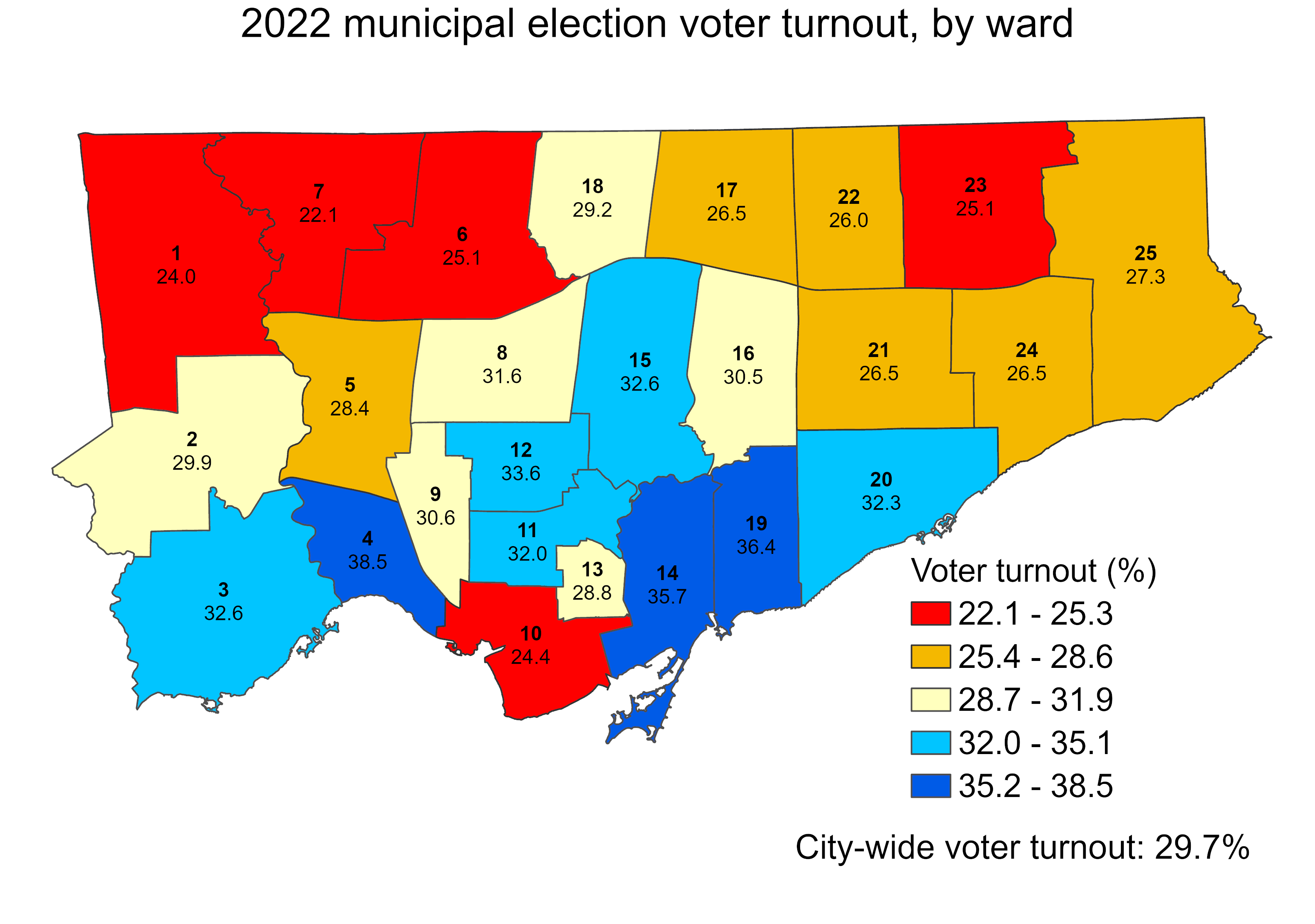
Ever since John Tory was elected mayor of Toronto in 2014, voter turnout in municipal elections has been in decline. In 2010, the year Rob Ford was elected mayor, turnout was 50.4 percent. Four years later, 54.7 percent of all eligible voters went to the polls to elect a new chief magistrate. However, in 2018, just 40.9 percent bothered to vote, and in 2022, turnout fell further, to just 29.7 percent.
With the recent release of detailed voter statistics from the 2022 municipal election in the Toronto Open Data catalogue, it is now possible to see how much turnout dropped in each ward.
I dig deeper into the last election’s dismal showing, and what it might mean for the upcoming mayoral by-election, at Spacing Toronto.
This coming Monday, October 24, Ontarians will be electing new city councils. In Brampton, Ottawa, and Hamilton, the mayoral races should prove to be interesting. For Ottawa in particular, with Jim Watson stepping down, voters have a clear choice (and I’ll be cheering for Catherine McKenney). Though Gil Penalosa offers a new vision of a sustainable, active, and safer city, it’s very likely John Tory will win an unprecedented third term, the first to do so since amalgamation in 1998.
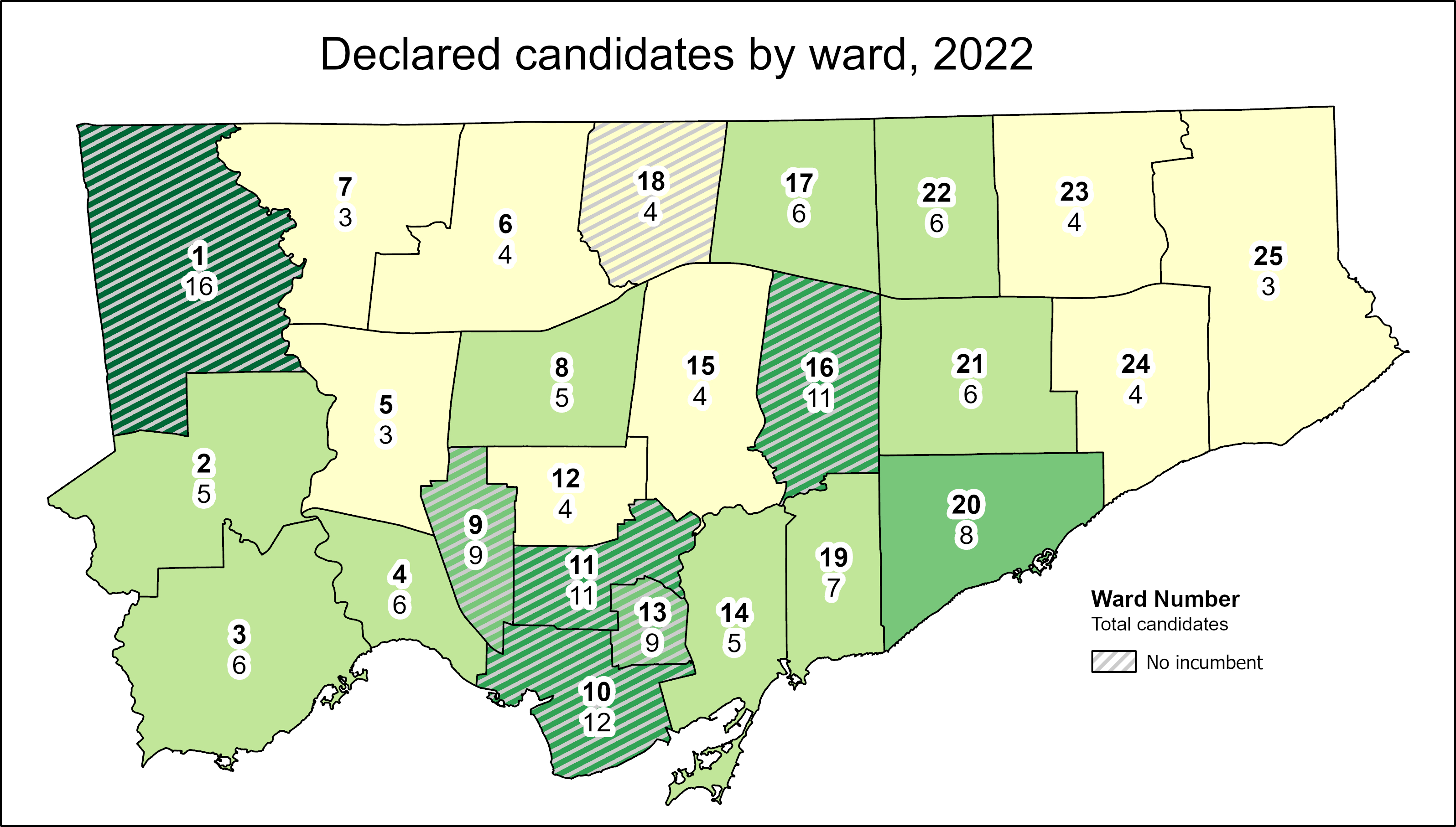
At Spacing Toronto, I have been offering some insights by mapping the state of our local democracy, ward by ward. Though there are seven wards in which no sitting councillor is running for re-election, the new council may not look too much different from the last one. That’s because two former councillors — Vincent Crisanti and Jon Burnside — will be looking to get back into office. Meanwhile, Mayor Tory has been busy campaigning for twelve candidates, including eight incumbents, that will help advance his agenda of incrementalism and austerity. Among Tory’s picks are Frances Nunziata, who has been in municipal office uninterrupted since 1988.
Here are the links to my posts at Spacing:
Open wards and the power of incumbency: The power of incumbency, and the mayor’s own influence, will weigh heavy on the final results. Though there may be seven “open” wards and a few more truly-competitive races, there is a lot happening behind the scenes to favour certain candidates.
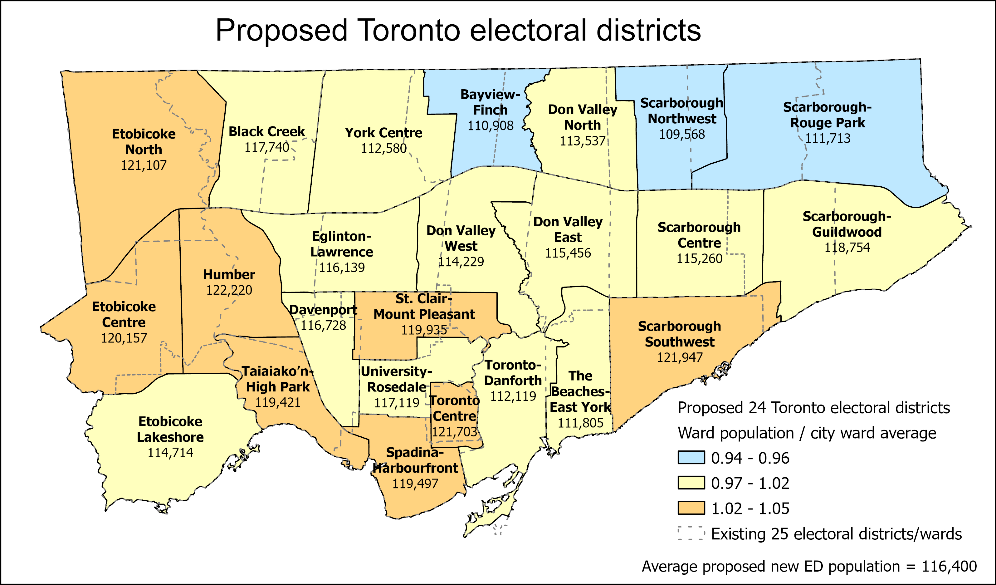
Population disparities between Toronto’s 25 wards: How ward boundaries that were drawn in 2013 have exasperated imbalances in population, leading to burnout in high-growth wards (with several downtown councillors deciding to move on). If Toronto continues to be forced to use federal/provincial riding boundaries, it will have just 24 wards in the 2026 election.
What Toronto’s new ward boundaries might look like
Toronto is a highrise, rental city – unlike City Council: Though nearly half of all Torontonians live in highrise dwellings and/or rent their homes, Toronto City Council is made up almost entirely of homeowners. In only a few wards, detached houses make up the vast majority of the housing stock and homeowners dominate. I ask why city council doesn’t reflect the way an increasing number of us live. The interest in this post had me on CBC Metro Morning for the first time, early on September 30.
Duelling campaign endorsements: Though Mayor John Tory has supported a few candidates before (most notably, Etobicoke councillor Mark Grimes), this time, he’s actively campaigning with twelve allies. Meanwhile Progress Toronto is backing nine challengers, focusing on races where it hopes to help get new faces elected.
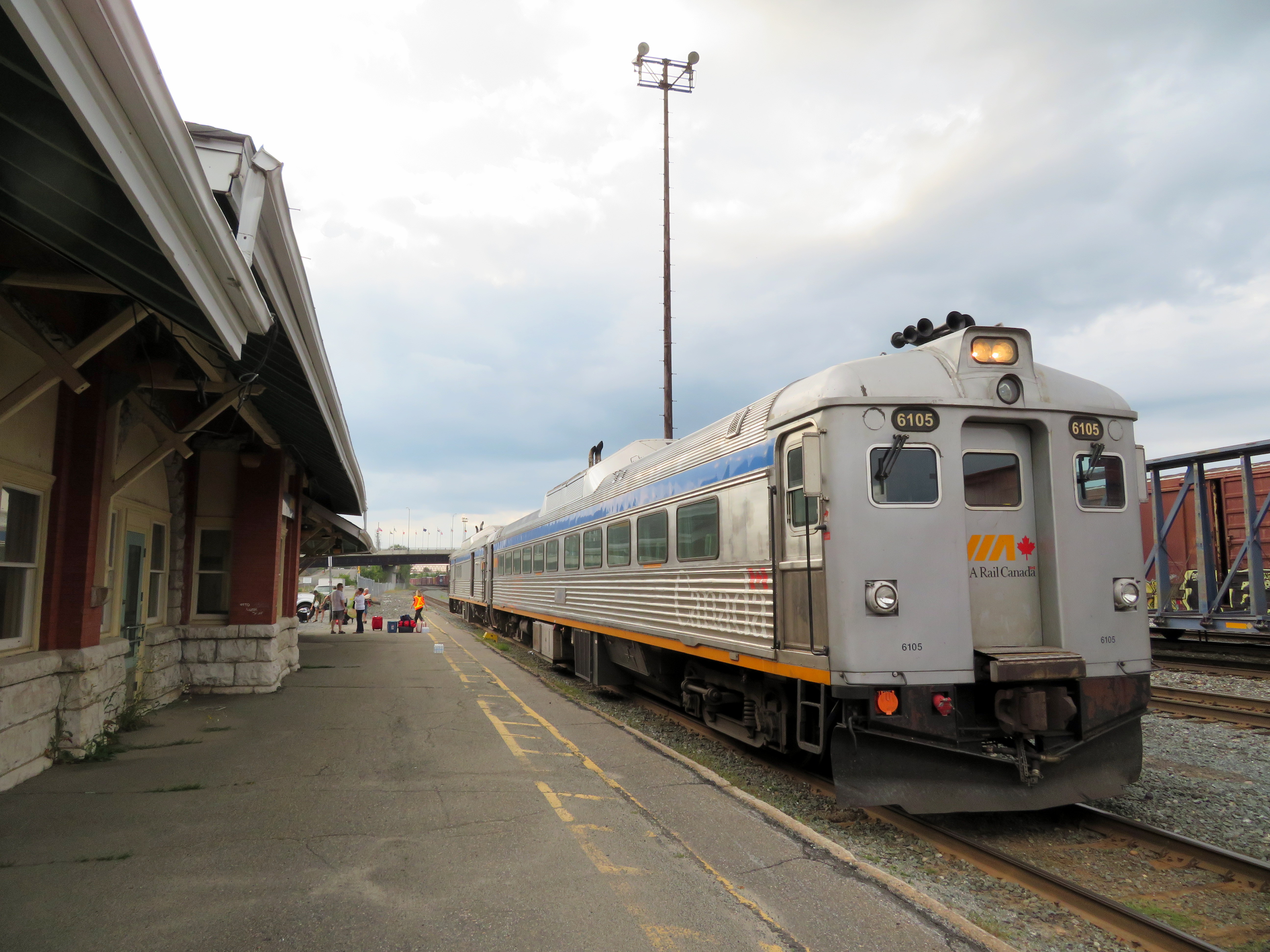
Rail diesel coaches (RDCs), introduced to Canada’s railways in the 1950s, were used on branch lines and in local service on busy mainlines through the 1980s. Today, they can only be found on VIA’s Sudbury-White River service, a remnant of the once-mighty CPR transcontinental network.
Updated December 18, 2023 as part of my interactive maps migration.
I recently completed a map of all Canadian passenger rail services that operated in 1955, from Whitehorse, Yukon, to St. John’s Newfoundland. As I wrote back in March, the decline in rail services in Canada can be attributed to a few factors: passenger train revenues were augmented by express cargo and mail, mixed trains, carrying both passengers and freight, were still justified in a time before trucks took over general industrial traffic. An incomplete highway network in northern Ontario, Newfoundland, and much of Western Canada also guaranteed healthy passenger demand in an era before jet travel became accessible to the masses.
The introduction of rail diesel coaches (RDCs), with their lower labour costs compared to conventional trains kept some branch lines going through the 1960s, but by the mid 1970s, neither Canadian National nor Canadian Pacific were interested in running passenger trains anymore; both were increasingly focused on bulk freight (grains, minerals, chemicals, finished automobiles) and intermodal container traffic.
VIA Rail took over most of CN and CP’s passenger trains in 1978, with direct government subsidies helping to fund its operations and capital expenses. By then, passenger train service was concentrated in the highly populated Quebec City-Windsor Corridor, but there were still three trains a day between Halifax and Moncton, two trains daily between Montreal and Atlantic Canada, between Winnipeg and Vancouver, and between Calgary and Edmonton. Scheduled bus connections, some even operated by VIA Rail, provided connections to places such as St. John’s, Fredericton, Charlottetown, and the Okanagan Valley.
Cuts imposed in 1981, 1990, and 2012 devastated the network. By 2019, there were only three trains a week in Atlantic Canada, two trains a week between Toronto and Vancouver. Even the Corridor saw cuts: there were five trains a day between Toronto, Kitchener, and Stratford, in 2019, there were just two. The only bright spots were an increase in the number of trains between Toronto and Ottawa and growing commuter rail networks in Toronto and Montreal.
A revised map, linked to below, depicts the passenger network in 1955 and in 1980, just prior to the 1981 cuts. Routes operating between Canada and the United States are depicted (CN, CP, New York Central, Delaware & Hudson, Great Northern, Northern Pacific, and White Pass & Yukon in 1955, Amtrak and White Pass & Yukon in 1980). More information on each route is available by clicking on the lines.
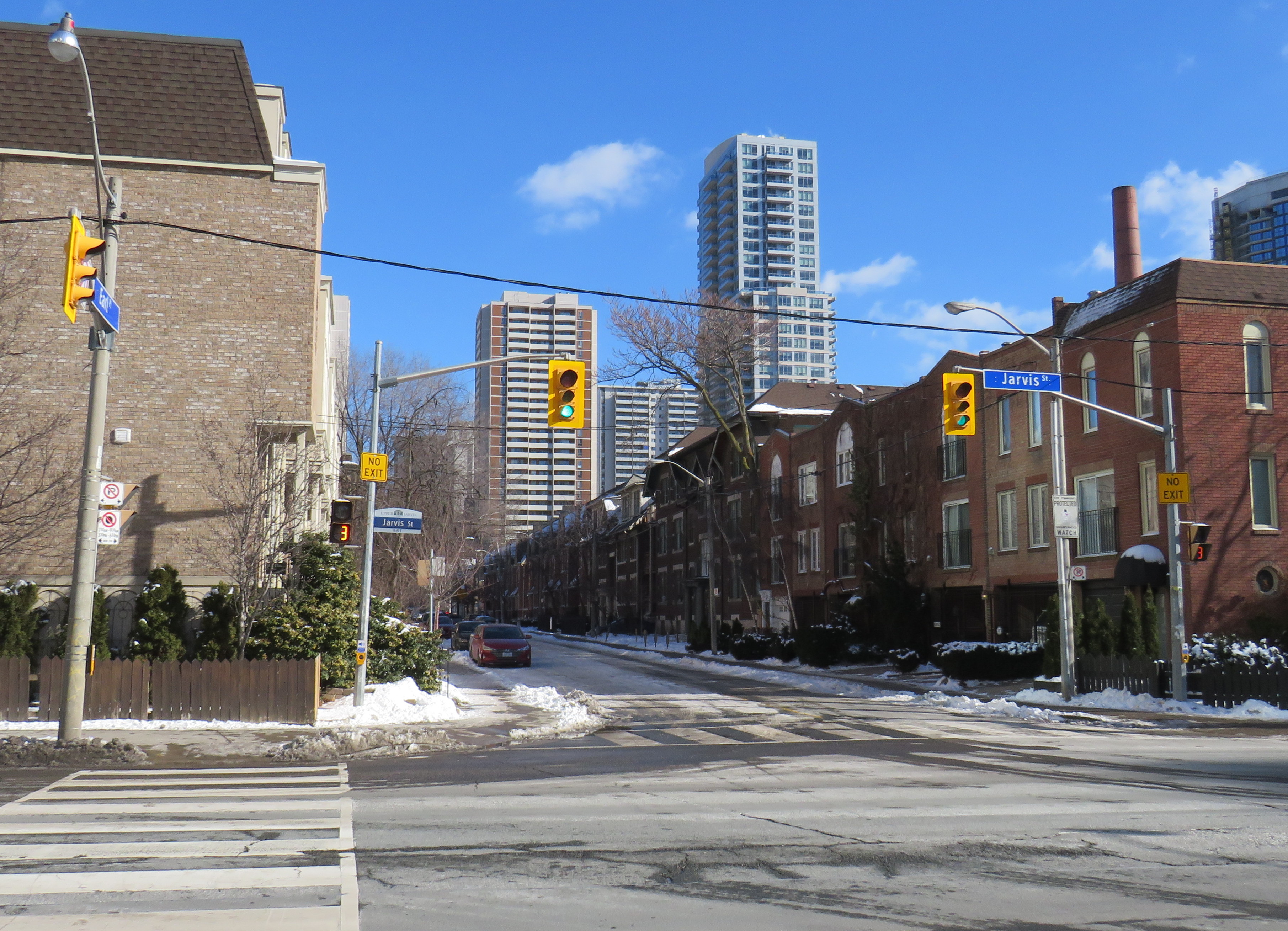
Misleading “no exit” signs, like these on Maitland Place at Jarvis Street, will soon be changed by the City of Toronto to indicate that indeed, pedestrians can continue through
Though these signs are required under traffic codes and regulations, they do not reflect that in many cases, there is an exit for pedestrians.
I quickly created a Google map of all locations in the City of Toronto marking such locations. Through a social media campaign led by Walk Toronto, we were quickly able to map over 450 locations where a pathway, sidewalk, or staircase allows a pedestrian to continue their way where motor vehicles are forced to turn around.
The motion, which was amended to strengthen the wording, requests city staff to develop a new signage standard to indicate where “no exit” signage betrays a pedestrian passage, and to begin installing these new signs this year.
Councillor Paula Fletcher’s motion (inspired by @Walk_TO) to have staff modify “No Exit” signage in places where there are, in fact, exits for pedestrians carries via show of hands, with some amended wording. https://t.co/owNfqtPgNUpic.twitter.com/eevn2bMwkN
The map that I created based on Dylan’s initial suggestion will be used to help identify these locations.
Given the ongoing pandemic, where we are all subjected to yet another lockdown, walking is one of the few permitted ways for each of us to get outside, enjoy the fresh spring air, and get much needed exercise. Knowing where one can walk, especially away from heavy traffic or busy sidewalks and paths, will only help unlock the city for more Torontonians.
I want to thank everyone who submitted locations for the map to Walk Toronto or to myself via Twitter or directly to me on this website. This couldn’t have happened without the help of fellow Torontonians.
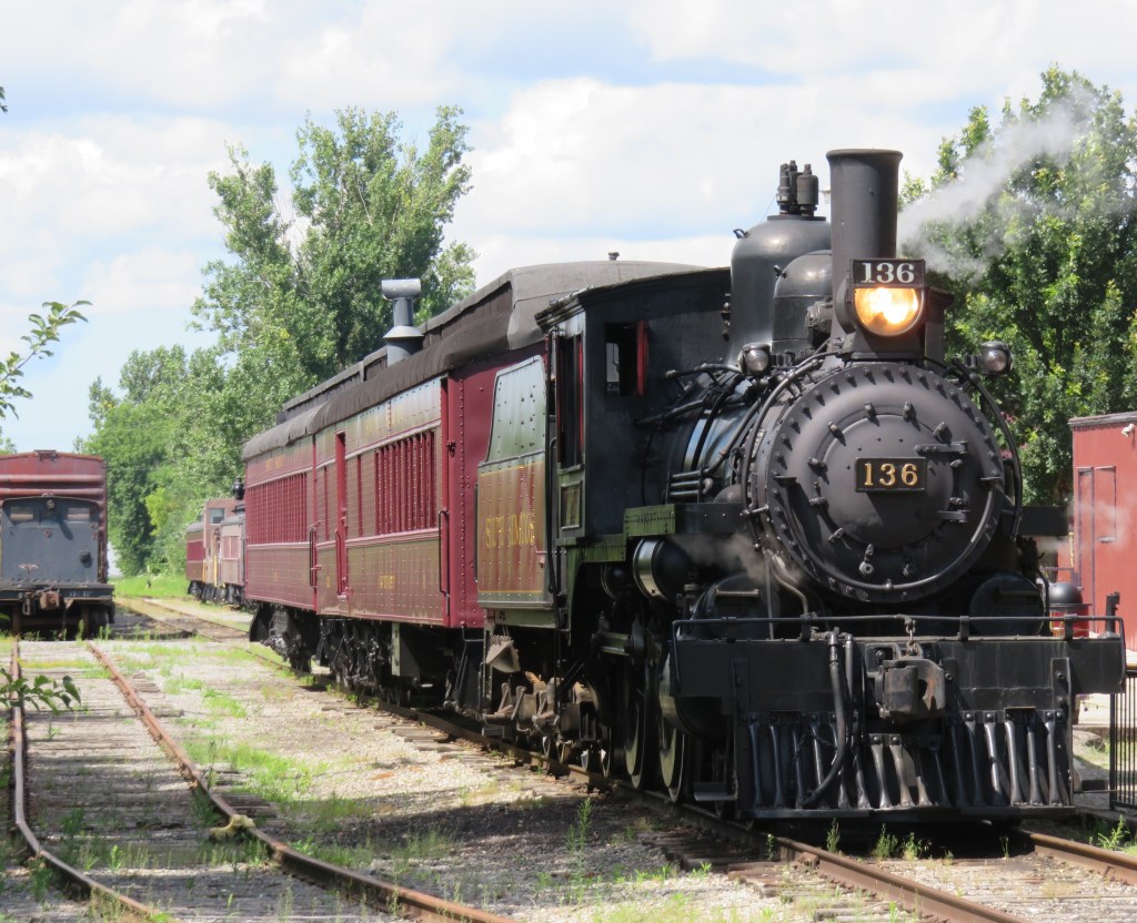
Former Canadian Pacific locomotive #136 hauls excursion trains at the South Simcoe Railway in Tottenham, Ontario
December 17, 2023: The complete map has been migrated to a newer ArcGIS Online account, on account of ESRI suddenly changing its monthly service account to charge bandwidth. That was a pay-as-you go account that helped me get re-acquainted with the ESRI ArcGIS Online platform before I set up a full online subscription to support a small business I co-founded in 2021.
However, I am happy to announce that I completed updates to the Ontario Intercity Transport Map and the 1955 Canada Passenger Rail Map, and that they are safely on a new subscription server at ESRI Canada. Please let me know if you have any suggestions or corrections to the maps, especially during the migration phase.
Sadly, passenger rail has faced a long, slow decline in Canada. Though commuter and regional rail systems in the Toronto and Montreal metropolitan areas have expanded tremendously over the last fifty years, rail service in general has declined in frequency, reliability, and even in speed. Prior to the COVID-19 pandemic, just six trains a day in each direction operated direct between Canada’s two largest cities, the fastest of those trains taking 4 hours 48 minutes to go 539 kilometres to get from Toronto to Montreal.
Seventy years ago, 28 trains on a typical weekday called at CN’s Hamilton Station, departing for Toronto, Niagara Falls, London, Guelph, Barrie, and Simcoe, with another 12 trains calling at the TH&B station on Hunter Street. In 2019, just six GO trains departed Hamilton for Toronto each weekday, with no direct connections even to Niagara, London, or Guelph.
There are several causes for the decline in passenger rail. In 1955, which the map below depicts, passenger train revenues were augmented by express cargo and mail, with the mail contracts alone helping to subsidize many branch lines. Lightly-travelled branch lines were served by mixed trains, which carry both passengers and freight. In Northern Ontario and Quebec, many highways were still of poor quality or unfinished — Highway 17 along the Lake Superior coast was not complete until September 1960. Construction of Highway 401 was just getting underway in 1955. In addition, the airline industry was still new, and air travel was expensive.
Improved highways drew more passengers to coach buses, while the move to trucks for cargo and mail deliveries made many branch lines unprofitable. Larger jet aircraft made air travel cheaper and more convenient for long distances. The major railways concentrated their energies on modernizing their freight networks, with CN and CP building new freight classification and intermodal yards outside of central Toronto, while focusing on bulk freight and shipping containers.
Though CN made efforts to win passengers back in the 1960s and early 1970s with new fare structures and equipment like the Turbo train between Toronto and Montreal, the government of Canada stepped in and took over most intercity passenger rail services in 1977. Though VIA Rail Canada acquired new modern locomotives and rail cars for the Ontario-Quebec corridor services, cuts to government subsidies made in 1981, 1989-1990, and 2012 forced further service cutbacks. British Columbia and Ontario also cut passenger services on their own rural railways.
I mapped the year 1955 for several reasons. I have CN and CP schedules for those years in my collection, while I found contemporary Ontario Northland and New York Central schedules online. It was also the year both railways inaugurated new transcontinental trains: CP launched the Canadian, while CN launched the Super Continental, luxurious diesel-hauled trains with modern sleeping cars and lounges. There were six trains a day leaving Montreal and Toronto for Vancouver that year. In 2019, there were just two trains a week.
In 1955, there were still many branch passenger and mixed trains in Ontario and Quebec, most of which were gone by 1965. Mixed trains were notoriously slow, though, but in many cases, there was a faster parallel highway coach. 1955 was also the last year for CP’s electric trains between Kitchener and Lake Erie, with the London & Port Stanley and Montreal & Southern Counties railways ending passenger runs a year later.
For Ontario and Quebec, I used Paul Delamere’s amazing Ontario Railway Map Collection and Quebec Railway Map Collection, adapting his work to identify those routes used by passenger trains in 1955, then mapping them on my own server. Mapping other routes was much more labourous.
Original version of interactive map
Please contact me if you have any suggestions, corrections, or other feedback.
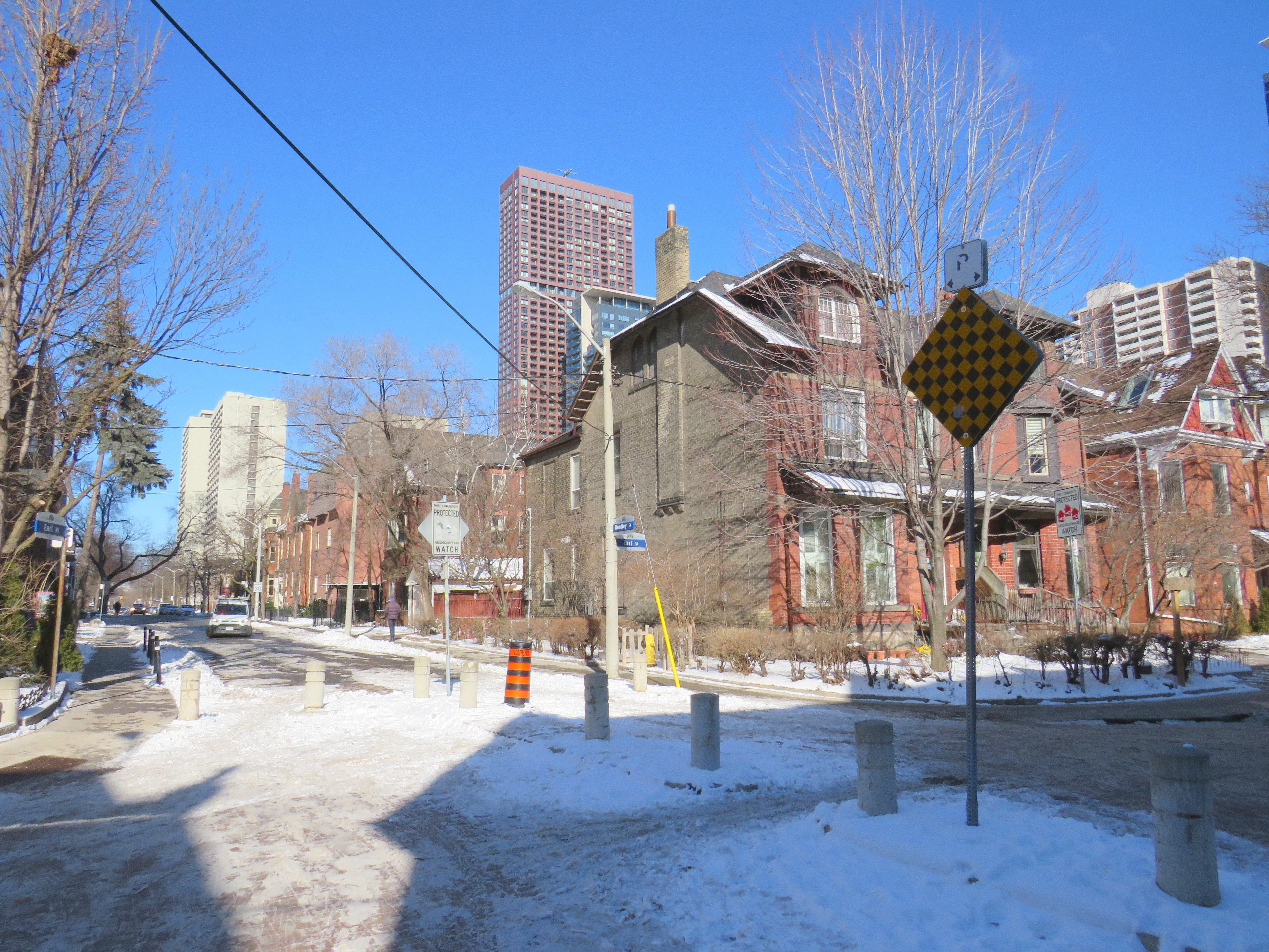
Earl Place, where “No Exit” signs betray through access for pedestrians and cyclists
Last week, Dylan Reid and I, both co-founders of Walk Toronto, decided to create an inventory of all instances in the city where “No Exit” signs do not apply to all road users. Though these signs are required under traffic codes and regulations, they do not reflect that in many cases, there is an exit for pedestrians. Some of those offer through passage for cyclists as well. We were inspired by a Twitter thread that expressed the frustration of getting around the city by foot, where signage is designed entirely for motorists.
Instances where pedestrians or cyclists may continue past a “No Exit” sign include traffic calming measures meant to keep out through motor vehicles on once-continuous roads. The intersection of Earl Place, Earl Street, and Huntley Street is just one example: curbs and bollards restrict motorists from continuing through, though a narrow passage allows cyclists to continue past; sidewalks also allow through pedestrian movement.
Earl Place and Huntley Street
In many other cases, suburban street designs, such as cul-de-sacs, limit vehicular movement though residential subdivisions, but narrow public walkways allow pedestrians access to parklands and neighbouring streets. In other cases, changes in grade between streets allow for a staircase, but not a through roadway down a steep hill. These are common in the Swansea, Baby Point, Silverthorn, and East Toronto neighbourhoods.
As of January 30, 2021, I have mapped over 250 misleading “No Exit” signs throughout the City of Toronto, though I know there are many more. Please send them to me via Twitter or via a direct message, and I will be sure to add your submission.
Our goal is to convince the City of Toronto to add signage recognizing where pedestrians and cyclists do have an exit. Perhaps too, this might inspire you to get outside, and walk around the neighbourhood, checking out passageways you might have not known about.
While most people are urged to stay home as much as possible during the ongoing COVID-19 pandemic, there are those who must carry on. These include health care workers, staff at grocery stores, pharmacies, and other essential businesses, and others who can not work from home. There are also those who continue to require transit to undertake essential errands, such as medical appointments.
Thankfully, most transit systems have carried on. Through GO Transit has experienced an 80% drop in ridership since the beginning of March, it continues to operate all rail lines and most bus routes, providing fewer trips, but maintaining the same span of service hours. The TTC discontinued most express routes, but it maintains a grid of frequent bus and streetcar services.
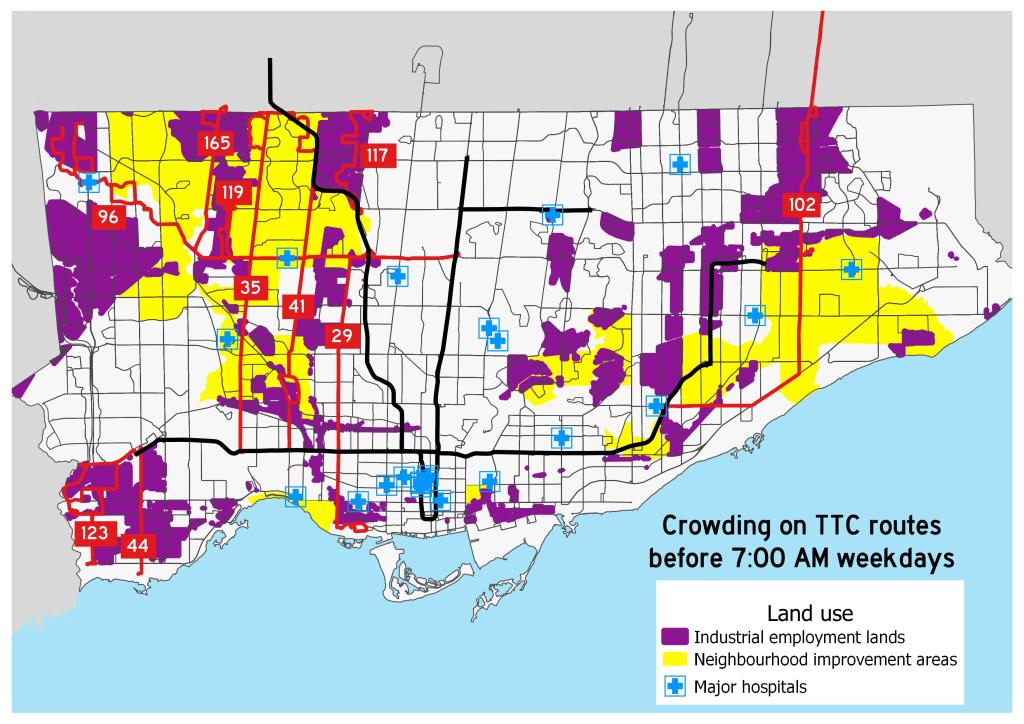
However, the TTC and Brampton Transit continue to struggle with crowding on certain routes. Brampton Transit — which has resorted to an “enhanced Saturday service” level –will only carry half a bus’s seated capacity to enforce social distancing, which has resulted in “closed-door” situations where buses won’t stop for waiting passengers. As a result, several routes are now discontinued during peak periods so that buses are sent to address crowding elsewhere. Brampton Transit serves many shipping warehouses, including two Amazon fulfillment centres, which remain busy during this time.
Routes 117 and 119 are industrial services, connecting warehouses and food service plants. These industries — like the infamous Fiera Foods plants served by Route 119 — rely on low-paid, often temporary workers, with early morning starts. Certain warehouses and many food-service plants also have very early starts to the day. It would be tough for workers to accommodate the TTC’s request to travel at later times. Routes 96, 102, and 165 also extend into major industrial areas. Route 123 serves the Metro supermarket chain’s distribution centres on Dundas Street and The West Mall.
Many of these routes run through Toronto’s neighbourhood improvement areas, which are identified by the city as those requiring additional investment due to issues such as poor access to services and higher concentrations of low-income families. In addition, routes 41, 96, 119, and 165 serve the Humber River Regional Hospital, one of Toronto’s largest health care facilities, while the 96 Wilson also directly serves Etobicoke General Hospital.
Though it would be best for private essential employers to stagger shifts during this unprecedented time, there may be a need for the TTC to redirect some resources towards these parts of the city.


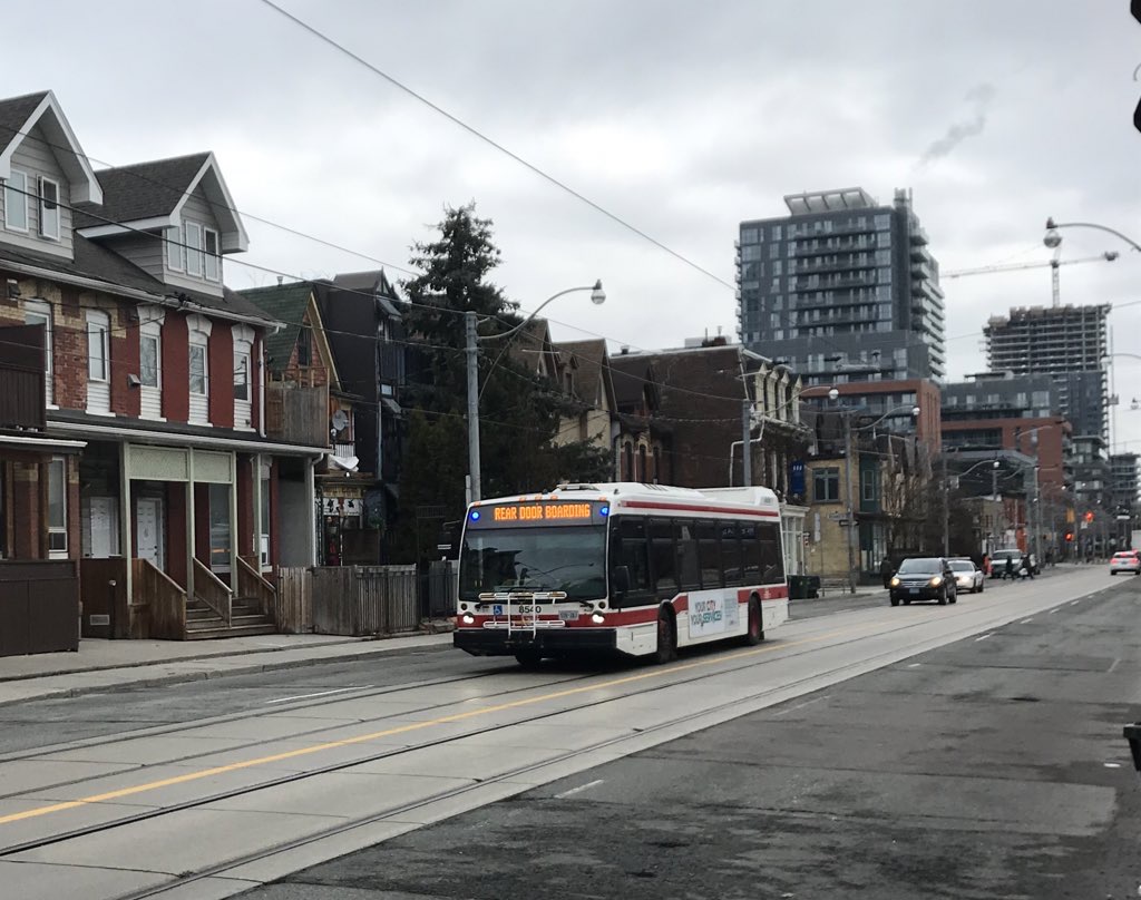 Rear door boarding on TTC buses is just one measure the TTC has taken to address the COVID-19 crisis
 Map of overcrowded early morning TTC routes during the COVID-19 pandemic