I love maps, especially physical, paper maps. I like to visualize the places I travel to and determine how each city and region’s transit networks work. Though online interactive maps can be very helpful (like the ones I created to show all intercity transport services in Ontario and across Canada, filling a much-needed gap), there is still nothing like a well-designed static map, especially when it is in print and easily accessible to the public.
This means providing maps that accurately and clearly depict the entire transit system, along with landmarks, connections, and frequency. Los Angeles Metro’s system map does a reasonable job for a map that covers a very large region.
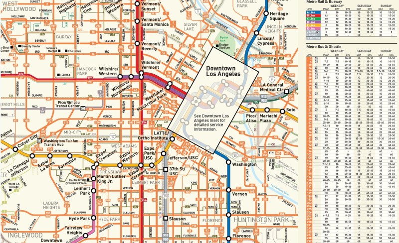
Thankfully, most urban transit systems in North America continue to provide proper system maps both on their websites and in print, provided free on request at subway booths or terminal offices. (Some, however, have charged a small fee for a physical copy of their transit maps, such as San Francisco’s Muni.) In Europe, complete transit maps often have to be purchased, such as in Berlin or Vienna.
I recently visited two mid-sized American cities that have done away with physical maps for their transit systems: Pittsburgh, Pennsylvania and Denver, Colorado. In those cities, figuring out how to get around by tram and bus was frustrating, even in an age of Google and Apple maps and transit planning apps accessible to anyone with a smartphone.
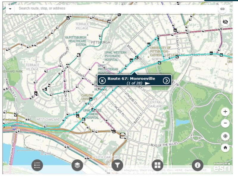
Pittsburgh Regional Transit (formerly known as Port Authority Transit) operates a complicated web of bus routes that radiate from the city’s downtown core, along with a few cross-town and feeder routes. There are three busways and a light rail service to the southern suburbs. However, there is no proper system map, either in print or online as PDF or image file that allows the new or casual user to make sense of the network.
Individual bus and LRT route schedules can be found under the Schedules tab on the PRT website, but one needs to know what route they are looking for. Under Rider Info, there is a link to a system map, but it takes the user to an ESRI interactive map.

The user can then select a service by route name or number in a drop-down tool, but the map itself is difficult to figure out. Zooming in reveals the location of fare vendors and park-and-ride lots, but not important service details like route numbers or service frequency.

Even at the neighbourhood level the map is difficult to read. The screenshot below shows Pittsburgh’s Oakland district, home to University of Pittsburgh, Carnegie Mellon University, several other educational institutions, medical centres, parks, museums, and cultural venues. Many bus routes follow Forbes Avenue and Fifth Avenue, but as each route is layered on top of each other, it is difficult to discern where each route runs and where they go.
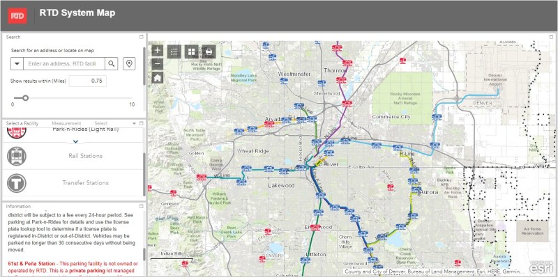
Denver’s Regional Transportation District (RTD) also uses ESRI interactive maps to show bus routes (rail services are depicted in a static image map as well). At a small scale, only the light rail and commuter/regional rail services appear, along with transit park-and-ride locations. Denver’s bus system is less complicated than Pittsburgh, operating largely on a grid, but still, a proper map would make it much easier to get a sense of the network.
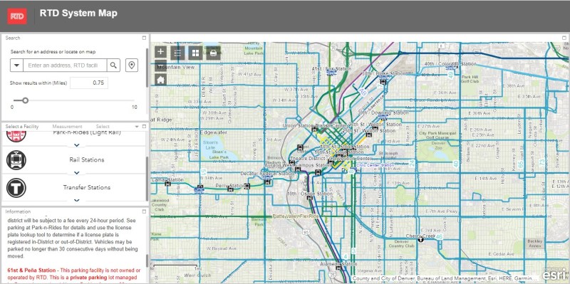
Zoom in, and bus routes appear, along with route numbers, but there is nothing to show the level of service for each route.
Though online-only interactive maps have their purpose (my Ontario and Canada intercity maps are designed to show where connections exist, or not, and how to obtain schedule information), they are not well suited for urban transit systems and are very difficult to read on a mobile device. Properly designed static maps, in web image or PDF format do much better jobs.
It is worth comparing Pittsburgh and Denver to the Toronto Transportation Commission (TTC). The TTC’s complete system map is provided to customers for free at subway stations, with smaller, simplified versions available as tear-away pamphlets. Large-format versions are also displayed across the network in bus shelters and subway stations. A PDF version can also be easily found on the TTC website in the main Routes and Schedules page. Surface routes are categorized by service level (express, frequent service, regular service, limited service, seasonal, and community routes) with major landmarks and transfer points to connecting services clearly indicated.
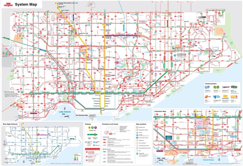
I have some minor complaints about the TTC’s map (like regular routes, express routes should be categorized in the map based on their service levels, for instance) but it is a reasonable, easy to read map that is also quite easy to find.
Unfortunately, more transit systems are moving away from easily accessible paper maps. Durham Region Transit, for example, no longer provides copies of its system map. Fortunately, a proper, well-designed PDF copy remains accessible on its website.
When travelling, or looking to understand a city’s transit network though, there is nothing quite like poring through a well-designed, easy-to-read paper map. It would be a shame if more agencies went the way of Denver and Pittsburgh.

2 replies on “Why transit system maps matter”
Although GO Transit posts large amounts of info on their websites, they are completely remiss when it comes to posting schedules and maps at hubs, and then only post a phone number reachable only by smartphones, not regular cellphones. Roughly 20% of the general population don’t have smartphones. I don’t by choice.
What happens when a passenger’s bus is cancelled, and they have to choose an alternate at the next hub?
What’s rampant in transit and travel industries is a lack of acumen to understand what the average plebe needs to get from Point A to Point B, and possibly thereafter to C.
A dead giveaway of this vacuousness is on elevators at many GO stations, which have two floors to travel to. One up, the other down. Average Plebe could be from Mars, and yet understand an arrow pointing up on a button, and one pointing down. In fact, some older stations have elevators indicating exactly this. Most don’t, and after using the one closest to me hundreds of times, I still get flummoxed trying to remember the function, rather than it being intuitive by arrow.
Someone arrives at Pearson speaking another language, with a smattering of English. What is “UP” going to mean to them? And it’s not Union Pacific…
The persons that design these systems should be required to use them. Wayfinding would become vastly more logical.
I can understand the hesitation in producing print media.
1. it is very expensive at scale and
2. you can NOT remotely update a paper map or schedule, so it might not be good to release print media to people who will then be holding incorrect information if they come back in a week or more.
My company has paper maps and schedules… but they are already out-of-date and we have used our printing budget for the year. We will release a new map and schedule… next year, if the budget permits, but in the meantime, people with paper schedules continue to miss the bus because they refuse to call/email for information and use our website.
If one chooses not to have access to the latest information (via the internet), it is their loss when they end up being misinformed.